like other macos or kde even now windows having glass effect make nice and beautiful and pressure to use and now a days most systems have a decent cpu so it does not take a lot of cpu maybe negligible ??
what are the thought on this??
1 Like
I’d say the biggest problem with transparency and blur is that they usually just get used because it “looks pretty”.
I think you’d see more support from the wider community if someone demonstrated that it served some real purpose or solved a real problem.
4 Likes
The purpose is so you can see content that is “behind” the window but in such a way that it does not get confused with the content in the foreground. That is why it is always blurred. Though this seems less important when a system already has features to avoid overlapping windows, i.e. activities overview, workspaces, window tiling, etc.
To be honest, that sounds like more of rationalization than a rationale. The obvious way to view two different content sources without having them obstruct each other is window tiling.
Since I’ve never seen an adequate example of transparency or blur used to that effect, I have to assume it’s wanted because its pretty, not because it actually solves a problem that doesn’t already have a solution.
It is not really about viewing different content sources since you cannot actually view it fully due to the blurring. It can only give a hint as to what is behind another window. The activities overview is what fully makes it redundant, not window tiling, since you can always see all windows there without concern for the Z order.
1 Like
my basic point is just having blur makes gnome visually A+ just see the difference with blur and without blur now blur used cpu but very tiny for newer systems it does not matter but for those don’t want they can disable that like the effect that we see visually.animation animation in gnome does not make any usability improvement
but it makes pleasure to make.
same here just add blur my shell and see gnome become a os from future i think it makes sense to have that.
by default on quick toggle and stuff
look at porsh mobile-shell/mobile-shell-visuals.png · master · Teams / Design / os-mockups · GitLab
Okay, I see where you’re coming from now. I haven’t heard of using transparency/blur as a form of “hinting” in that way before.
Actually it does. Tobias did an excellent talk about semantic animation at FOSDEM 2018. This is what I mean by the importance of demonstrating how blur/transparency could be used for more than pure aesthetics.
1 Like
where???
my points make sense it make de better looking like kde and macos
I was responding to @jfrancis, who provided a rationale for how transparency/blur could be used to serve a purpose. Although he pointed out the Activities overview makes it moot, it’s still an actual reason to pursue it.
Your point is really just subjective, but let’s assume it’s not and transparency/blur is objectively attractive. Something that is pretty will draw the attention of the user. Something that draws attention without purpose is distracting.
You’re also asking someone else to do work for you. If the only reason you can give is “because I think it looks good”, the only people who will volunteer are people who agree with you and don’t have anything else better to do.
1 Like
first impression is the last impression if user likes the look and feel they will stick with
now about the work it need to be discussed on the lead devs of core gnome as it is a shell component if we from gnome are agree and make it on a to do list in maybe 44 or 45 release some one will work on for sure and it is not an issue.
Okay, well best of luck with your idea ![]()
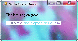
That is just what I heard from Windows Vista fans around 15 years ago when it came out with those glass effects. They had a terrible problem with contrast however:
It can only work if the effect is extremely subtle, but that further diminishes the effectiveness of it…
1 Like
Is that the blur-my-shell extension? I think that shows you already have it? Of course that is only for the shell, not for the apps…
i think having blur in the quick toggle and bottom dock will make it awesome other blur may not be required it depends on looks need to be tested by ux team
Transparent surfaces are usually look dirty to me
1 Like
It’s true that transparency is often used in a distracting way. But blurring and transparency, as it is implemented in the blur-my-shell extention, can actually also help users understand the hierarchy of content. Understand that a popup is above the content below it. Understand what is beside the popup, etc.
I’ll have to verify what exactly makes blur-my-shell easier to use and come back here with some screenshots and examples when I’m back home on my gnome desktop ![]()
1 Like
having it make system like mac and beautiful
While previously stated that transparency is used to see whats “behind” a window
I see little to no useful examples of transparency being used so I will write some examples I believe need a transparency.
Why even do transparency?
It can help users in multiple scenarios. Such as seeing otherwise covered content, it includes overlaying windows as well as overlaying UI elements.
It also helps with Z axis navigation by allowing users to peek the elements behind .
It also helps with focus. Ex: when reacting to a message it can be resized and put in front while other messages are blurred out (focuses on a selected item, removes clutter, while still appearing in the same space).
UI Elements:
-
Overlay controls:
-Media playback controls for video
-Image viewing applications for navigation buttons
-Subtitles for video for better contrast (Live Captions is an app that could benefit a lot from this)
-Overlay controls for touch devices: pen options, text editing options and other pop ups that need to be close to the working area/pen/finger (like in a current build of Rnote) -
Dialogs and pop up windows:
Gnome has many dialogs that are locked in the center of the application, making them block other content which can be problematic at times for certain applications
-For image editing applications when a dialog covers an image
-Color pickers
-Emoji pickers
Shell and Shell extensions:
- Overlay elements:
-App menu sub-folders (like in Blur My Shell)
- Extensions that would benefit from transparency:
-Pano - a clipboard manager that uses a huge portion of the screen
also it looks nice ![]()
Edit: I would like to add that glass transparency right now is hard to implement(not counting both x11 and wayland) and can be expensive on some hardware. And it can behave rather differently depending on the hardware if not implemented well.
2 Likes