look at the report we got from gnome survey that has been done in 2022
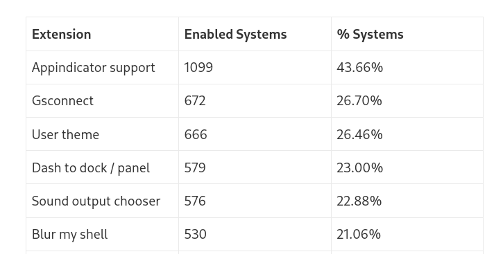
more than 20% users using it and it is actually makes system nice.
this actually look nice just because it have blur.
look at the report we got from gnome survey that has been done in 2022
I wanted to add a note to be careful with interpretation of the results from the gnome-info-collect report, as @allanday has written in the limitations of this report:
The people who provided their data with gnome-info-collect were primarily recruited via GNOME’s media channels, including Discourse and Twitter. This means that the data we collected was on a fairly particular subset of GNOME’s users: namely, people who follow our social media channels, are interested enough to respond to our call for help, and are confident installing and running a command line tool.
The analysis in this post should therefore not be treated as being representative of the entire GNOME user base. This doesn’t mean that it’s invalid – just that it has limited validity to the group we collected data from.
It should also be noted that the data from gnome-info-collect is by no means perfect. We collected information on GNOME systems rather than individual users. While there were some basic measures to avoid double counting, they weren’t foolproof, and there was nothing to stop the same person from submitting multiple reports using different accounts or systems. We also have no way to know if the systems which we got data on were the main desktops used by the reporters.
agree but still it is better than nothing
To be fair, “looks pretty” in itself is often a good enough reason to do something, even if it doesn’t serve a purpose.
For example, the ability to set a wallpaper for the desktop is extremely useless. Personally I would vote for removing this feature. Yet somehow almost every system supports this.
I mean, when people look at those who used Firefox Personas in LibreOffice, they might go like, “Why on earth would anyone do that?” But they themselves probably have a nice photo as their desktop background.
Blur my Shell does not help with the hierarchy. In fact it contradicts the whole spacial model of GNOME 40.
My guess is that apart from “it looks good”, the main reason people might like it is because they are still attached to the old, more common spatial model, where the desktop is treated as a fixed, immutable ground on top of which everything happens.
Overlaid controls are already transparent in GNOME, though. See for example Transparency Impacting Legibility (#335) · Issues · GNOME / libadwaita · GitLab.
Why do you think it doesn’t help with hierarchy? And how does it contradict the spacial model of GNOME 40?
What do you mean by “the desktop is treated as a fixed, immutable ground on top of which everything happens” ?
Visually, having the same background for the workspaces and the overview means there’s less distinction between the two.
Conceptually, it contradicts the spatial model because under GNOME 40, there isn’t supposed to be anything beneath the overview. Rather, the “desktops” (or workspaces) are treated as being positioned on top and occupying a portion of the overview; when you activate the overview, you’re zooming out spatially. The gestures, the animations, etc. are all designed so that the whole shell is like a physical space that you could move around in.
With the blurred desktop background behind everything, it would imply a completely different model. The desktop (singular) would be the fixed stage. When you activate the overview, the app grid, or switch workspaces, these UI elements move in and out of the desktop, but the desktop itself is not moving.
To use a physical analogy, the old model in GNOME 3 is like having one desk in your office. You might put things on it and move them around, but you always have that desk underneath everything. Even when you switch between tasks, you’re just shoving unused stuff to the side; but you’re always sitting in front of and looking at that desk.
But in GNOME 40, you have multiple desks. When you switch to a different workspace, you’re walking away from your current desk and towards another one.
In GNOME 3, since you’re always sitting in front of that one desk, the distinction between the room and the desk is not relevant. So the desktop background and the room’s wallpaper is conceptually the same thing, just a fixed backdrop to everything.
In GNOME 40, the desktop background is applicable only to the desks. The room itself is distinct from the desks, and so it’s painted with its own color.
Woah! That’s actually quite smart!
I went and disabled the Blur My Shell extention and I see now what you mean. And I think i’ll keep it disabled! ![]()
Where could I read more about these design guidelines? And where are these conversations happening? (I’m a game designer with high interest in UI and UX so that all look very interesting to me!!)
It was explained in their original blog post that revealed the design: GNOME Shell UX plans for GNOME 40 – GNOME Shell & Mutter. And you can find mockups and discussions on GitLab: Design · GitLab
This topic was automatically closed 30 days after the last reply. New replies are no longer allowed.