Visual personalization in GNOME: Does GNOME want this experience?

So I’m just finishing work and pondering the future of GNOME and the whole theme discussion, and the conflicts with users/distros. I know this discussion has been had but I’d like to see what this community feels about adding 2020 common visual personalization features into GNOME.

Goals of personalization features if added:

  1. Understand what is reasonably expected in 2020 in desktop personalization
  2. Deliver visual personalization that encourages adoption of new users
  3. Decrease the desire for users to use third party GTK or shell theme, while still supporting current options in tweaks.
  4. Have more distros ship with Adwaita with supported custom defaults instead of different themes.
  5. Do not break functionality or drastically lower quality

2020 public expectations

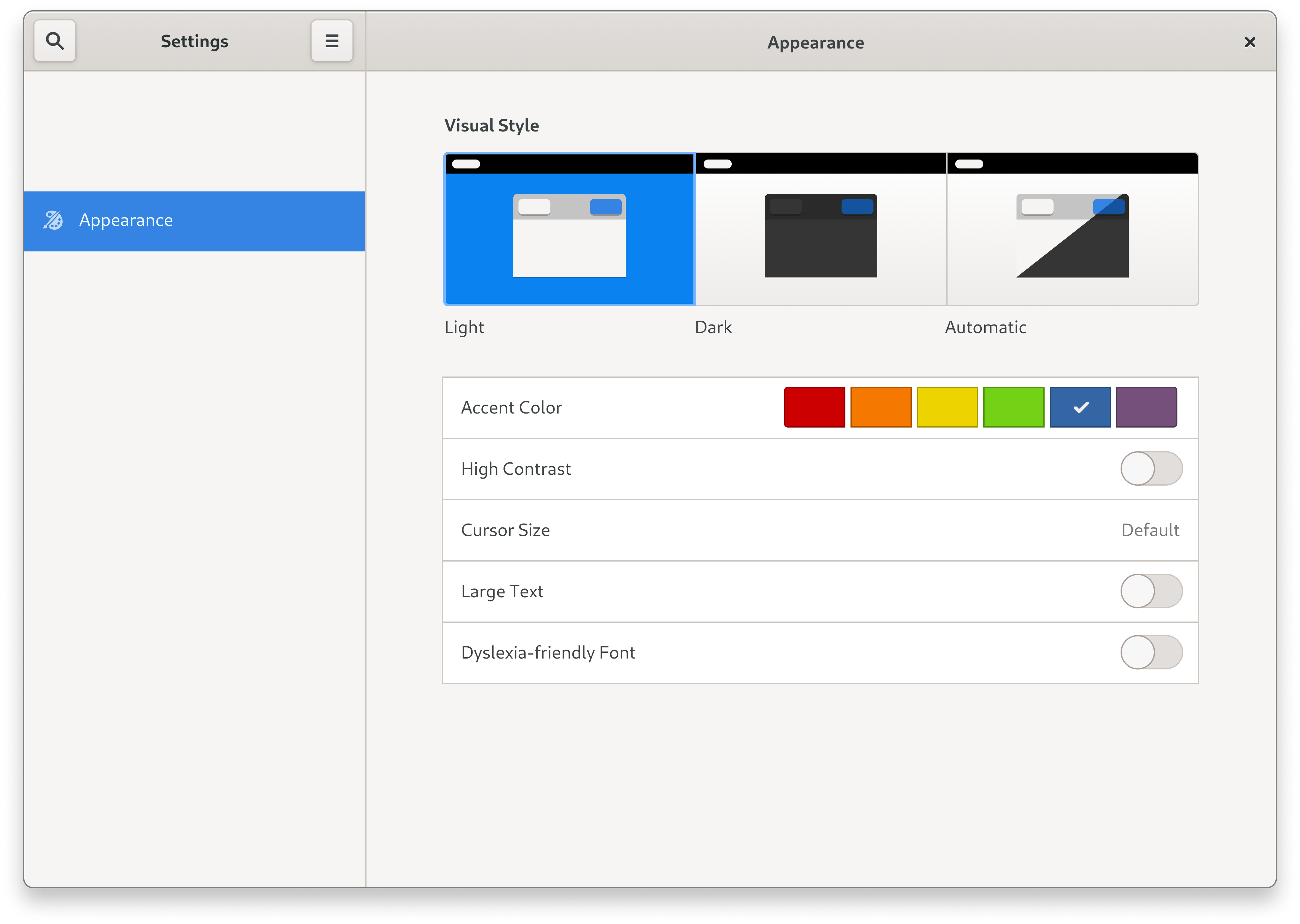
  1. Standard and dark modes:
    • Adjustable based on time
  2. User selected accent color that impacts at minimim the selection background color,toggles, and buttons, and at most impacts extras like folders.
    • Generally people are ok with curated selection of colors
  3. Option for split dark/light theme (like Yaru)
    • I hesitated to include this, even though it’s a personal wishlist item, because it’s not seen as commonly outside of desktop linux, but it is popular in GNOME third party themes.
    • Many distros seem to prefer this style.
    • Goals may be fulfilled without this inclusion

Implementations: Where did this expectation come from

Windows 10

  • Dark mode
    • Can be automated separately from personalization settings, with built-in (not third party) automation settings.
  • Accent color selection
    • Curated colors: blue, purple, pink, red, orange, yellow, green, grey
    • Impacts selection background, toggles/checkboxes, buttons.
    • Folders remain light yellow, like a real life folder
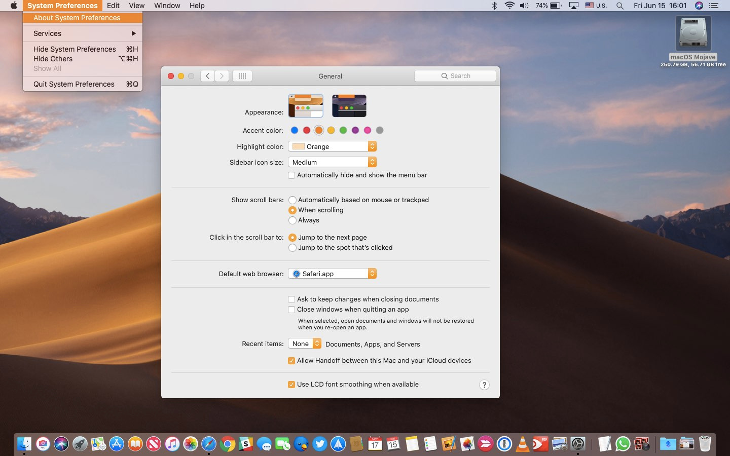
Mac OS / OSX

  • Dark mode
    • Has “Auto” mode
  • Accent color selection
    • Curated suggestions with color wheel selector
    • Impacts selection background, toggles/checkboxes, buttons
    • Folders remain blue
    • No third party theme installer

iOS & iPad OS

  • Dark mode
    • “Auto” mode for time based automation
  • No accent color selection
  • No third party theme installer

Android 11

  • Dark mode
    • Automation supported
  • Accent color selection
    • Curated colors: Blue (the default choice), Cinnamon, Black, Green, Ocean (cyan), Space, Orchid, Purple
    • Colors slightly different in light and dark modes
    • Impacts apps that pull highlight color, settings, toggles
  • No third party theme installer

(Bonus) KDE NEON

Supported personalizations:

  • Full theme engine with ability to select different color schemes.
  • Automation available via third party widgets

Linux distros offering light/dark modes + color selection:

Most of these are in the form of separate themes, and the whole theme is changed when the color is selected. Most press around the GTK based projects note these as positive improvements from GNOME.

  • Elementary OS 6 (in dev)
  • Zorin OS
  • Deepin 20
  • KDE NEON (any kde based distro)
  • Likely more

Linux distros offering just light and dark modes, or light/dark mixed

  • Ubuntu
  • Pop_OS!
  • Likely more
  • (Bonus) GNOME based distros with tweaks enabled

Why is this popular?

If I had to specualate, I would assume it’s popular for the following reasons, but feel free to discuss below:

  1. Let’s users see themselves as they use the computer. It’s a warmer feeling to be home with your own stuff than at the office.
  2. Does not overwhelm the user with options
  3. Minimizes inconsistencies for the value it brings to the experience.
  4. People can’t just tell themselves to stop hating the color blue (jk)

What is GNOME’s viewpoint, or yours?

16 Likes

The proposal overall seems nice to me.

This seems to be a good place to start. Maybe, you can submit a merge request in gitlab, and get started for now.

Thanks !

Unless I misunderstood I’m guessing a feature request issue might be a better place for me to start being a novice with development of any kind. (I’m familiar with git and only have just learned the basics of javascript/typescript. No C at all. No familiarity with GNOME’s underlying code/structure). Coming from art school though I have more design experience. I figured discussion on here might help change the future feature request into something better thought out, and less likely to be dismissed

Just looking at accent color suggestion first, since dark variants already exist for the most part, I’m guessing there are a couple approaches:

Accent color approaches

  1. If we look at how Elementary or Zorin accomplishes the color selections, it looks to be a simple as having different themes, and those are changed in the same way tweaks sets a different GTK theme.

  2. Create some dynamic system that utilizes a user defined color without changing the theme. I think with the way the png assets are rendered this would be difficult, but I’m not the most knowledgeable to be able to say that firmly.

My experiments

Building custom theme

If trying the first method, I could help by generating the themes CSS and assets themselves. I’ve learn how to rebuild the assets after editing the assets.svg, and use sassc to translate the sass to css. Using this method I generated this Adwaita variant with my preferred color.


(Ignore icons. I generated my own in Oomox, but if i had time would download default gnome ones for this picture. On Pop_OS, default gnome icons aren’t present)

Flatpak

Now, my flatpak apps are respecting this theme, which is strange as I thought there would be a flatpak issue. I think maybe it’s because flatpaks can access ~/.themes since it’s on the user directory, but I didn’t know this was possible. If that’s the case, this might be good for a user theming, since the only theme that would have to be in the system directories would be the main theme, and each user through settings could apply a custom color pre-installed in ~./themes.

Theme generator?

Seeing as how building Adwaita the way I did it (if it was a proper way to do it) was pretty painless, it might be possible to make an application, or even a bash script, that does the work for you if you can select a main highlight color. I think if theres away using command-line to get inkscape to replace all instances of a particular color with a different one, that would be a definite possibility. I think something like this would be cool in Tweaks, or just as an official tool you can download.

What colors, what approach for deciding?

I think one of the most difficult things is deciding what colors, will be good if this is an official offering in base GNOME. I don’t think just picking random colors is a good idea. For example, the “Awdaita color variants” theme pack available on GNOME look, is full of bright/light over saturated colors that make looking at selected text blinding, no offense to the creator. And as much as I wish that the color I used above was included (since it’s pleasing to my eyes and also good for text visibility), I’m not sure that’s a fair way to decide.

For header/background vs text, someone made the excellent tool “Contrast” available in flathub. Perhaps something like this for highlight colors could help decide which hue/saturation/value levels for each base colors to use. You would want to offer as many as are common favorite colors if you ask a kid. My picks would be: violet (like I used above), blue (default), cyan, green, orange, red, pink, & neutral grey or bluegrey. Each would have to be a version what is easy to read white text on top of.

Edit: Seems like something I did wrong in my attempts to rebuild adwaita. the checkboxes/radios have a red square in them, see picture below:

5 Likes

Below are the GNOME design team folks, that I know of:

https://gitlab.gnome.org/jimmac
https://gitlab.gnome.org/bertob

@jimmac @tbernard

You should probably get in touch with them, if you are planning to work on making design improvements to GNOME.

Thanks!

1 Like

Thanks for the reply. I’ll look into getting in touch to see what they think.

2 Likes

Just want to drop a quick Settings mockup with my personal thoughts on the matter:

  • As of now, there is no global “Dark Mode” setting in desktop Linux apps can use. While its possible to force a global dark GTK stylesheet (what Pop_OS! and Zorin OS already do), this might cause problems with apps that were never designed with dark mode in mind and non-GTK apps have no way to check whether the user prefers light or dark colour scheme. A global dark style preference apps can opt-in to would be great.
  • Same goes for colours: there should be some sort of colour API apps can opt-in to support.
  • Supporting colours other than Adwaita Blue would also let distro mantainers add branding to GNOME without shipping a custom stylesheet.
  • Certain accessibility features should be moved from “Universal Access” to the new “Appearance” panel in the System Settings. Having options such as “High Contrast” and “Large Text” be buried under “Universal Access” makes them undiscoverable to the majority of users.
  • Consider adding an option to use OpenDyslexic as the UI font, just like elementaryOS 6 does.

14 Likes

The settings of the “Night-Light” mode are currently in the “Screen” panel. If I didn’t miss anything (are they by screen?), I’d probably move them here, as it’s linked with the “Automatic” “Visual Style” more than with anything less.

The “Accent Color” option should probably have at least one place reserved for the default, which should be set by the distributor; I’d let the distribution add its logo in it I think. And maybe a second one for Adwaita-blue? but how to explain to the user the difference between distributor and upstream choice? An old-style foot would probably look out of place… So not sure for that second thing.

There’s the problem that for now (I think), “High Contrast” is based only on Adwaita-light; if it didn’t evolved recently at least (since the “new style” high-contrast theme, that might evolve more easily than before).

Anyway, good job! I like it. :+1:

2 Likes

While “Night Light” and Automatic Dark Mode are both scheduled events that are vaguely related to “Display”, I don’t see a reason to group them together considering:

  1. “Display” tab in the System Setting relates more to the monitor hardware (i.e. resolution, refresh rate, scaling) than visual settings.
  2. Both macOS and Windows have their Dark Mode settings separate from monitor settings, so moving it there would break the users’ mental model.

GTK has had a HighContrastInverse theme for some time now, so I don’t think there should be any problems.

1 Like

This mock-up is really great. Thanks for spending the time to make and share. I also think your other ideas are right on. +1

BTW: I fixed the checkbox issue on my experiment with generating a violet variant. If anyone is wanting to generate a colored variant. You have to pull a really old branch of adwaita to generate all of the png assets. At some point they removed the checkboxes form the assets svg and the assets.txt in the master. After that you can combine those assets with a newer pull of adwaita if you want. (but not master, thats TOO new, and has weird issues on current gnome desktop"

Funny enough on a Telegram group the same discussion emerged.

Here is what still needs to be discussed about dark mode alone:

1- How is it going to be implemented?
a) The first option and the one that might be implemented if things go well in Elementary is: Create a system call for dark mode for applications, this way non GTK and GTK applications could ‘read’ the system call and implement dark mode the way the developer wants it to.
b) The other option is what Zorin OS did, slapping a dark gtk theme. This seems simple, but might cause problems in the future, for example: Qt applications wouldn’t be able to take advantage of this feature and some applications could not be ready for a dark Adwaita/Yaru theme (since these are the Big Themes), causing readability issues.

2- Are GNOME apps ready?
a) There seems to be an old issue with Adwaita Dark and the calendar app regarding readability.
b) Placing something in GNOME Settings means it will o be offically supported by the GNOME, and things need to be well rounded for them to be implemented in GNOME.

Personally, I feel like Elementary’s implementation should be upstreamed to Freedesktop and used in other desktops as well.

Accent colors are another discussion. I think there is no major problems in simply slapping Adwaita Color Variants’ themes on top of GNOME, only issue I see is regarding the shell theme, should User Themes extension be enabled by default? Or should shell’s code be modified?

3 Likes

For the default colors, I think GNOME’s colors palette should be used…

1 Like

https://developer.gnome.org/hig/stable/icon-design.html.en#palette

I think this is a link to the GNOME color palette for reference to Gustavo’s comment

Also, I’m happy to hear/not surprised that this came up in another forum too. Like the original post’s point, I think this is kind of becoming just a basic expected thing that people are now looking at GNOME and wondering why it’s not there.

As far at GNOME color palette, what about including a color or so outside of the palette. My main thinking is that pink is a very common color people would want, but it’s not present. I know there are some elementary folks that use this forum… so I’m curios if we can find out their methodology of the colors they chose.

1 Like

An opt-in “prefer dark” preference is planned, it’s mostly a matter of figuring out some implementation details, such as where this preference would be stored, and someone actually writing the code to make it happen.

Some relevant material:

https://gitlab.gnome.org/Teams/Design/os-mockups/-/issues/53
https://gitlab.gnome.org/GNOME/gtk/-/merge_requests/1669
https://aplazas.pages.gitlab.gnome.org/blog/blog/2020/04/02/coloring-api.html

As for accent colors, I don’t think this has ever been seriously discussed. Personally I’m not sold on the idea, seeing as it complicates things for app developers, and looks pretty terrible on macOS/Windows:

That said, if distros were to agree to use one of the stock colors instead of changing the system stylesheet, it might be worth it from an ecosystem point of view…

6 Likes

Linux Mint provides many themes that are the same but with different accent colors. That is a working solution, but probably not what the actual maintainers of GTK would want.

2 Likes

Part of the goal is to allow distributions to customize the look of their desktop without breaking stuff. So saying “let’s create many themes upstream” will not really help, neither the GNOME project themes designers, nor the downstreams.

1 Like

Do you know if there are plans/wishes to do this via a @media (prefers-color-scheme: dark) { ... } in CSS? There are two related things in librsvg that could help icon themes (media queries for the dark theme, custom CSS properties for colorization and avoiding duplicated color values everywhere), and I’m trying to prioritize things.

2 Likes

This looks great. A week ago I was settling for support for Adwaita-dark. Read support as in: it is possible to switch to it without installing deprecated tools.

2 Likes

https://blog.elementary.io/platform-changes-in-elementary-os-6/

This new post from Elementary’s blog talks a little about their platform changes that helped with this. I’m not sure how relevant it is implementing the features being discussed on GNOME

2 Likes

Not sure what you mean by split light/dark theme but if you’re talking about having dark as in light-dark-darker, where titlebars and some decos are dark but most widgets still remain light, I believe it’s quite desirable because nowadays you have dark non-gtk applications like say Spotify or VSCode with a light title bar which sits just between the dark app and the dark Shell top bar, this doesn’t feel appropriate and even though these apps might someday use CSD I wouldn’t hold my breath for it, while it’s not that difficult to provide a middle ground theme like Yaru does for users who dislike going full dark (and this is not only a matter of aesthetics but also of accessibility, full dark is hard on eyes at day light).

3 Likes

As I understand it, the 3rd option is to automatically change the theme just like the Zorin OS that uses a light theme during the day and at the end of the afternoon it changes to a dark theme automatically.

3 Likes