Four clicks to Power Off

Why not make it a simple, one level, five items menu (or whatever this UI element is called), with:

[Settings]
[Lock]
[Log Out]
[Suspend]
[Power Off]

This takes only a small fraction of the screen, less than when you expand current Power Off item:

power-off-dialog

which itself is tiny on modern sized displays. I completely disagree with calling 5 item menu too long. I think Gnome team is overengineering this feature to the detriment of usability.

1 Like

Except this is not true on laptops, for instance:

You should accept that maintainers and designers have thought about this a little while longer than you have, and have to consider a whole lot more use cases than yours.

2 Likes

What Emmanuele says, plus:

  • Settings
  • Lock
  • Lock Orientation
  • Log out
  • Switch User
  • Suspend
  • Power Off

is not five (and that’s not accounting for the proposed power-off/restart split)

OK, 11 items in your case. Visible vertical divider makes it 6+5. Limiting it to 6+3 doesn’t really make much of a difference. People are exposed to longer menus every day.

I’m not questioning the amount of thought designers put into it. I’m expressing my opinion as a user about the end result. In this case, it seems that the main line of argument is centered around notion of longer menus being very hard to use. I don’t think this is true. It takes a bit longer to mentally process a longer menu, but in this case, it can be exploited to make accidental power off action more difficult, which was stated as a design objective earlier.

2 Likes

As a datapoint, I have the same menu as ebassi on my Dell laptop which is a 1366x768 screen, so if we had any more, the menu might extend past the bottom of the screen. I’d say this menu shouldn’t get any bigger.

Emmanuele’s screenshot shows a typical laptop case, but not an upper limit. There can be brightness controls, additional network items (like mobile broadband or bluetooth connections), and indicators for location services and remote sessions when those are in use.

And again, there are not 5 system actions but up to 7 (with a proposal to separate power off and reboot, making it up to 8).

Then you’re pretty much going against the conventional UI and UX design wisdom of limiting the number of items in a menu to between 5 and 9, which is roughly what human beings can handle in terms of short term memory.

Yes, Miller’s Law applies to working memory and not objects in a list that you can read, which is why it’s not really a good choice for search results, or list of categories; but menus are fixed actions, in this case, and people rely on spatial memory more than reading their labels, especially after a while.

The old GNOME HIG used to recommend no more than 15 items in a menu, which was roughly 7 times two; the new HIG recommends 12 items.

1 Like

Maybe this wisdom needs a reassessment. I’m looking at applications millions of people use daily and here are the lengths of (sub)menus I see:

  • VS Code: 18, 13, 16, 18, 19, 16, 11, 16
  • LibreOffice Calc: 24, 22, 23, 20, … (too many to keep counting)
  • VLC Media Player: 13, 14, 7, 10, 2, 10, 9, 2
  • Okular: 15, 13, 8, 7, 4, 7, 8, 8
  • ImageJ: 18, 13, 22, 21, 30, 41, 6

The majority of them are very long by the standard you’ve mentioned, but I don’t see users clamoring to shorten them.

1 Like

None of the applications you listed is part of GNOME, or follows the GNOME human interface guidelines, so they are entirely inconsequential as to what GNOME applications and system components should do.

Additionally, all of those applications are fairly specialised tools, usually employed by people that already know them and spend a considerable amount of time in them; they rely a lot on spatial memory or key bindings to invoke actions, and the menus do not change their contents depending on hardware or network connections. None of the above apply to the system menu in GNOME.

2 Likes

True, but there is a world outside of GNOME. Looking at it could be one way of wisdom reassessment I wrote about. I think that the outside world should not be entirely inconsequential to GNOME.

2 Likes

Is this really an argument? Maybe we need to make 5 or 6 clicks to get to the shutdown and restart buttons? These changes lead to only one outcome: people have to install more and more extensions to do basic stuff effectively. 4 clicks to get to such a basic feature is a great example of bad UX.

Upd. The right way to do this was making the new menu opened up by default (or at least make it changeable easily). But now we need to use extensions like this or this (take a note - they only emerged in 3.36, so this is the response to the latest changes). I would rather see extensions that would hide the opened up by default power off / log out buttons. But something tells me they would not exist. Because nobody would create an extension to make something harder to use (and controversially better looking).

2 Likes

Yes.

The primary goal of UX design is to create intuitive interfaces. So far there have no complaints that the submenu is hard to understand, which definitely was the complaint with the previous design.

1 Like

This whole topic is a complaint that this submenu makes the UX worse. It looks nice, I like the design but the fact that I need to use 4 clicks to shutdown or restart (with no easy way to tweak this) - the actions performed at least once per day every day - is upsetting. I was pretty annoyed by the need to confirm the action on the last step (or wait 60 seconds) and now it’s even worse. I’m trying to introduce Linux to my friends and family but I end up making too many excuses about it.
I don’t want to be ungrateful as this is a free software and nobody owes me anything. I love Gnome, I’ve been using it for years. But unfortunately, I can’t recommend it to newbies. I can’t explain them why do they have to install extensions to make basic stuff comfortable - this discourages them instantly. And I really wish the devs to listen to the feedback from the users, not just do everything by the book.

2 Likes

I don’t usually use Windows, but IIRC, there are also four clicks also there. And nobody cares about that. So you don’t need to install them extensions for that. In my mind, looks like a problem solved. :wink:

Probably because like many you missed the original discussion. The original UX was objectively bad; people were actually writing blog posts about how to suspend your desktop.

  • There are also frequent complaints about wasted screen space on 1368x768 screens, so just moving everything as vertical items in the menu isn’t going to work (your first link)
  • Making secret options that behave differently based on right/left mouse clicks is non-intuitive and and a non-started for Accessibility users (your second link)
  • Removing the 60 second confirmation dialog makes the UX principle of “It’s Easier to Ask Forgiveness than Permission” impossible to fulfill.

And I really wish the devs to listen to the feedback from the users, not just do everything by the book.

In all fairness, that’s a pretty passive aggressive comment. Developers and designers are here right now listening; did you bother to read the preceding comments in this thread?

If 4-clicks is too much, propose a solution that addresses to problem without causing any of the others already highlighted. Then justify it with some rationale.

1 Like

That really depends on your definition of “basic stuff”, which is all a question of how you use your computer. Not. Everyone. Has. The. Same. Needs.

I don’t ever turn off my computers. My laptop, I let sleep/hibernate by closing the lid. My desktop… people turn off desktop computers? At most, I screen-lock mine before walking away. (And I use Super+L to do that.)

My point is neither that I don’t care about the number of actions involved in the logout process (though I don’t), nor that I think the current UI is fine. (In actual fact, I’ve never given it enough though to have an opinion.)

My point is that litmus tests are bullshit, and there’s no such thing as some universal concept of “basic stuff” that we can fall back on to quickly declare an OS acceptable vs. inferior. That’s a cop-out, it’s nothing but a means of begging the question and giving yourself permission for your own biases. (Whether or not it’s even done consciously — and it’s often unconscious.) An OS is more or less useful to an individual based on how well it meets their needs.

If I were in charge of the “basic stuff” test, one of the basic criteria would be that every window, every dialog, every UI panel must be resizable, especially if there’s any possibility that its contents could exceed its initial dimensions. And Windows would fall flat on its face in that regard. (But then again, none of the OSes would get perfect marks — my discovery recently that the wired networking settings dialog in gnome-control-center is non-resizable, even when it opens at reduced dimensions on a low-res screen, was not a pleasant one.)

The funny thing is, if that were done I suspect you’d eventually realize that it didn’t help nearly as much as you imagined it would. Because the number of clicks is not actually the problem.

Oh, I know it seems like it is, but that’s only because it’s the most available means of quantifying something that’s actually more of a “feeling”: That the Power Off option is a chore to reach.

It is, but it has nothing to do with the number of clicks. Not directly.

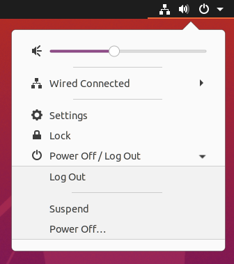
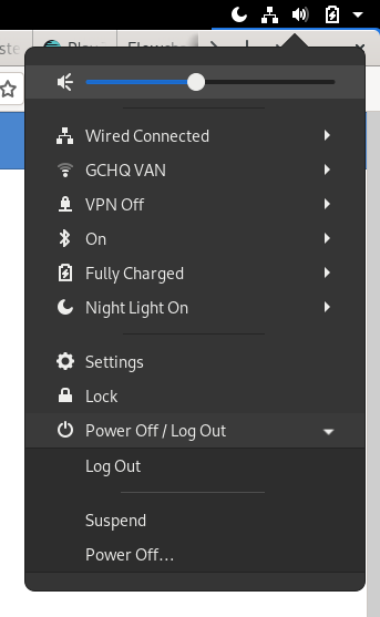
The reason it feels like a chore to power off your Linux machine is pretty simple, and it’s something that’s never been addressed in all of the iterations it’s gone through. Nor have I seen it brought up here (though, if someone did and I missed it, then I apologize.) The real issue is: The GNOME Shell user menu is upside-down.

It’s a chore to access Power Off in GNOME Shell because:

  1. That selection is inside a submenu,
  2. The submenu is at the bottom of a menu that opens from the TOP,
  3. The menu area above that submenu is dynamic content that’s constantly in flux, meaning the specific item you want is constantly moving up and down and you can never predict exactly where it’s going to be on the screen when you want to click it.

In Windows, you’ll note, the Shutdown / Power button / what-have-you is always near the bottom of a menu that opens from the bottom of the screen, meaning it’s placed (a) near the location of the first click, and (b) at a fixed distance from the location of the first click. You can develop muscle-memory for the Windows shutdown option, you can click it practically without thinking about it. You can’t do that with the GNOME Shell user menu’s session options; never have been able to, in any of their iterations.

You could disagree with this by pointing out that Apple ostensibly made the same “mistake” with the shutdown/logoff options for macOS. It’s true that on the face of it, the Apple menu suffers from the same issues, so how can they really be problems if Apple uses the same sort of design?

In response I would point out that this is a case where small differences make all the difference. (Though, in part I think it also speaks to how much Apple really expect users to use the Apple menu options for shutting down their Macs, when they go to great lengths to provide multiple more-accessible methods.) That aside, the key small differences between the GNOME Shell user menu and the Apple menu are:

  1. The Apple menu’s contents aren’t actually very dynamic at all. All of the menu entries are fixed-height single lines of text, and any dynamic elements are relegated to submenus. Even the stuff down at the far bottom of the menu moves up or down only very infrequently. It changes from OS release to OS release, but only in small ways. “Runtime” changes, if there are any at all (are there, these days?) will be tied to certain specific contexts. So when you open the menu from the Finder, at least, you can be confident that it’s always the same height and everything is in the same place. There’s certainly nothing like the GNOME Shell user menu, which hosts a dynamic, ever-changing list of contents and those entries have embedded submenus. The user menu’s height isn’t even fixed for the duration of your interaction with it!

  2. Apple actually leverage that distance from the initial menu click, along with the design of the menu itself, as PROTECTION against accidental clicks. By placing the “destructive” options in a relatively-fixed position all the way at the bottom of the menu, they can be pretty sure that if you travel all the way down there to click on one of them, it wasn’t an accident.

  3. You’ll also notice that every single selection in the Apple menu either opens a submenu, or launches a popup that requires additional input. Because everything is placed in a flat list at the top level of the primary menu, in essentially fixed locations, it’s safe to make it all single-click access because — even in the very unlikely event someone clicks by accident — none of the choices there have immediate consequences, not even the “safe” ones. They all lead to some interaction that gives the user the chance to say, “Oops! That wasn’t what I wanted.”

    (And, really, it’s a sign of how considered their design process was, that Apple ­— the company infamous for requiring two secondary confirmations just to format a floppy disk — managed to come up with a design that let you terminate your session and even shut down the OS that requires only a single confirmation to protect against accidental clicks.)

    …But, I really do think it’s mostly just that they know most people will never use those menu selections.

Wait, are you actually citing the hypothetical lack of extensions to alter the shell from your preferred design, as an argument for why that design is superior? C’mon, now. If you’re not going to take this conversation seriously, what’s the point of having it?

In point of fact, when the Universal Access icon was a default part of the top bar in earlier GNOME Shell iterations, we got extensions like this one to hide that icon, and now there’s a switch at the top of the Universal Access panel in gnome-control-center that does the same thing.

Eliminating one extra click might help reduce the UI fatigue a tiny bit. There’d be some immediate gratification there. But deep down, perhaps subconsciously, I’d bet money that what really bothers you about the user menu shutdown/logoff process just isn’t as simple as 4 clicks vs. 3 clicks.

5 Likes

@FeRDNYC You make a good point about the Windows power off items being near the control that opens the menu. That makes more of a difference than I had realised. Windows has another advantage, shared by Mac I think, that if no apps are open it doesn’t need to show the confirmation, or it can close it itself if some apps were just a bit slow to shutdown. That wouldn’t be practical in GNOME because there isn’t enough integration to guarantee all apps can automatically close safely.

My opinion, considering everything we’ve discussed so far is that separating the power/log out menu from networking, audio etc would be the best alternative to the current design.

It’s 3 on Windows
2 on Android
3 on KDE
3 on XFCE from the Whisker menu and 2 from the built-in Action Buttons widget on the panel
4 on Gnome currently. Unprecedented and inconvenient.

Menu ⟶ Log Out ⟶ Shut Down ⟶ Okay

[N minimise-to-actually-see-desktop steps] Double Click Desktop ⟶ Program Manager ⟶ Switch To ⟶ File ⟶ Exit Windows ⟶ Okay

(really this is getting ridiculous now)

1 Like

Yes, I did read that.

Here’s how it looks on 1368x768 laptop with everything enabled.

I can’t see the problem here, everything fits. If user clicked this menu, it means he wanted it to be open and to take up space. If he clicks the other menu (e.g. WiFi), the Shutdown menu closes up as usual and there will be more space.
To be honest, I don’t understand why such rarely used functions as WiFi (which you set up once and use for months without touching it) and bluetooth (probably used even more rare) are accessible with 3 clicks while Shutdown which is used at least once every day, is hidden behind 4 clicks.

Also, you don’t need to criticize the extensions I provided the links for: they are just to show the demand for less clicks that appeared exactly after Gnome 3.36 introduction.

If I understand correctly, “easier to ask forgiveness than permission” means doing things faster with less confirmation. Then this is the opposite of what you’ve written.
Why do we need 2 sub-menus? Ok, you don’t want to make the first menu opened by default - fine. But then if the user actually opened it intentionally (with 2 clicks already), why make him click on the option of his choosing 2 times more? Because Mac has this last confirmation menu? But it also has 3 clicks in total.

I didn’t want to hurt anybody. The only reason I’m writing is because I love Gnome and want it to be better. If I didn’t, I would have just switched to the other DE without any feedback. But as for now, I still can’t see solid arguments in favor of 4 clicks.

I propose making the last confirmation menu optional and changeable. If not via the regular Settings than via Tweaks at least.