You’ve just been told your app icons look different because the distribution takes liberty and changes identity of apps with themes. If you dislike applications randomly changing identity without their maintainer’s knowledge, bring it up downstream.
2 Likes
My comment was directed towards Ubuntu UI designers not Gnome developers. I thought it was perfectly clear.
2 Likes
This is a GNOME forum though. We know. Unless the distributions get to know from their users, there is no hope of a change.
4 Likes
Couldn’t think of the name at the time but yes an extension: ‘Dash to Dock’. Gotta have a dock, ever since I used NeXT I can’t do without one. You know ‘old dawg and all …’ 
1 Like
I also think the current menu structure is not ideal. It’s true that Power off is rarely needed, but on a rolling distro like Arch or Debian testing/unstable I often want to reboot after an update, especially if the kernel has changed. At the moment, when I click on Power Off / Log Out the menu expands, adding:
Log Out
Suspend
Power Off…
then I have to click “Power Off…” to open a whole new dialog with buttons for Cancel, Restart and Power Off. Why not simply include Restart in the expanded menu?
1 Like
We’d want to keep the dialogue to confirm the shutdown/restart (remember it includes things like unsaved documents) so adding restart to the menu wouldn’t actually save you a click
Right. There’s an issue with associated merge request for that, but it doesn’t make a difference in terms of number of clicks.
An extra confirmation seems a bit tortuous when one has already had to click in three different places in sequence. Perhaps clicking “Power Off/Log Out” could go straight to the dialog instead of opening an expander first.
3 Likes
How do you log out, switch user or suspend then?
Add controls for those to the dialog. Although switch user and suspend don’t necessarily cause data loss, it’s still a good idea to save everything first, because the other user could shut down, or the PC could fail to resume from suspend.
1 Like
So we rename the menu item to “Power Off / Log Out / Suspend / Switch User”?
I would think if this were to be considered, the better approach would be to investigate alternative button UI/UX and present some options to the design team.
The original problem was the style of button just didn’t work with the number of available options. As a point of comparison, popup menus in GTK use a joined button style for these situations (eg. verb-icon).
I’m not suggesting that specifically (nor do I really care), but the only sane way to reduce the click-count is to remove the need for a submenu. Otherwise you’re just moving the clicks, not reducing them.
So we rename the menu item to “Power Off / Log Out / Suspend / Switch User”?
Why would the item have to list everything in the dialog box, when it doesn’t currently list everything in its expander? I suspect you’re playing reductio ad absurdum, but actually, renaming the item is a good idea. Call it something like “Leave Session”. I deliberately chose “leave” over “exit” because “leave” doesn’t sound so final; you might be coming back to it after suspending or switching user.
4 Likes
Removing the submenu was effectively what I just suggested, assuming you mean the items that appear under the expander.
I agree that this is already an issue with the expander. The difference is that you can reasonably expect that an expander will expand when activated, instead of executing an action that isn’t the one you intend.
To me that sounds like a synonym of “Log out”; certainly a lot less “final” than powerering off.
There’s a reason the current label is far from great, there’s not really a good term that sums up the contents (or at least the designer didn’t manage to come up with a better one).
In any case, I linked to a request to split up the dialog between “Power Off” and “Restart”. It is extremely unlikely that we will go in the opposite direction and double the actions in the dialog instead.
This seems to be what you were suggesting, but I seem to have missed where you changed your approach to:
My point was really to re-iterate how we got to where we are, and I’m viewing this discussion as “We created a new problem while solving the old one”.
So rather than trying to fix a fix, I’m suggesting re-visiting the original problem. To me, the commit title would read “Present the session options in an elegant and intuitive way”, not “Optimize the click-count in the user menu”.
At first I thought the main role of the dialog was to provide Restart as well as Power Off and would be redundant if the Restart action was provided earlier. But Zander Brown explained the need to keep the dialog:
So that made me think of an alternative.
OK, but I’m worried that we may never settle on an “ideal” solution and all small improvements get rejected and we’re stuck indefinitely with something that nobody really likes. Should we continue the discussion here, maybe changing the thread title, or start a new thread?
I’m not sure; I don’t think a new thread is really necessary. I think this will ultimately fall under the purview of the design team, so my approach would be to try to brainstorm with mockups. Pencil & paper is not frowned upon AFAIK, so it doesn’t have to be fancy.
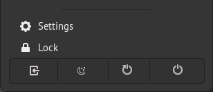
In the previous, overcrowded design the buttons were:
[Settings] [Lock] [Power (Secret Suspend)]
Whereas is it now:
[Settings]
[Lock]
[Power Off / Log Out]
  [Log Out]
  [Suspend]
  [Power Off]
If Settings & Lock are grouped separately (as menu items), then there’s already more room to deal with the power options. Treating the power options as distinct group might result in something more like this where the bottom item is a joined-button group:
[ Settings ]
[ Lock ]
( Log Out | Suspend | Power Off )
I’d be curious to hear the design team’s thoughts on why Suspend & Log Out are grouped together. One is session-lossy, the other is not. Suspend & Off are both power related, but again Suspend is not a session action.
I’d also be interested to know if the design team is opposed to buttons in the menu, or if the submenu just exists as a more flexible “button box”.
Windows and Mac OS both have these controls in their top-level menus. I think the reason GNOME designers didn’t want to do that is because the menu could get quite long by the time you’ve added a few connectivity-related items etc. It’s OK in Windows because the start menu is quite big anyway and has more than one column. In Mac OS the menu for exiting and settings is separate from the networking menu etc. GNOME could adopt either approach.
A multi-column menu is probably more “modern”, but might be harder to design, especially as its contents would be different depending on what features are available (Bluetooth, VPN etc).
Alternatively each of the icons on the top-right could have its own menu. Then the Settings gear icon should be moved into the bar, but the extra space could be compensated by removing the triangle from the power icon. But the power icon doesn’t convey very well that it can also be used for lock or log out. How about replacing it with a representation of a door?
I’m not sure I’d like that; the simplicity of the single-point entry for this is pretty nice. You also end up with a number of one item drop downs, or oddly grouped icons with category menus.
I was really just thinking of re-approaching the “crowded buttons” problem with something like this:
That’s obviously a crude mockup, I just think there are more options for tappable and nicely distributed button that aren’t giant circles with padding in between each one. I can already see a number of way this could be cleaned up to look more at home, too (like not using an icon from breeze  ) .
) .
1 Like