I’m sorry if this is not the right place for this. If so, please let me know where I should post my request.
I’ve tried several desktop environments over the past decade and always come back to Gnome, which is my favourite. The only thing I’m missing is the possibility of setting a workspace grid, with both rows and columns (e.g. 3x3 or 2x5). I’ve used extensions like Workspace Grid and Workspace Matrix in the past to do this, but since Gnome 40 some of their key functions have been broken, like drag-and-drop-apps and click-on-desktop in the workspace overview. I’ve made a humble donation to the developer of Workspace Matrix to support the amazing work he has done so far in maintaining the extension all the way to Gnome 46.
However, I believe that this should be part of the core Gnome options. I know some people preferred the previous vertical workspace layout, and many others prefer the current one. One way of keeping everyone happy would be to let them configure whether they prefer a vertical, horizontal or grid layout in the system settings. Would it be too onerous to implement this feature? Has it been proposed before?
At the time the Shell had vertical workspaces and an activities button on the panel. Currently the Shell has horizontal workspaces and the activities button has been replaced by a dynamic workspace indicator. The workspace indicator on the panel, the workspace thumbnails in the activities overview and the workspace previews in the app grid all use a horizontal layout. How would arbitrary sized grids look and work in a consistent way for these 3? I think it can’t work without breaking the current design.
Thanks, @jakedane! Yes, I think that’s the same proposal.
Both the activities overview and the workspace previews in the app grid work just fine with the extensions. I don’t think the dynamic workspace indicator could be set vertically or to a grid. I simply disable it right now.
It seems it won’t happen due to the default keybindings:
We now use a spatial model where horizontal shortcuts/gestures (super+alt+left/right, 3-finger swipe) navigate between workspaces, and vertical shortcuts/gestures shift between session ↔ window picker ↔ app grid. That is, we already use both axis for navigation, which is incompatible with a grid workspace layout.
I don’t understand why a different keybinding cannot be set for “session ↔ window picker ↔ app grid” to implement this feature. I personally use a hot corner for window picker and the Super key for the app menu.
It is more due to the spatial model with gestures, rather than only keybindings.
I think you should explain what are the benefits of a workspace grid over horizontal workspaces. That will not change the current design, but that would help to better understand what you want (at least if it is not only a visual preference).
Basically for the same reasons pointed out years ago by other users in Workspaces in grid (#1560) on Gitlab. In a nutshell, it is way more efficient and user-friendly when you use several workspaces (I’d dare say more than 3).
Fewer steps: Compare a 3x3 grid with a 9 linear layout (vertical or horizontal). If you wrap your workspaces, with the grid you are within 2 strokes from the furthest workspace (say, Down then Right) compared to up to 4 in a linear layout (from workspace 2 to 6 or 7). If they are not wrapped, the difference is between 4 and 8 from the furthest workspace. For the same reason, it is also faster to move apps from one workspace to another using keyboard shortcuts in a grid than through the activities overview.
Mnemonics: It’s much easier to remember where you and your apps are. Compare “I am in the Centre and Thunderbird is in the Upper Left corner” with “I am in Workspace 2 and Thunderbird is in Workspace 7”.
When designers uploaded mockups on tiling and window grouping to form workspaces (see mobile-shell/tiling · master · Teams / Design / os-mockups · GitLab) - where 1 window or group of windows = 1 workspace (this is what I understood about these mockups overall), I had the idea of keeping the window overview but to have previews of the windows displayed like a grid. Overall, this would show the workspaces (window groups) in the window overview. However, the problems are:
How can users still recognize which window corresponds to which window in window groups, especially when there are multiple windows of the same app.
How to switch between windows of a group when there are really many windows. Maybe switch of group then switch between windows with e.g. Alt-Tab? But an easy switching method is needed for mouse users…
I’m not quite sure I understood your proposal. “Keeping the window overview but to have previews of the windows displayed like a grid” means displaying all windows separately in a grid (i.e. not grouped in workspaces) in the Overview?
From what I can see in the mockups, it seems that the aim is to make Gnome work in a similar way both in desktop and touch devices like phones and tablets. The use of navigation axes makes a lot of sense for the latter (it’s actually similar to Android, which works great for that purpose). Workspace grids show their full potential with a keyboard and the simultaneous deployment of several apps simultaneously.
I have never looked at how to adequately move windows between workspaces in such a design (e.g., move a group of windows to another group or another window, move a window from one group to another).
This must indeed be taken into account, especially since in the case of a desktop computer we can have a group consisting of more than 3 tiled windows (previews must be kept at a reasonable size for touch devices). And we can also wonder how to represent these groups of more than 3 windows…
Maybe actual workspaces (groups of windows as well as empty virtual desktops) and individual windows could be displayed in different parts of the Overview? For instance, windows in a grid below or above the current single row of workspaces. That way you could drag and drop windows (a) from one workspace to another and (b) from the individual window grid to any workspace, regardless of where it actually is right now (which the user might not know or be able to see in cluttered workspaces —as you point out—, making the feature pretty useful). Perhaps you could also toggle this feature on and off in Settings: ticking or unticking “Show individual windows alongside workspaces in the Overview”.
If I understand it correctly, this approach doesn’t actually solve my current problem. I want to switch (and move windows) between workspaces more quickly using my keyboard (pressing Ctrl+Alt+Down once or twice as opposed to pressing Ctrl+Alt+Right three or six times to get to the 4th and 7th workspace respectively). Ideally, I wouldn’t like to use the Overview at all, except for rearranging the few windows I’m not quite sure where to find. It adds additional steps (key strokes, clicks, dragging and dropping, etc.), as well as requiring to change my focus from my actual work to the Overview and back again. I also want to be able to remember more intuitively and quickly where I and my apps are, without having to launch the Overview to figure that out (as I currently have to).
That’s not really what I tought of, but that would be a first step. However, if we still have a row of workspace, then we cannot move windows directly between workspaces like they were organized in a grid - the visual must match the other behaviors for consistency.
Currently, what I described is a solution that stays compatible with what the design team is doing. However, this need investigation.
Within such design, we still need gestures to show:
Workspace Overview (replacing the Window Overview). This need a new gesture as sliding up and down with 3 fingers will switch workspaces in this design.
Window Switcher. To show a window switcher to switch between windows in the current workspace.
I currently use the hot corner for the Overview and the Super key for the App Grid. Just like the three-finger gesture, the hot corner could perhaps also cycle between the current workspace, the Overview and the App Grid.
Using hot corner(s) is a thing. Gestures are different as theiy can be triggered from anywhere on the screen. We can possibly use 3-finger gesture to switch between workspaces, and 4-finger gesture for the other things (but we need how to arrange the Window Switcher/Workspaces, and the App Grid). Sadly, I am currently working on other designs. I just keep this one in mind.
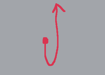
I don’t really know much about thouchpad gestures, as I use a mouse even with my laptop. Is there a gesture that scrolls halfway down and then all the way up? Something like a tick.
Thanks for your time and good luck in all your projects, @Mikenux!
Thanks! Note that I can, even vaguely, discuss this subject
Overall, on touchpads, gestures can be triggered anywhere from the desktop. So they can’t conflict with gestures in app windows.
As for the gesture you showed, it seems to me that it would work better with moving a window (going down, then going in the wanted direction) rather than with view switching. But there is indeed the width with which you make a gesture (i.e. a large or slight gesture), and also the speed with which we do it.