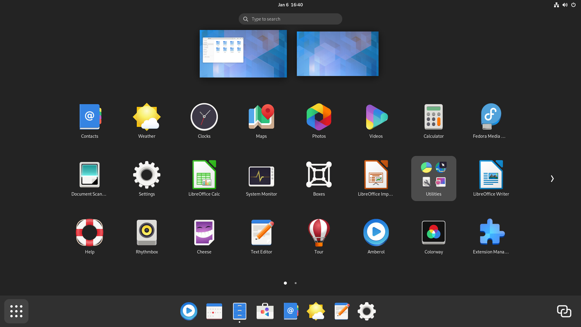
Continuing mockups with two panels. Perhaps the idea of replacing the dock as on macOS with the panel like in old versions of GNOME is strange, the panel at the bottom looks distracting, and it probably depends on the styling, with blur and transparency there is will not such a strong sense of compression or claustrophobia.
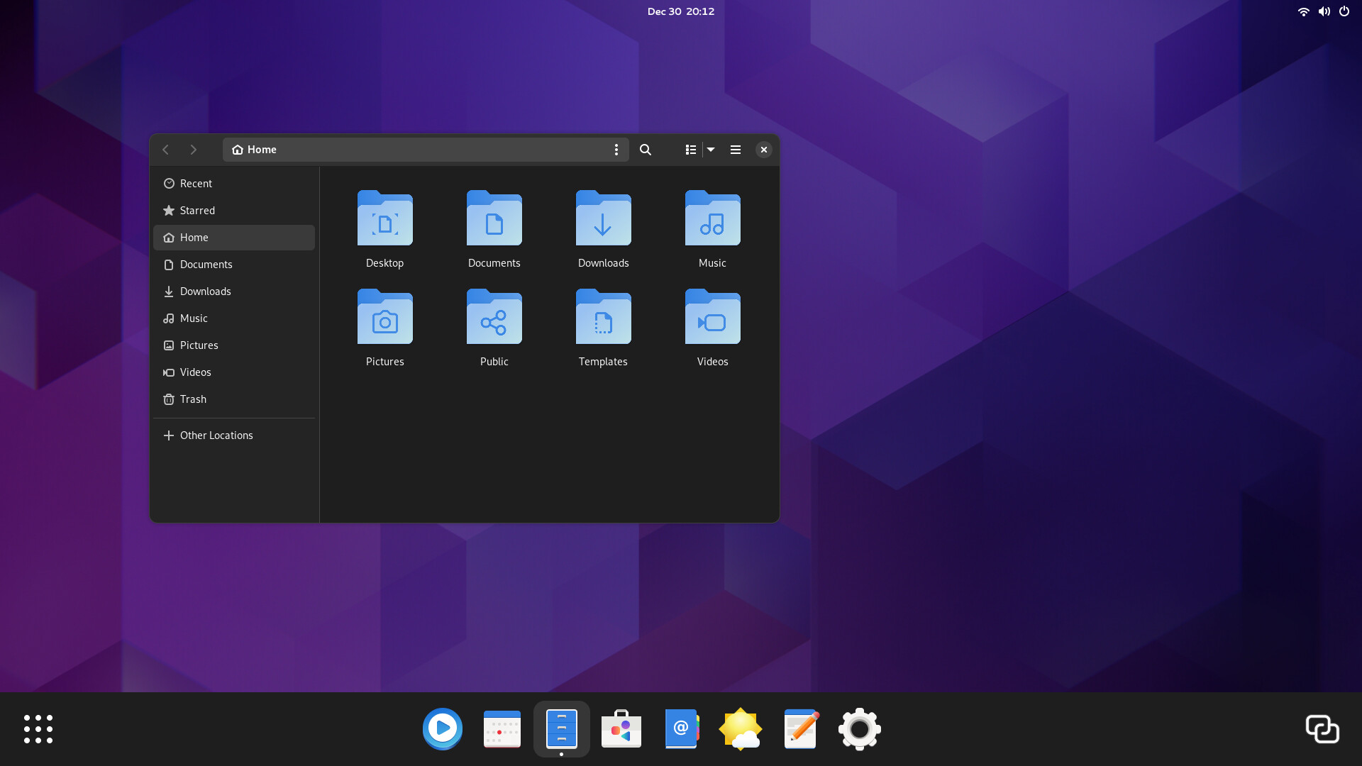
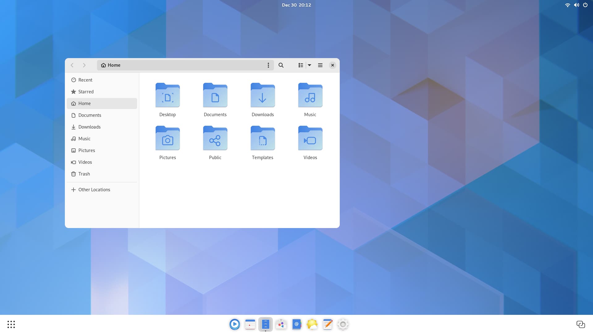
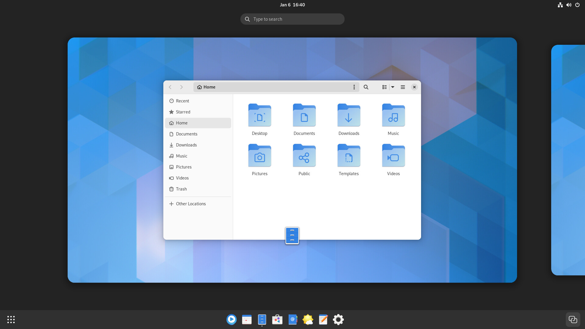
Here’s an example of a light and dark style.
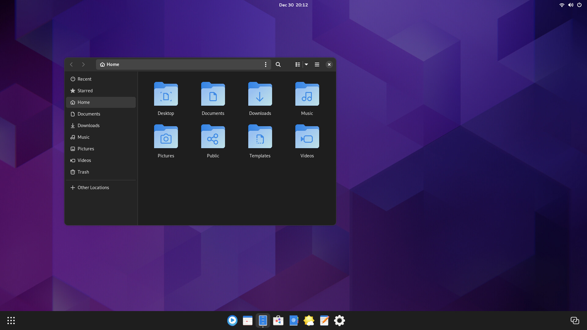
The location of the app menu and activities buttons on the sides can be awkward, but it feels more balanced, plus, in GNOME 2 workspaces were placed on the right, so it logic thing.
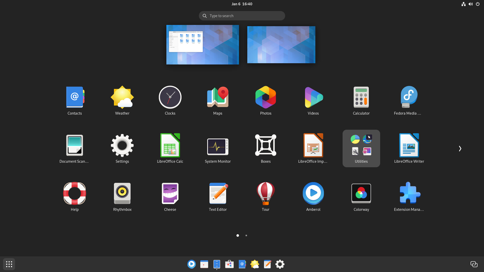
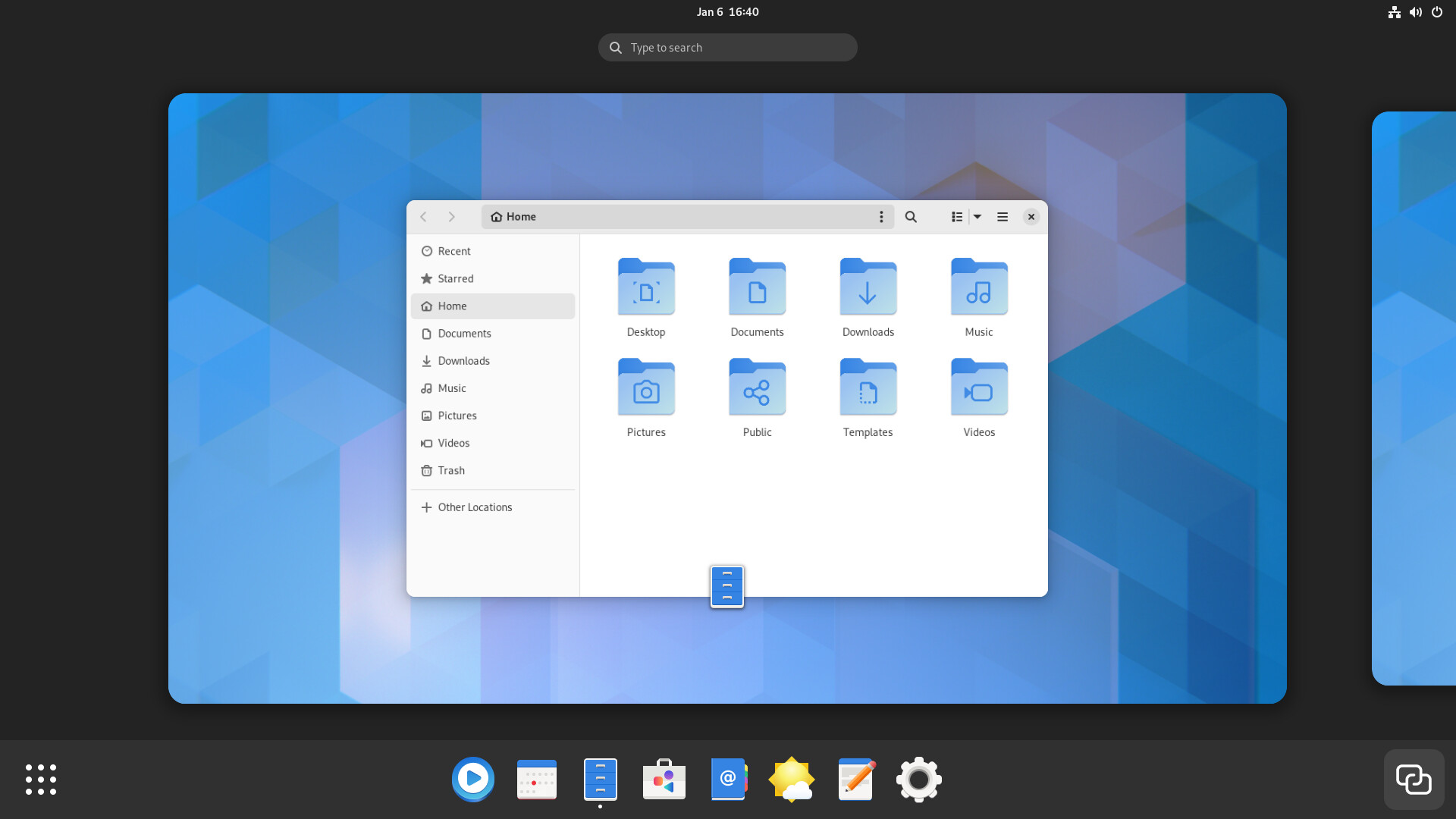
This is the tablet mode, where the bottom panel is larger.