I recently landed a UI refresh for Déjà Dup, and I thought it’d be fun to break it down the changes here.
(Note that you can play with these changes yourself in the nightly build.)
OK on to the changes!
Restore Navigation
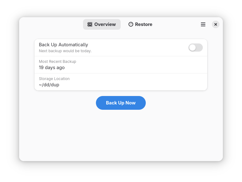
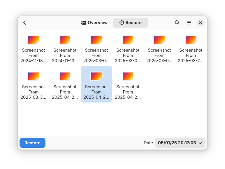
Old UI
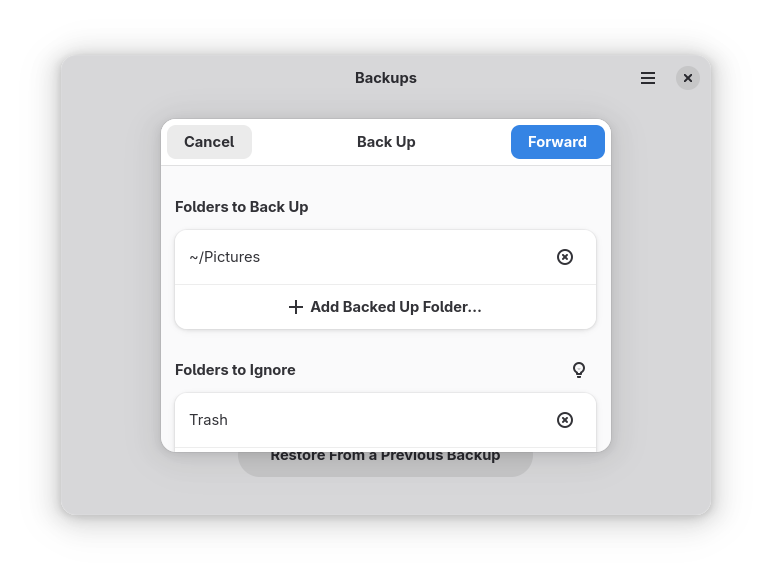
The previous UI used a tabbed interface. The main tab was a general “Overview” tab with a Back Up Now button. The other tab was a “Restore” tab with a file browser, restore button, and a date picker.
There are two improvements I wanted to make:
- Make the connection between the restore view and the backup itself more obvious. Tabs work best with views that are conceptually distinct. Otherwise it’s not as obvious what options you’re missing in one tab from the other.
- Clear the way for a future where we out-source the file browsing to the file manager itself. In the future, we might mount the backup with
restic mountand then just open the user’s file manger on that directly.
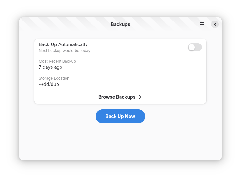
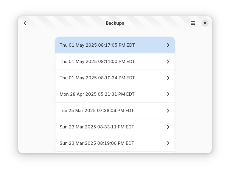
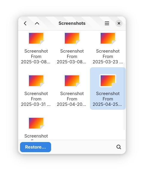
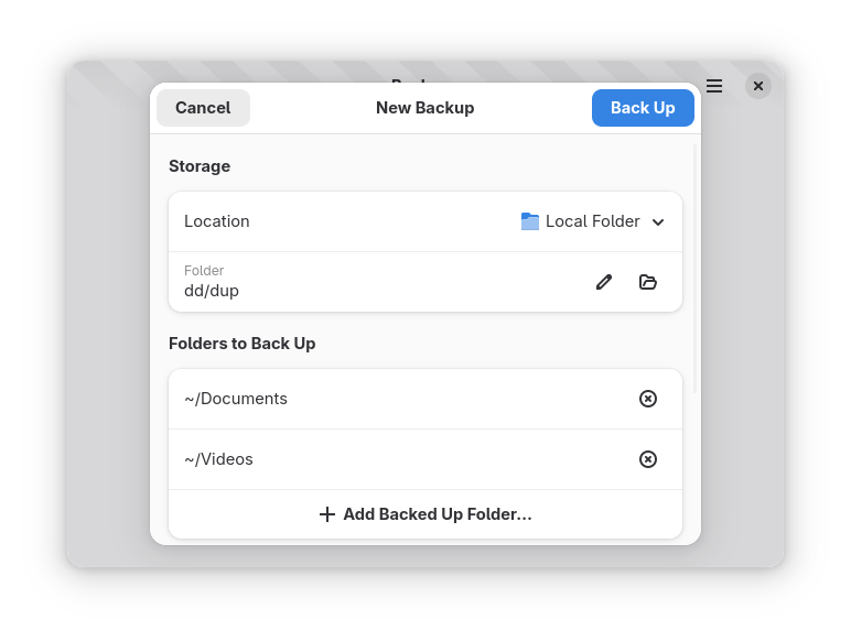
New UI
So now we use a series of navigation views that let you drill down into the backup, choose a date, then browse the files.
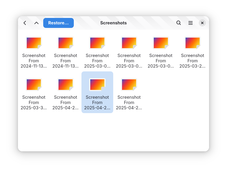
Later, when we add the mount support, we can just chop off this last screen and launch the file manager instead. Plus, if we ever add multiple backup profiles, you could drill down into each profile, whereas a tabbed interface would struggle with that.
You’ll notice that there are now more controls in the header bar during file browsing. When the screen is narrow, some of those controls move to a bottom bar:
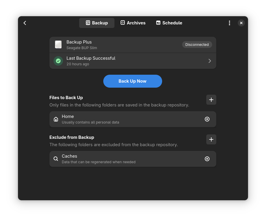
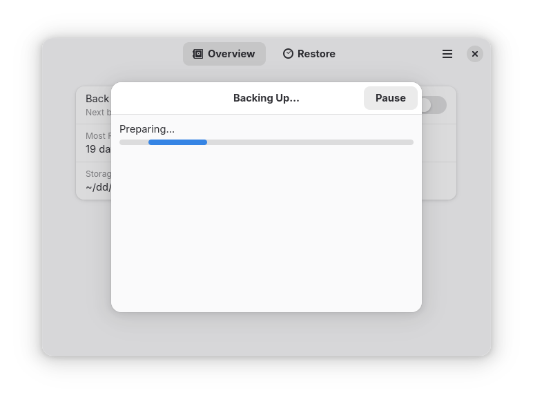
No Progress Dialogs
The GNOME HIG recommends against progress dialogs:
In general, progress windows are not recommended, since the consequence of closing the window can be unclear and they can obscure useful controls and content.
And it’s true! During a backup, you can’t close or minimize the main window, which is annoying.
Old UI
The current backup and restore flows are very progress-dialog-oriented.
There’s not much information we show here anyway, when we aren’t asking questions of the user (like for the password). It doesn’t need to be so in-your-face during the actual progress part.
New UI
We’ve now switched to banners, to indicate an ongoing operation. And throwing up an alert dialog when we need to prompt the user.
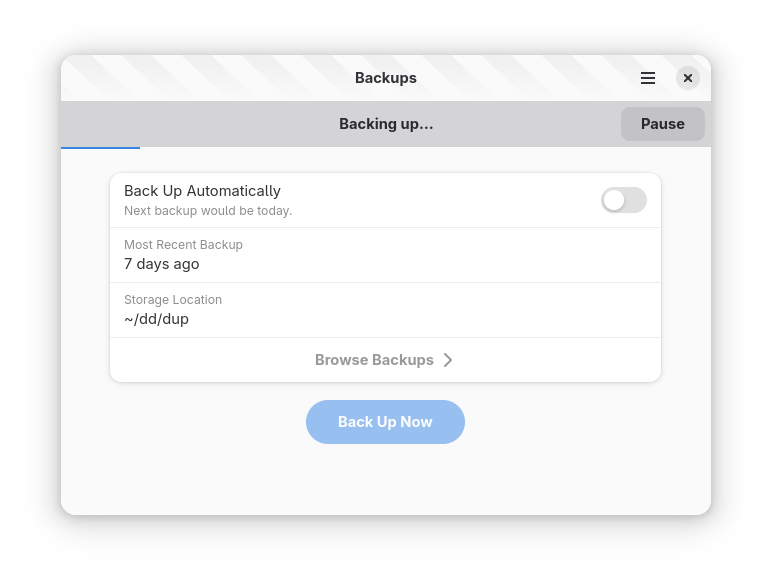
Now you can minimize or close the window (and the operation will continue in the background).
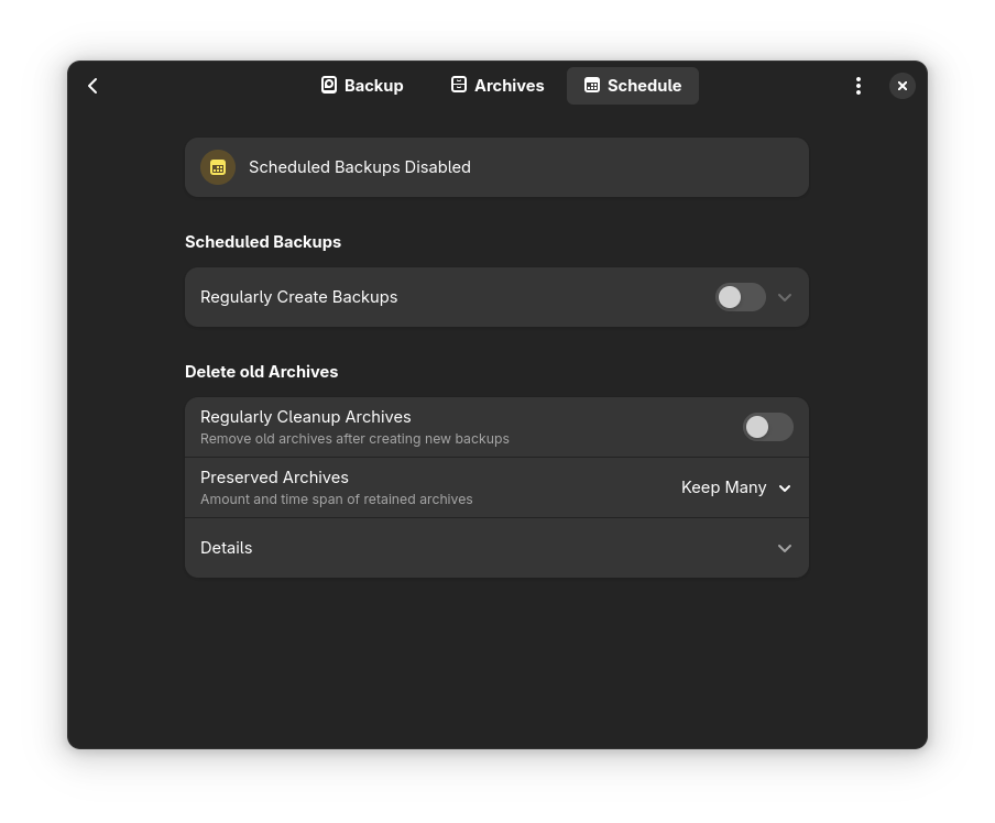
Action Dialogs
Déjà Dup was a little lax previously about indicating whether an action would happen immediately, or throw up a dialog (or Action Dialog, per the HIG).
Old UI
New UI
We’re now a bit better about marking buttons that throw up an action dialog with an ellipsis so you know there’s a chance for more information, and the action dialog is only one page long, not a multi-page-wizard like we used before.
Bonus Changes
In addition to the above UI changes, I’ve also enabled Restic by default for all builds. (Previously it was only enabled by default in flatpak builds.)
This is all coming in release 49.0, later this year. I’m hoping to squeeze in the aforementioned restic mount support too, but we’ll see how that shakes out.