Window Focus: Call for Testing

The design team has been discussing alternatives to the app menu for indicating window focus in GNOME Shell, and we are seeking feedback on a prototype of the proposed new behavior.

The Why

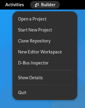
Back in 2018, we removed the unique menu items from the app menu. However, we kept the menu itself, so that it could be used as a window focus indicator, and so it can show a loading spinner for apps that are slow to show a window.

However, when doing user research over the past few years, we’ve noticed that people are often confused by the app menu in the top bar. Often, they think that it’s a task switcher, a shortcut to a specific app, or don’t understand what it is at all. It seems to be a trip hazard for new users.

Additionally, we’ve realized that the app menu doesn’t work very well as a window focus indicator. It doesn’t differentiate multiple windows of the same app, it’s only present on the primary monitor, and it’s sometimes located a long way from the window that it’s indicating.

We’re therefore investigating an alternative design for indicating window focus, which would both improve the focus indicator experience, and potentially enable us to stop showing the app menu in the top bar. The new design adds a subtle scale effect to newly focused windows when switching workspaces, super+tabbing, or closing a window.

For the loading spinner, we are still exploring alternatives, but feel that this is a relatively easy design problem to solve. Showing a spinner in the top bar is one obvious option.

Call for Testing

Thanks to @Leleat we have a prototype of the new focus indicator behaviour, in the form of a GNOME Shell extension. We’re looking for people to test this extension and give feedback about whether it works for them as a replacement for the app menu as a focus indicator. If you never use the app menu it’d be still be helpful for you to test it, to know whether you notice it being gone.

To participate, install this extension: Focus Indicator - GNOME Shell Extensions

Feedback can be provided as comments here or on Matrix in #gnome-design.

Edit:
As additional context, some constraints and things we already tried for this:

  • We can’t change the window content or appearance to indicate focus, because that needs collaboration from toolkits. GTK apps have always had a distinct backdrop style, but other toolkits don’t, and this needs to work for everything.
  • We can’t do borders on windows for technical reasons (windows draw their own shadows and we don’t know the border radius)
  • Toning down unfocused windows doesn’t work, it interferes with legibility
  • We can’t rely on window shadows, because they’re rendered by apps, and some toolkits don’t draw shadows (Global window shadows (#1517) · Issues · GNOME / mutter · GitLab)
18 Likes

I’ve tested it on a desktop PC with single 24" display. It don’t think this would work for me as-is. I appreciate the work to have a prototype for the new design!

Pulse effect doesn’t happen with all ways to switch workspace

Is this by design, or a limitation of the extension, but for me the pulse effect only happens when using Ctrl+Alt+Left/Right to switch workspace while not in activities overview or using Super+Tab and selecting an app open on another workspace.

The pulse effect doesn’t happen for me when I for example:

  1. Open activities overview with Super or by flinging the mouse cursor to top right corner
  2. Switch to another workspace with Ctrl+Alt+Left/Right or by scrolling the mouse wheel
  3. a. Close activities overview with Super/Escape or clicking an area outside the open windows
    b. Close activities overview by selecting a window with Enter or clicking on it

I almost always use the “fling mouse cursor → scroll wheel → click a window or press Escape” to switch workspace. There’s no feedback about the focused app after closing activities overview, no pulse effect to show where the window is on the screen.

No focus indicator for switching windows within the same workspace

When I have multiple unmaximized windows open on a workspace — I typically have 6-8 apps open on the 1st workspace (3-4 apps on other workspaces) — and I’m switching between them a lot (from web browser to spreadsheet, to file manager, to image or document viewer, back to spreadsheet, back to web browser, on to calculator, on to text editor, then back to web browser and so on describes my past 2 months) it happens that I get lost which window I’m in. More so because I often use “Always on Top” on one of the windows. The slightly faded header bars of unfocused windows aren’t always enough of a visual cue for me

With the current design I can glance at the top left corner to confirm which app I’m in. The new design would remove that and I think I’d miss it.

3 Likes

Thank you for involving everyone in the design process.

After testing the extension I found the below points:

  1. Removing the app menu from the top bar is a good idea, because as you mentioned I have also never understood the use for it and its purpose in unclear.
  2. If we want to show window focus then the scale effect is good, but this works only during the focus transition. Once the transition animation is complete there is no visual cue as to which window is in focus.
  3. May be one solution will be to increase the color contrast between active and inactive windows. This way with a single look a user will be able to know which window is in focus.

Hope this helps. :slight_smile:

3 Likes

To add an observation, the menu is also used to show desktop actions. These are unique actions defined in the app’s desktop file.

For example the top 5 actions below are defined in Builder’s desktop file. Just a random example; I spot thirty odd apps on my system with desktop actions.

Screenshot from 2023-01-04 21-57-22

The desktop actions are also shown in an app’s context menu on the dash and in the app grid, so they remain available, but that’s more steps to get to them (open activities overview/app grid first) and may be less discoverable (because in context menu).

13 Likes

In a multi-monitor use-case where only the primary monitor is displaying the top bar and the app is running on another monitor, the desktop actions that are currently available in the top bar are very hard to reach and are thus pretty much useless. Also in case of a single monitor, when the actions are already available in the app’s context menu then displaying them again in the top bar is simply a duplication, I am not sure how useful it is.

when the actions are already available in the app’s context menu then displaying them again in the top bar is simply a duplication

As I wrote, the app’s context menu may be less discoverable and anyway having to go through activities overview/app grid is not making them easier to reach for apps on the primary/a single monitor.

I am not sure how useful it is

I’m not sure either. I’m only observing there are unique actions in the app menu for many apps, and that use for it was not mentioned in the opening post.

4 Likes

I almost always forget those actions are there, actually. This might be a good reason to find a better way to expose those.

1 Like

Thank you for making this experiment.

I have been using the extension on a dual monitor setup (one 25" 2560×1440 and another 19" 1280×1024), I never used the app menu as a focus indicator (and not even as an app menu). I use workspaces heavily, with around 3-4 windows per workspace. I move around the desktop with a mouse.

I found the effect most useful when the newly-focused app is on another monitor, the movement attracts your eyes to the right place. I never use super-tab, but tried it, and the effect is also helpful, especially when moving to another workspace with a lot of windows. The effect doesn’t work when switching workspaces by going to the overview, but I usually I click on the window I want the focus on. It might help to also have it when closing the overview without a window selected. It also doesn’t work on maximized windows, so when you have a maximized window on a monitor and close a window on another one, you won’t know the focus moved to the maximized one.

However, it is distracting when you’re reading content in a background window, and close the window above, as the content will be moving around. It happened several times to me when developing an app, which involves frequently closing the app while reading reference documentation. Granted, this is not something a lot of users will do, but something to keep in mind.

To be honest, while it’s useful for giving an indication of the new focus when switching contexts, it doesn’t help when you leave your computer and get back to it later. For that, I still rely on the visual cues I’m currently using: top-most window with strong shadows and not faded headerbar, and a click in a non-interactive part of the window to be sure.

2 Likes

I’ve tested it on my laptop PC, which has a 13.3" FHD display. Earlier I tested it on my desktop PC and as noted above that did not yet work well for me because the pulse effect doesn’t happen with all ways to switch workspace and not having the focus indicator makes it harder for me to find the active window when staying on the same workspace.

It’s a much better experience for me on the laptop. For one primary reason: that I’m using the laptop on my lap so without a mouse :slight_smile: I’m switching workspace with touch pad gestures and the pulse effect is reliable with that. And I use the laptop for much lighter workloads, so don’t have as many apps running.

But what Romain described above at the end does happen for me also. Because I use the laptop mostly while doing something else at the same time (having a meeting, watching something on another screen) I frequently get back to the laptop and the screen is dimmed—then finding the app that has focus again is now harder because there is no focus indicator. So I resort to the same “better click the window again to make sure it has focus” method.

I also note that on this smaller screen the pulse effect is very hard to notice for smaller windows unless I’m already looking at the right area of the screen. In the app settings I changed “Scale To” from 101% to 103% and that works better. Also on the desktop PC after trying it out there. I think 102% might be the sweet spot but it doesn’t let me set that value.

I noticed now that when closing a window the pulse effect also happens on the next window that gets focus. Maybe the pulse effect for that could be toned down a bit somehow? I don’t think I need as much help when closing a window to find the next window that has focus (and it may likely not be the window I want). Windows aren’t flying across the screen as happens with workspace switching.

I also changed the Scale Down Animation Duration from 150ms to 100ms which I think is a bit nicer.

3 Likes

I agree wit the drawbacks Romain mentioned. The current implementation has also some technical issues

  • the animated window clone shows up above everything on the screen, which is really annoying if you have any overlay object on the screen, like dock for example.
  • if always on top window doesn’t have focus, the focused window is animated, but then the always on top window gets the focus.
2 Likes

You can enter it with the keyboard :wink:

1 Like

Doh! Okay, changed it to 102% and I will leave the extension on over the weekend to see how this goes.

I like the idea, and it looks nice on Alt + Tab. But when switching workspaces, it throws me off instead.

I believe this is because the new animation feels like a natural inertia after a window quickly pops up.
And in the case of workspaces, it looks silly because:

  1. Animation starts after the switching animation is fully over, and that feels like it’s way too late.
  2. It has no natural reason to jump.

Maybe it could jump sideways in the case of workspace switching, so it feels like an inertia.

In general I really like the idea. Although it won’t help to focus without interaction, it became clear to me how awfully boring my desktop is without fun little animations.

6 Likes

I have the same exact feedback as when I first saw the extension. I have an ultra-wide screen, half-tile everything and use alt-tab for switching between windows. Every single time I do that that window jumps. And every single time the text in that window becomes blurry for a moment, so it’s like my eyes go out of focus. This is honestly headache-inducing.

7 Likes

I kept the extension on for a few hours while continuing to work. Usually its visually pleasing but sometimes it just throws me off for a second or two.

My workflow:
I have either one or two vscode window open in different workspaces, firefox in third and terminal in forth that i frequently switch between. I also have discord and other chat apps open on fifth space that i sometimes switch to.

I frequently switch between firefox and vscode and sometimes to terminal space. I also have a second window for firefox or a chrome/edge window open on the same workspace as vscode.

The problem:
Switching between different workspace when the window jumps towards you, sometimes the animation throws me off for a couple seconds if i had just quickly switched to other space just to look at some reference.

Above changes improved the situation for me but the animation has some rough edges compared to defaults so the animation curves and timings need some fiddling with.

The behaviour is a little strange. Unless some more polish is done, I don’t think it should be a default of the Gnome DE, but at most stay as an extension.

What about using the same thing Gnome apps have when using the keyboard directional keys to navigate through the app UI elements, just like this image, but instead for the whole app window:

Screenshot from 2023-01-06 21-42-38

3 Likes

After a while of testing I have to say that I have troubles to see the active window if my desktop is in dark mode and the active window is on top of another dark application window or the dark background.
It’s also hard to see if the active window is very small

Hey!

As was already mentioned, while the tested extension tells me which non-maximized window is focused, there’s no way of telling without any interaction.

The animation only happens for non-maximized windows, which means 80-90% of my apps are not affected by it. An example of my setup is having a maximized chat app or a music client on one monitor and a browser/terminal/typing app maximized on the other screen.

I’m worried also about the fluency of the animation on low-spec devices. I’m running an okay-ish i5 dual core laptop which under a normal load is happy enough to run Shell between 40-60 FPS. If a device is under a lot of stress, the animation can get lost or become unpleasant to watch due to stuttering and jumps.

Thank you for working on this! There definitely is a better design than the current one and I very much appreciate you all trying to find it.

2 Likes

Hi, I tried out the extension on an ultrawide monitor and I find it overall good, but not enough.
For one, when I change workspace there are quite big movements because of the ultrawide and the animation is so subtle, that I can hardly see it. I played around with the settings and found that 102% works much better and solves this issue.
My other problem is what others also mentioned, that this only helps when you are interacting with the system, not if you are coming back from a break and just look at it.
So I think this is a great addition, but not enough and is only part of the solution.
I think that maybe in overview mode, it is easier to add a focus indicator to the focused window, as it is not currently ‘in use’, so that might help a bit, but then this is still a problem in desktop view.

Additionaly I never used the focus indicator in the top bar and never had “big problems” because of focus issues, so I am not sure how big of a problem this really is. Maybe this animation is enough after all? The only time I got frustrated due to focus before, was when I was closing apps with a keyboard shortcut and accidentaly closed an app I didn’t meant to close. But the animation already solves this, as the newly focused window gets elevated after I close the currently focused window.

Thank you everyone who is working on this problem!

1 Like

Thanks for proposing this experiment, and make it so easy to try! I really like that!

My impressions so far:

  • I agree that the app menus are useless, I never use the menu items (I expect important actions to be available from the app itself), and I never thought of seeing it as a focus indicator and don’t think I’ll ever see it like that; so I really like that app menus are gone for good with this extension!
  • I tested on on my TV (60", 1920x1080)
  • I agree that the zoom animation could be boosted to 102%
  • I also agree that the animation doesn’t work when switching workspaces, but changing the workspace switch delay to 250 ms really changed this feeling for the better

I will definitely install this extension on my main PC. Juste removing the app menus is a win IMHO.

1 Like