Why GNOME 3 user interface has no menus?

Hi,

If possible, I would like to know why GNOME 3 user interface has no menus.

Windows/Mac has menus and almost all applications in this world has menus.

I am using GNOME Flashback Metacity and I require only two clicks to start calculator app.

In GNOME 3 without menus, I need to click mouse 3 times and type around 3 letters (cal) (total 6 ops) to open the calculator app.

So, usage wise GNOME Flashback Metacity is more efficient than GNOME 3.

Besides, in GNOME Flashback Metacity, the top bar and the bottom bar are taking around 6% of screen space (I measured it with inch tape, my display is 15.6 inches) but that is not much of a problem.

So, not having menus is not saving a lot of screen space.

But anyways, I would just like to know what was the idea behind not having menus in GNOME 3 user interface.

Regards,
GE

One can install the "Apps Menu" shell extension (which is an inbuilt extension) from the Extensions app.

Well, first of all, Gnome does has menus. The quick settings menu is a menu for example, the primary menu of an app is an menu.

But let’s talk about the menus Gnome doesn’t has which I guess you mean with your comment: A start menu (like in windows) and the menu bars common in more classic application.

Please do note though that these are primarily my views, there may be other reasoning as well.

Let’s begin with the shell: Gnome tries to be as out-of-view as possible on normal use. Also, its concepts are also build with the use of workspaces as an important part of window management. Therefore, the activities view serves as the central point for managing your workflow and applications.
I consider it quite good to provide the options in a good context, so it can be better understood by the user.

That also brings me to the menu bars. Menu bars always show all options, no matter if they are currently useful or not.
Gnome apps try to be easy to use and understand. Therefore, it is a better practice to only show the options in the context where it matters.

So, in short: Gnome tries to guide users by providing options in a specific context so it can be easily understood, which is why it doesn’t use menu bars or menus in the main shell view.

1 Like

Starting a new application is more work without menus. I gave an example in my first post.

Why do we need technology - mainly to reduce manual work + machine/software should be easy to use.

We need both of these and in my opinion these are the fundamental pillars of technology.

tl;dr: menus are inherently hierarchical, and do not scale.

We used to have a menu in GNOME2; it was populated by the list of installed applications, and submenus were categories. The problem is that menus should not change their structure just because you installed an application with a name that sorts lexicographically earlier than one that already exists; this breaks any sort of spatial memory, the only thing that menus have got going for them. Additionally, menus should not have more than 10-15 items (the threshold for short term memory is 7±2 items), which breaks horribly when you start installing a lot of applications. Both these points lead to the creation of submenus through categories, to keep some sort of stable (or “stable-ish”) structure; the problem becomes categorisation of applications: application maintainers are responsible for putting their applications in a category, or in more than one—by way of an example: Evolution is a Mail application, a Calendar application, a Task management application, and a Productivity suite; does this mean that Evolution should appear in four different submenus? Another issue: if the categories are managed by applications, how are users supposed to structure their own categories and application launchers? Menus are also small and finicky to operate on devices with a touchscreen, like hybrid laptops.

In practice, user testing and studies have clarified that application launching works and scales best when you give users a re-orderable grid of applications, with the ability to create groupings by themselves. Finding things is done via searching, not browsing through convoluted and arbitrarily opaque hierarchies.

You can’t “have both” at a project level: you do have to choose. Considering the shortcomings of menus, the application grid and the search have yielded a much more positive result; they are familiar to people using computation devices that aren’t a personal computer from the late '90s.

On that we agree. Sadly, nostalgia isn’t always an indication of “ease of use”.

3 Likes

Well, I can only say that some people like menus and some don’t. I personally like menus.

I have read some articles on Internet where people have said that they don’t like GNOME 3. But, its all okay with me. Its a personal choice to like menus or not. I just wanted to know the reason and probably the main reason that I gathered from your answer is that menus get cluttered over time.

As for cluttering, all user installed programs that are not system programs (not provided by GNOME) can go in a single sub-menu of say “User Installed Programs”. May be the label text may change but I am just saying what I think about the solution to cluttering.

I don’t install too many programs, so I don’t have the cluttering problem.

In my desktop, Evolution appears in Office sub-menu and its fine with me.

Anyways, I just wanted to know the reason and I guess you gave the main reason (cluttering of menus over time).

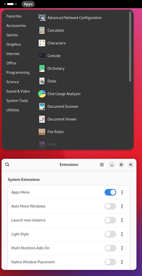
Another thing that I like about GNOME 2 is that I can pin my favorite programs on the top bar and then start them in one click.

I can achieve the same in GNOME 3 using extensions but I like having it by default as in GNOME 2.

I am just quoting the following from the Wikipedia page of GNOME 3:

Linus Torvalds, creator of the Linux kernel, publicly expressed his dislike of GNOME 3, and called the version 3.4 release a “total user experience design failure.”[20] He also described it as “one step forward, one step back”. Torvalds initially switched from using GNOME to Xfce, but then switched back in 2013, citing the use of GNOME Shell Extensions as a fix for shortcomings, and called it “more pleasant”.


Now, I am thinking that why did GNOME 3 provide extensions to make it more like GNOME 2? If GNOME 3 is better than GNOME 2 and majority of people like GNOME 3, then I don’t think there was any reason to provide extensions.


Not all extensions are written by GNOME developers; some of them are, like the ones that were used in the “GNOME Classic” session, which was provided as a bridge for long term support distributions, like RHEL, to gradually introduce their user base to a newer version of GNOME. The GNOME Classic session has been removed from core in this development cycle, which means GNOME 48 won’t include those extensions, even if downstream distributors may decide to keep them.

You also have to realise that GNOME 3.0 was released 14 years ago. Just like GNOME 2.0 and GNOME 2.32 (first and last releases of GNOME2) are fairly different from each other, GNOME 3.0 and GNOME 48 are fairly different from one another.

As a side note: please, don’t bring Linus into this. He is a kernel developer, and has no more authority about UI/UX of a desktop than any random web forum participant.

2 Likes