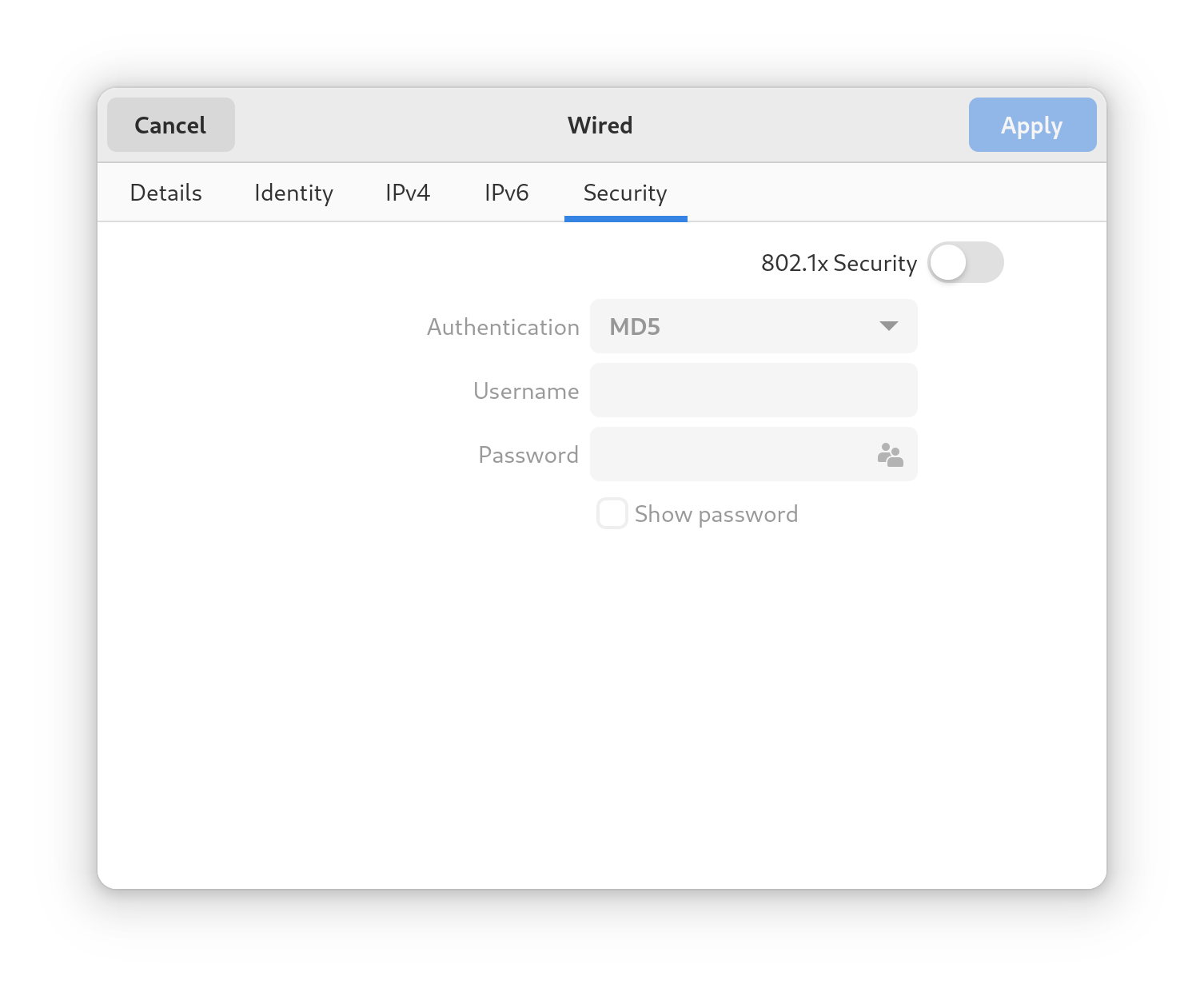
If you compare the styles of Settings and gt4-widget-factory, there are many changes on Settings that make it differ too much from any other modern GNOME applications using GTK4. Controls are bigger, inactive controls are more blurry, with a less visible border. All that is propagated to another system windows like the Open File dialog, that look as white as a piece of paper, with little contrast to say it some way.
Should not exist some consistency here?. Screenshots for comparison.
You are comparing the default GTK4 theme with the Adwaita theme, as provided by libadwaita. The Adwaita theme is the GNOME theme, and GNOME Settings is using libadwaita widgets and style, just like any other application targeting GNOME ought to.
So there are two themes now, one for plain GTK4 applications and other one targeting GNOME. So applcations that only target GTK4 (when updated) like Eclipse, Firefox, Thunderbird etc when updated to GTK4 their controls will look out of place with other GNOME applications, not nice. Even the simple File dialogs look different.
Tastes are subjective but the whiteness/lack of contrast of libadwaita used on Settings and the blurriness of inactive controls don’t look like an improvement to me.
If you wanted strong consistency in terms of styling, then you chose the wrong platform: the Linux desktop has no single UI toolkit, which means you can’t have “consistency”.
Those applications don’t use GTK, except for their own top level window, and they are already using their own look. It’s also exceedingly unlikely they will be ported to GTK4.
There is no “blurriness”: those are inactive controls, which are greyed out. The font rendering is different, so it won’t be as jagged as in the screenshot below; but it is consistent between libadwaita and GTK, since GTK is the component in charge of rendering the text.
In any case, looks are debatable. If you want more contrast, I strongly encourage you to enable high contrast support in the accessibility settings.
This is not a excuse for not trying to have some kind of consistency. Now applications using the same version of the same UI toolkit will have even system dialogs different, etc. It isn’t ideal
I am pretty sure they will at their own time. GTK3 will not be around forever like GTK2 never was. And all these applications upgraded.
It isn’t about text rendering, is that the components when disabled remove all their borders and now look like a controls that was blurred. Some user may even think they are always a non writable field, always a read only text.
I know it is difficult to change GNOME UI decisions, that I really don’t try, but just my opinion, more division even inside the applications using the same toolkit isn’t ideal.
The fact that libadwaita is based on GTK4 is immaterial: you already have applications that are using GTK3, Qt5, and whatever other toolkit already exists. Consider libadwaita a toolkit based on top of GTK, since it provides the components that allow app developers to write GNOME applications.
The important aspect is: GNOME applications use libadwaita. They are consistent within GNOME, as the GNOME human interface guidelines describe behaviour and appearances.
GTK2 is still around, even if it was frozen in 2011, and EOL’ed in 2020. GTK3 is likely going to stick around for another 10-15 years. In the meantime, we might very well get two more major releases of GTK.
A word of advice when dealing with UX and UI design: using generalisations isn’t going to make a case for you. Stick to what you thought, and what you experienced.
Don’t take the following as antagonism, more like a joke. I am pretty sure If I have said “I” someone would have said, You are the exception, this was designed for the common case. or something like that
In the end I wanted to express my disappointment with the UI differences, not expecting any change, just my two cents, as people say.
It doesn’t really matter: Eclipse, like Firefox, or Thunderbird, or LibreOffice, or Chrome, or whatever, is not a GNOME application. This means there’s no expectation that it should fit in with GNOME, not even today, just like there’s no expectation that it should fit in with KDE, or Xfce, or Cinnamon. Those applications have their own UX design and goals.