IMO Gnome Search should show all apps. Right now it only shows 6 (using 3.38, ignore this post if it has changed since).

There are a lot of other apps that contain the word “files” in their comment, and should be shown. Why is it restricted to 6 ?
IMO Gnome Search should show all apps. Right now it only shows 6 (using 3.38, ignore this post if it has changed since).
There are a lot of other apps that contain the word “files” in their comment, and should be shown. Why is it restricted to 6 ?
I don’t recall how it was for GNOME 3.38 though I guess the same as on GNOME 42 so when you search it shows:
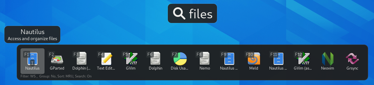
No search provider blocks show in your screenshot but for example if I search for “files” here I also get a block from Nautilus for matching directories and files (I have a few directories with “files” in their name), and a block from Software for matching apps I could install.
To narrow down on search results you can type more keywords.
one row of matching apps
(…)
To narrow down on search results you can type more keywords.
Yes, that’s what I’m talking about. IMO apps results shouldn’t be limited to 1 row.
To narrow it down you have to know the app’s exact name, which isn’t always the case.
In my example I think it would be better if it showed all apps related to the “files” keyword, and not just arbitrary limits the search result to 1 row.
[EDIT]
To narrow down on search results you can type more keywords.
Usually to narrow something down, you have to see that “something”. If the search result returned all the apps matching that keyword, then we could call that “narrowing it down”. But that’s not the case here. Basically what’s going on here is that the search result is incomplete.
It’s quite disturbing. If I search an app matching abc, I expect to get all the apps matching abc, not just an (arbitrary defined) subset.
IMO apps results shouldn’t be limited to 1 row.
What should the limit be then? 2 rows, 3 rows? What if there are more search result than fit on the screen? The search matches apps (and system actions like reboot) that have words starting with the term typed. For shorter or more generic terms that will be more than fits on the screen.
Perhaps, going by your screenshot, you don’t have a use for search providers results but putting more apps result rows on the screen would leave less (or no) room for search providers results and makes that much less useful.
I don’t know how search determines which results it show if there are more than fit. As far as I can tell it matches words from the Name, GenericName, Exec, Comment and Keywords keys in the desktop entry files (system actions are added separately). It might be interesting to have a look at that code and figure out how it works.
I mean why does it show these 6 apps in your screenshot—in that order—what gives them priority over your other apps that match ‘files’? Maybe something can be improved on that.
What should the limit be then? 2 rows, 3 rows?
I don’t know what to think. In a way you are right, showing all apps needs space. But on the other hand, if I search for “files” and get 6 results, I take that as “Hey, we found exactly 6 apps matching your search”, whereas in fact I now know that it says “Hey, here are 6 apps matching your search. There could perhaps be more, or perhaps not, we won’t help you with that, figure it out yourself”
As far as I can tell it matches words from the Name, GenericName, Exec, Comment and Keywords keys in the desktop entry files (system actions are added separately). It might be interesting to have a look at that code and figure out how it works.
Not really interesting in my case, where I want ALL apps related to the term “files”, be it their name, comment, keywords, …
I ended up installing an extension that does what I want :
But I still think that finding ALL apps related to a search term should IMO be natively implemented in Gnome’s app launcher, one way or another
Hello @chentao!
Could you give your use case for wanting all apps “related to the term “files”, be it their name, comment, keywords, …”? Mine is using it as a launcher.
The solution seems simple enough to me.
Not a lot of people need more than 1 row of apps to show up in search and the ones that do need more than 1 row, don’t need just 2, or 3 rows. They need all matching apps to show up.
So, why don’t we just add a subtle ‘More Apps’ button right below the 1st row which on clicking, would expand the number of rows to however much are needed to show all results.
Or keep one row but if there are more results let the user page through the results similar as how the app grid does it?
Could you give your use case
I had a specific use case where I was testing several file managers (Nautilus, Dolphin, Nemo). I was also doing some various other tests, like using a dark theme with Dolphin, and so on. Well, the bottom line is I had half a dozen desktop files for file managers, and was surprised to discover that not all showed up. Like I said, I always assumed the search results were exhaustive, it turns out I was wrong.
Another use case would be if you vaguely remember the description of an app.
I agree, these use cases are not too common, but still I think a way to find ALL apps matching a search term should be implemented. It can be confusing to get only a subset of the search result
This topic was automatically closed 30 days after the last reply. New replies are no longer allowed.