Accessibility in Fractal is not so great at the moment and I wanted to address it. I enabled the visual accessibility warnings in the GTK inspector and it painted the window red, giving me a good sense of things that need to be fixed
I had a quick look at Accessibility and the stuff linked from there, and it all seems to focus on the how, but I don’t see anything about the what. I.e. “you should put a label on stuff”, but no “a good label would be…”.
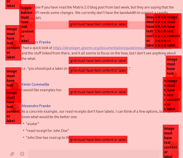
As a concrete example, our read receipts don’t have labels. I can think of a few options, but I don’t know what would be the better one:
“avatar”
“read receipt for John Doe”
“John Doe has read up to this”
something totally different?
If I missed the part where this is explained, a link would be appreciated.
Personally, I’d go for option #3, of course, with combined read receipts, of course, and with name shortening or something, you don’t want to hear all the names in bigger rooms, but you want a way how to see them, I don’t know, in a menu with times when they read the message, like Element does, for example.
Hello,
From an users point of view both element android and element web show read receipts as some tiny user pictures and a number for example three avatars and a text saing +3. It indicates six users in total have read up to that point on the timeline.
From an accessibility and usability point of view that control is an actionable button reachable from the keyboard with label similar to these variants depending on how many users have seen that message.
User 1 read
User 1 and user 2 read
User 1 User 2 and User 3 read
User 1, User 2 and 2 others read
User 1, User 2 and 3 others read
And so on, I believe you can understand now.
Counting users starts from the user who’s read marker is the most recent so as the visual appearance updates, the label should update with this too.
When this button is activated with the keyboard or clicked with the mouse or tapped on the touch screen list of individual read receipts is revealed. That list should include name of the person and the time when that user read up to the point. The list should be navigable with the keyboard, clicking or activating the entries should open the profile page of the user.
Perhaps Fractal’s UI does not 100% match this proposal as I haven’t used it for quite some time, but I believe you can understand from this that accessibility properties should complement the UX.
I see your message as a huge compliment to screen reader users. So I’ll try out Fractal again and revisit the issues I have filled.
Edit:
When creating labels try to avoid describing what the control is i.e. the control role such as button, list item and similar and what state the control is e.g. expanded, focused, selected and similar. Try to make it brief and explain what it does or what it describes. For example, user pictures are displayed all over the app and acting on them might do different things depending on the context. Clicking the own avatar might open a dialog where user can edit his profile details and clicking different user avatar might open his profile, mention the user and similar and if it matches the UX I’d label those avatars such as Edit my profile for the own avatar, %{displayname} profile, Mention %{display name} and similar.