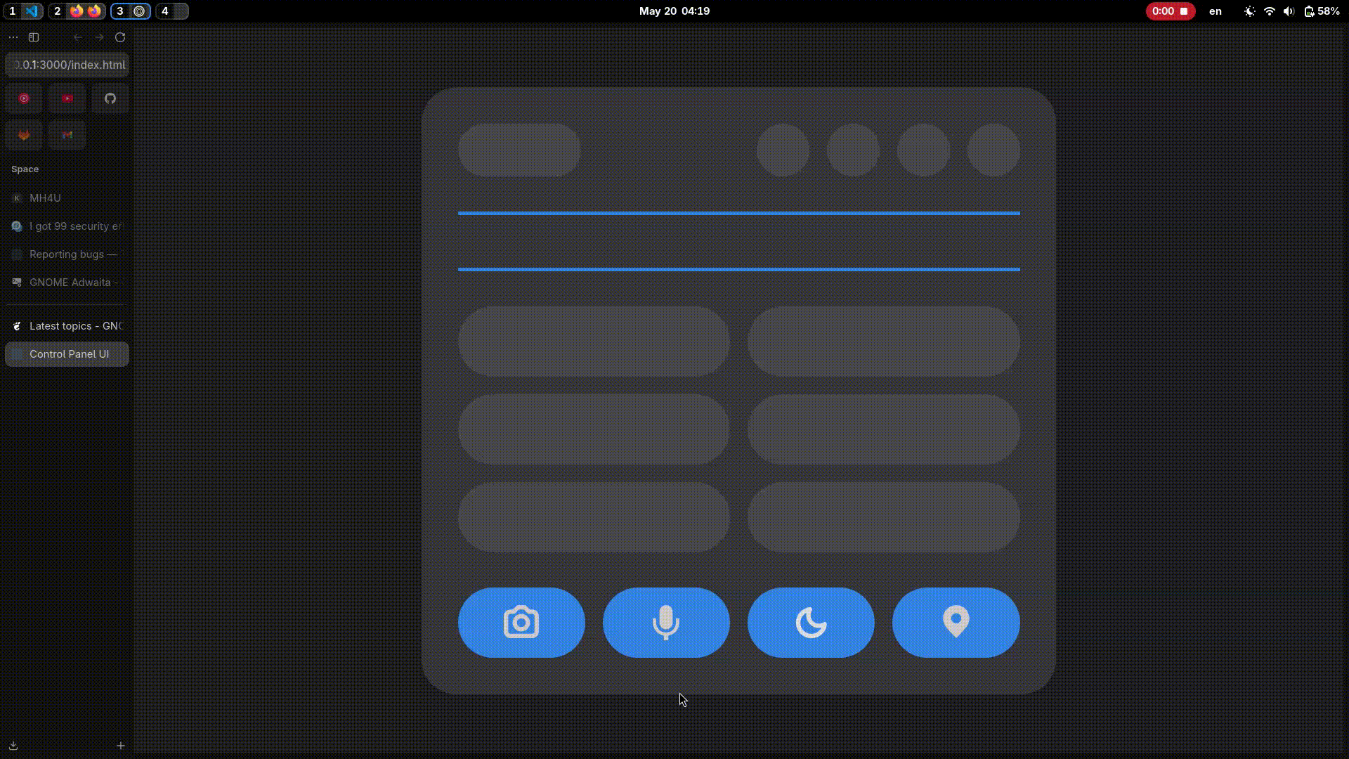
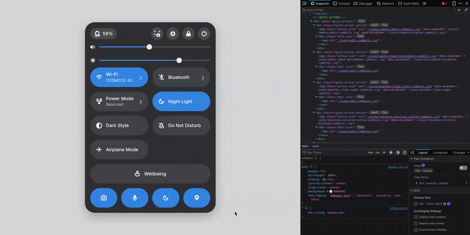
Hello! I made a simple HTML/CSS concept for quick system actions like turning the microphone, camera, Do Not Disturb, and location on and off.
The design is inspired by Material Design. It’s meant to improve accessibility by making these controls easy to find and use.
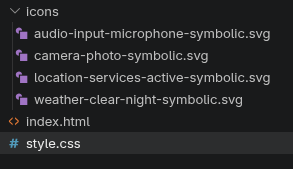
From what I understand, camera and location can only really be fully turned off in system settings, not through a custom toggle. The microphone can usually be muted when an app is using it, and sometimes also with keyboard shortcuts. I still added it for consistency in the layout.
Do Not Disturb could be shown in a simpler way instead of a full label, so the interface looks cleaner but still stays clear.
I also think this kind of layout could work well for something like GNOME Mobile simple controls are important on smaller screens.
I just had some free time while working on my website design projects, so I wanted to see what you all think.
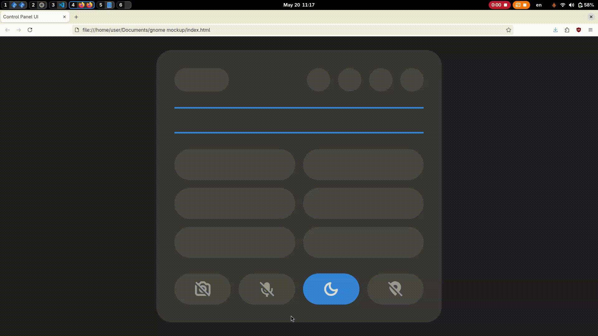
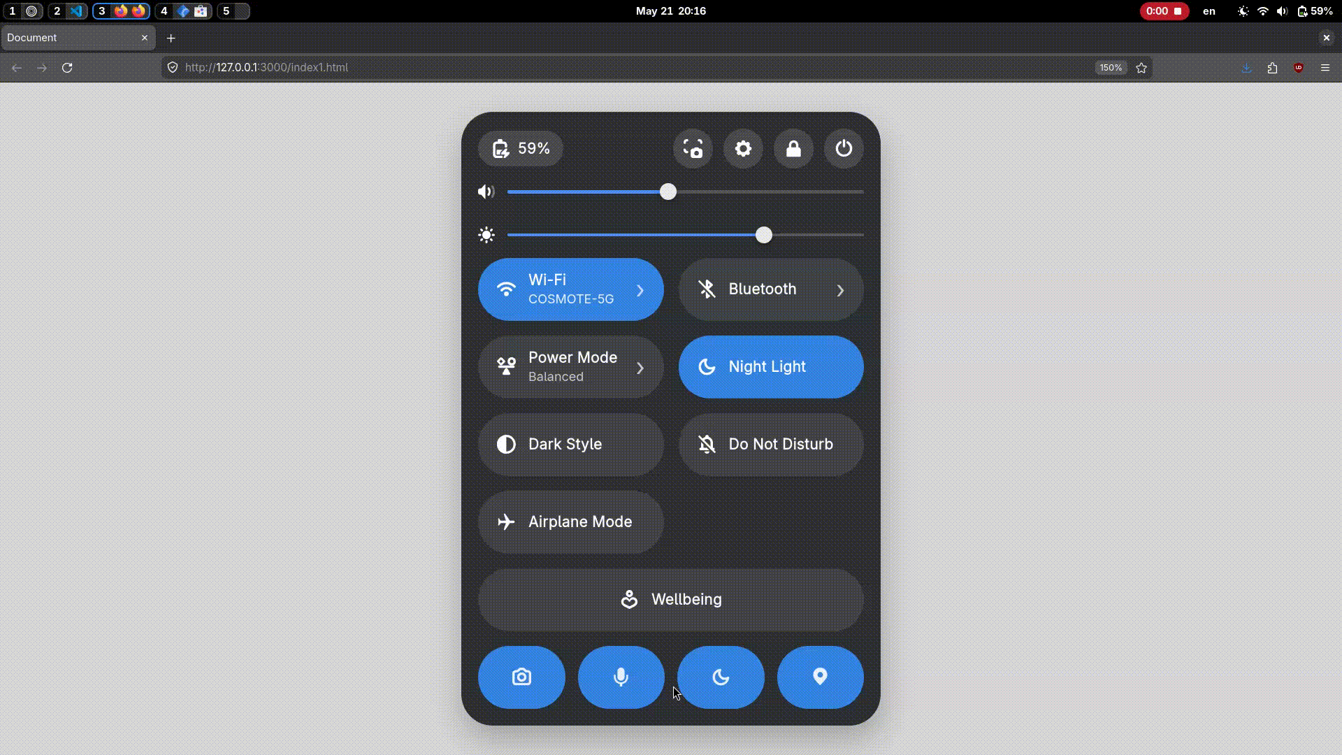
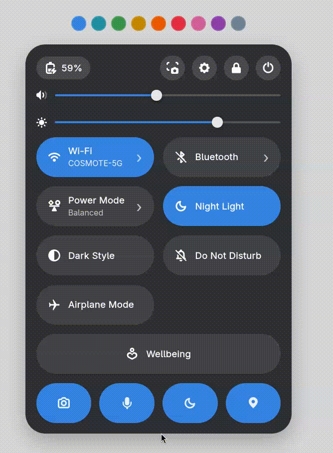
So I updated my code to make the Quick Panel look like the default panel my laptop has, mainly so it better reflects the final vision of the concept. I also resized the new quick action icons at the bottom to match the smaller pill-style ones already in the UI. Personally, I think the larger icons looked better, but let me know what you think.
I also added a new Wellbeing button. When clicked, it can either open the wellbeing settings (if enabled) or display the remaining time if wellbeing has already been set up.
I’m back with more improvements (yes, again I know it’s only been like 30 minutes ).
I added an edit button that appears when hovering over Quick Actions for a longer time. This helps in situations where, for example, a user is on a PC without access to a camera or location services, allowing them to swap a Quick Action for something more relevant.
My next step is designing a sub-panel for Quick Actions, similar to Android’s Quick Settings customization. Users will be able to replace a Quick Action they don’t want with a different one, making the panel more flexible and personalized to their needs.
Final update for today: I also added an accent color picker so you can preview the concept of what it could look like with the colors that GNOME offers.
It’s somewhat unlikely. The reason why GTK can animate icons is that there’s an SVG parser for extra attributes that turns commands into rendering operations for the GTK scene graph. The Shell has a similar API, but it’s not as comprehensive, and it would still require adding an SVG parser.
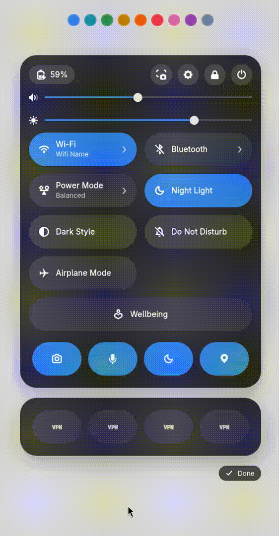
I’ve designed the sub panel. For now, it’s always visible, but the intended behavior is that it will appear when you click the edit icon and disappear when you press “Done” in the bottom-right corner.
The idea is that you can configure up to 4 quick actions. These can be dragged, dropped, and rearranged freely to match your preference. For demonstration purposes, I’ve added 4 placeholder VPN quick actions to showcase how the concept could work.
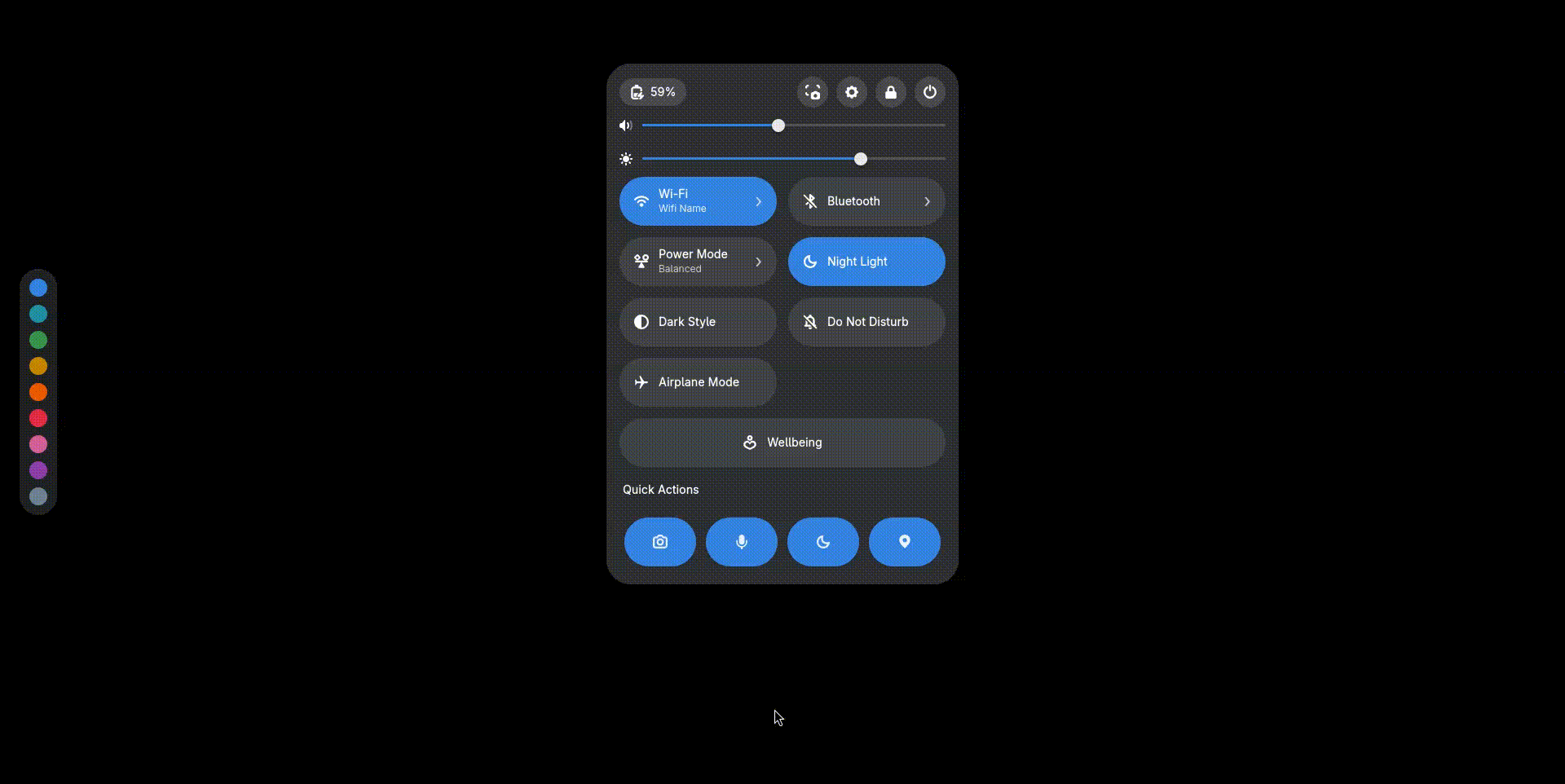
Hello again everyone. I’ve updated the quick actions layout by removing the individual edit buttons from each action and moving a single edit control next to the ‘Quick Actions’ label. You can now enter edit mode using the edit button and press Done in the bottom-right corner when you’re finished. I’ve also added four new quick actions: VPN, Zoom, screen sharing, and a timer. (The Wellbeing button doesn’t currently change color with the accent. I think it makes more sense for it to stay green, since that fits the idea of wellbeing better)
These look really cool! My mockup definitely leans more toward Material Design, but it still uses GNOME’s default elements. In my mockup the quick action buttons aren’t full pills like GNOME’s current toggles. They’re more like half-pills with just a centered icon. I don’t think GNOME’s existing pill buttons are really designed for aligning a single icon cleanly without text. I also think the smaller design makes better use of space, which leaves more room for additional actions and customization options without making the Quick Settings panel feel cluttered.
 ).
).