Why the Gnome environment block icons in menus? In cases of huge menus like in LibreOffice are icons very useful in quick orientation.
Sometimes it seems to me that Gnome is more interested in what it looks like than how it can be used… It should be an environment for people not for nice screenshots.
We do not “block” icons in menus; icons are generally reserved for “nouns”, or “objects”—for instance: website favicons in bookmark menus, or file-type icons—instead of having them for “verbs”, or “actions”—for instance: save, copy, print, etc.
The reason is…
They are really not. People use spatial memory to find menus; the more (very small) icons you put into a menu, the more you have to make those icons “different” enough that they can be recognised. This means two things:
trying to convey complex actions in 16×16 pixel images
trying to remember lots of different 16×16 pixel images
This is never going to scale on both ends—icon artists won’t be able to make icons that convey complexity for every action, and users won’t be able to remember them.
Just because you don’t understand a decision, or don’t agree with one, it doesn’t mean it was made for nothing, and you should not be casting aspersions on the people who made it. GNOME designers have thought about this change, and there’s plenty of literature that supports this decision.
These rules, by the way, apply to most interface guidelines across operating systems, so there’s nothing really special about GNOME.
I wanted to write my views in a separate post, but you were too fast to respond
I do like GNOME UI and it’s minimalism, but find it very hard sometimes to find it useful from utility perspective when the number of actions get more.
Rhythmbox which had a simple menu UI, got really messed up in its UI, having to abstract menus in all kind of places.
Also, GIMP still uses the old menu style, which I find it as a huge relief. Not sure how that’s going to change in the GTK3 port. There were already questions in forums ( omgubuntu ), on whether GIMP would get rid of menus from users.
Though this discussion is regarding icons, and not menus I find the same to apply to icons too. The moment I use Office apps, I get used to the icons within few minutes, because most office apps are consistent in their icon UI design across products and platforms.
Also, though I agree UI surveys are a useful tools for getting valuable feedback, I sometimes wonder how are the survey volunteers selected, and who decides that those few volunteers are enough to represent the entire software user community ?
Main reason for saying this is Microsoft Office has been there for years, and all these years, I never heard a single complaint from users ( non-technical users who don’t know anything other than MS office, users who are novice like older non-technical people, and my tech colleagues ), regarding their UI or their menu icon design.
UI surveys are not for testing that a given percentage of people find an UI okayish. They are testing if some random people are able to perform some given action. No need to “represent the entire software user community,” so: if just one of the tester doesn’t find a way to perform one of the actions, there’s probably a bug, period. That’s not a statistical thing at all.
But, I repeatedly keep hearing from prominent GNOME devs and probably devs from other community as well ( I wouldn’t know ), that users don’t really know what they want. Then why do we need to pay attention to those handful of testers, rather than educating them to get accustomed to the new way the software works. Because, on the one side, I come across lot of users in forums repeatedly asking for something from GNOME ( desktop icons / app indicators etc ) which at least AFAIK doesn’t happen for ideological reasons, not for unavailability of time or resources, but would be okay with tester feedback.
I don’t care about icons that much, but I wonder why we can not add icons but hide them by default, allowing people to make them visible when they really like. I think maybe 20 years ago I used a GUI where exactly that was possible, but I can not remember if that was GTK, KDE or another GUI.
There is a difference between implementing whatever feature people ask for, and observing how they interact with software and discovering their underlying motivation. People will generally want interfaces that are familiar, even though there might be interfaces that would serve them better in the long term. Designer’s job is to find those better interfaces.
Of course design is hard, there might be trade-offs and designers themselves are not infallible. That’s why we have this community so we can improve the software together.
There is more chance of getting answers to your questions, if you word your thoughts respectfully and carefully. We don’t have prizes for sarcastic comments here.
Maybe you should stop moving the goalposts every time you get an answer you don’t like.
You can easily use Google to find various discussions on desktop icons and app indicators; there’s no point in trying to re-hash old topics. Plus, this has nothing to do with the original topic of this thread.
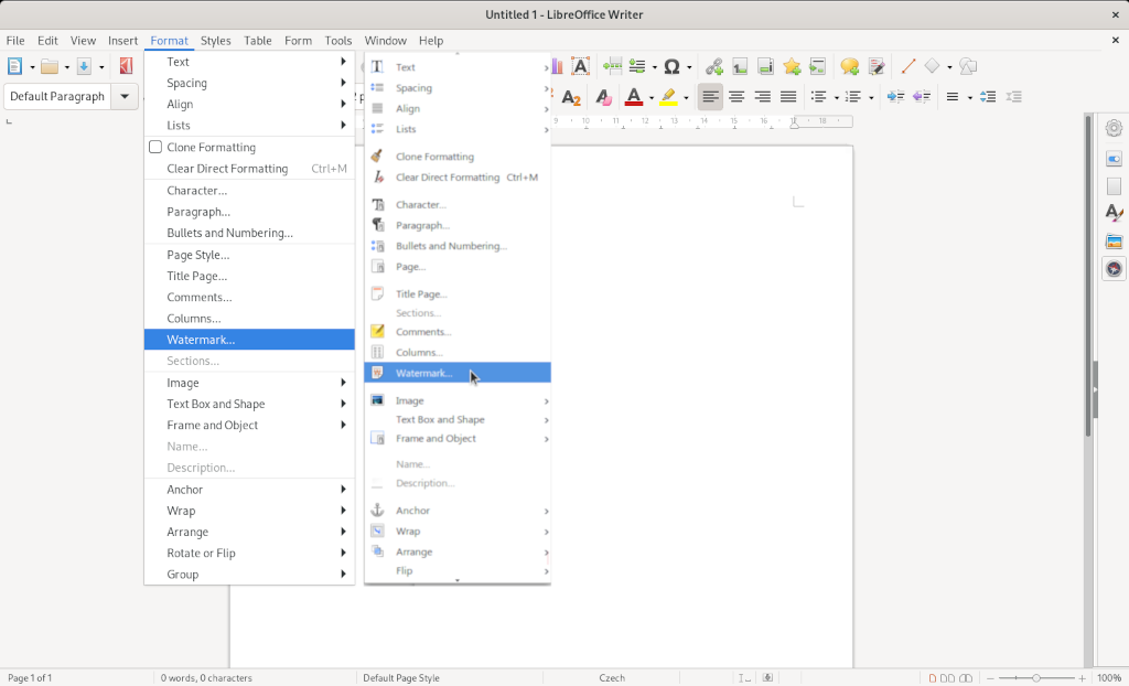
The first one. In the second, I take too much time looking to images, that for half of them are unclear, so I finish reading the text anyway. What’s the difference between the “Spacing”, “Bullets and Numbering…” and “Lists” icons? How would the “Clone Formatting”, “Clear Direct Formatting”, “Arrange” icons be clear for whatever? (Not counting of course that the “Group” submenu is easier to find. ) Icons in a menu are making things prettier, but not better.