Hi, please, consider bringing back the squared title buttons or an “adwaita-squared” theme, a toggle button in Tweaks App, something…
I don’t think we can change theme properties from settings like this, at least not without an unreasonable amount of overhead.
I was a bit surprised to have them changed while upgrading from 3.24.5 to 3.24.11 . Changed via !1037 (merged)
I have to confess that I don’t know what the update policy is for theme changes, but I do have some sympathy with the idea that visual changes shouldn’t be a slow drip.
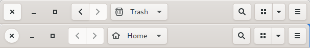
The squared buttons feels/harmonize better in the top bar while the round ones looks just like any other system, generic theme or google material.
I personally feel that round/square buttons are so generic that they don’t particularly impact identity. You could say that square buttons are too similar to Windows, for example - it goes either way.
I’d be happy to consider alternative ways to differentiate the window controls though.
The whole point of styling them differently is to distinguish them from application UI elements.
I understand, but from an user perspective is quite obvious that the last (or first) tree buttons belongs to the window manager.
When we say that we are differentiating these buttons, it isn’t so that people consciously understand that the window controls are different. Rather, it is a subconscious cue - it reinforces something that people already know, and by visualising the difference it makes it more solid and reassuring.
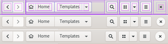
I think what I find quite jarring about the new window buttons is that on hover it looks like the styling and shape of them completely changes. This maybe didn’t feel weird before because they matched the other buttons on the headerbar.
Perhaps a more subtle hover effect, such as removing the shadow might feel nicer, but I’m not an design or UX expert.
To chime in with my two cents, I just noticed this in Fedora 31 myself (awhile) after seeing the post. After looking a bit closer, it seems like the diameter is 4px smaller than the other buttons:
It’s a bit of an eye twister since they’re different shapes, but this might be contributing to the “jarring” effect. The MR mentions the margin and padding were adjusted to match the previous look, but I’m not sure if that’s what this refers to.