Is it something expected?
or a bug in Pango or in the font itself?
When used in GtkEntries, such glyphs sometimes let pixels artifacts behind, seems related to the insert cursor painting itself just over those out-of-bounds pixels, and gtk only repainting the blue area when the cursor moves away.
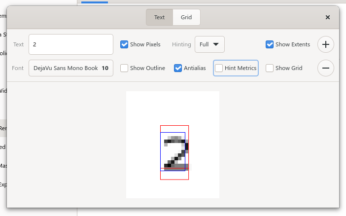
Now, I don’t know why, but there’s a small issue: the red and blue channels are swapped. Try inserting an emoji instead of ‘2’ and you’ll see it
So in the above picture blue is the ink rect and red is the logical rect (which makes sense). Ink rects can be a bit wider than the actual glyph image, that doesn’t cause any issue. As an example, the Cairo DirectWrite backend inflates ink rects by one pixel: https://gitlab.freedesktop.org/cairo/cairo/-/blob/bdd12408a72f/src/win32/cairo-dwrite-font.cpp#L906 (I have a patch to get exact ink rects, so this is will change very soon). However ink rects must not be smaller
Could it be that the ink rect is right, but the glyph is offset one pixel on the right?
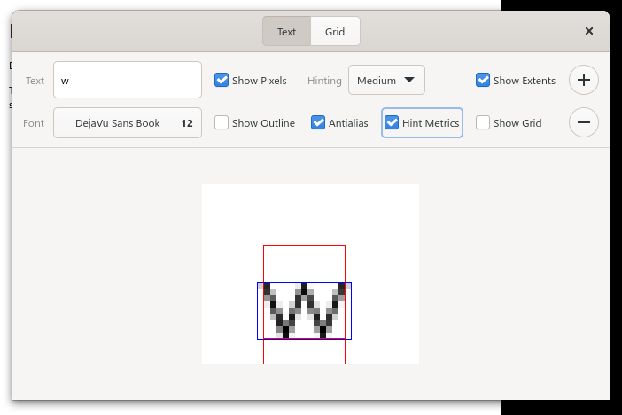
Ink rects and logical rects are entirely unrelated. Ink rects can be smaller than logical rects (example: " " - the ink rect is empty but the logical rect is not) and the ink rect can of course be larger than the logical rect (with Pango, the best way to get a vertical one is with a PANGO_UNDERLINE_LOW, but any long tail on a “g” or “y” will work. And for horizontal ink rects, pick an italic font and a diagonal glyph, say / or V)
The reason is that the logical rect is used for measuring things, and if you put 2 pieces of text (labels, PangoLayouts, whatever next to each other, one saying “A” and the other saying “V”, you want the result to read “AV” and not “A V”. In fact, that’s even relevant in a single piece of text because you want to place the cursor using logical rects.
Strange… that works on both msys2-Win11 and linux on my side.
(though for linux I remember I had to export the env var from my user environment and restart to apply)
Ink rects and logical rects are entirely unrelated. Ink rects can be smaller than logical rects
Yeah, what I wanted to say is that ink rects must not be smaller than the glyph image. For example, ink rects is what one would use to build a glyph atlas. If the rect doesn’t cover all of the glyph image, you end up drawing on other glyphs. If the ink rect is a bit wider you get some unused blank space in the atlas, which isn’t a big deal.
It can be a somewhat big deal if the ink rect is wider than it needs to be, because then GTK needs to redraw a larger area. And that larger area can extend into regions that are expensive to redraw (like shadows around the window) and that can have measurable performance impacts on lower power devices (like smartphones or 10-15 year old laptops) when scrolling.
If you’re really unlucky that can even make the redraw region enter the non-opaque region of the window, which will force the compositor to do a more expensive redraw, too.
I remember Christian Hergert and me doing measurements to that effect in gnome-text-editor and/or VTE and it was one of the reasons at that time that he added padding to the outside of the scrollarea.
So we’ve been trying very hard to get the ink rects accurate with the new renderers so that that doesn’t happen.
Btw, there’s a bunch of things that we fixed recently about that with hidpi, that I wanted to talk to you about that wrt the win32 Pango backend. So you could poke me on IRC sometime, so I don’t forget.