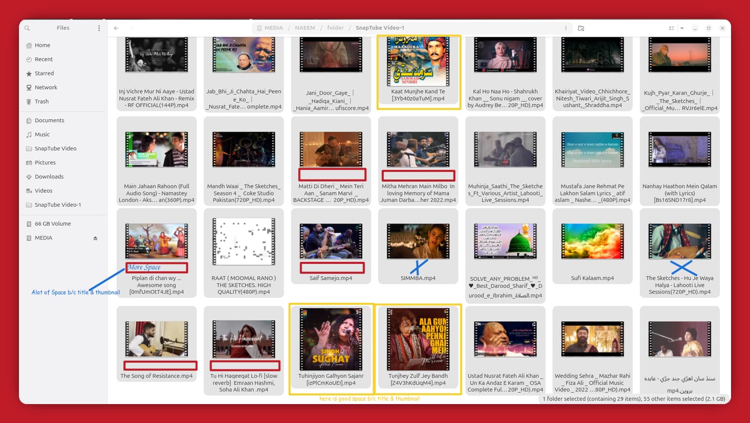
Fix : Much More Space between title and thumbnail.
I think preserving the consistency of the baseline of text is more important than inconsistent spacing between text and icon/thumbnail.
1 Like
“Further to my report, I’ve noticed this spacing problem is consistently present with 16:9 aspect ratio videos, particularly those sourced from YouTube. Based on my observations (as shown in the provided screenshots), other video resolutions do not exhibit this specific spacing anomaly.”
And I’d say it makes it more consistent and more pleasant to look at. This way text forms a nice border between rows files
The issue is that the thumbnail does not match the space nautilus designates for it. Designs like this files/grids.png · master · Teams / Design / app-mockups · GitLab help here, by making thumbnails more uniform.
This topic was automatically closed 45 days after the last reply. New replies are no longer allowed.