As I see that their is renewed interest in the development of Nautilus, I think it’s a good time to share a mockup I made a few years ago (see mockup below).
The mockup show my ideal arrangement of the shortcuts and bookmarks in the sidebar.
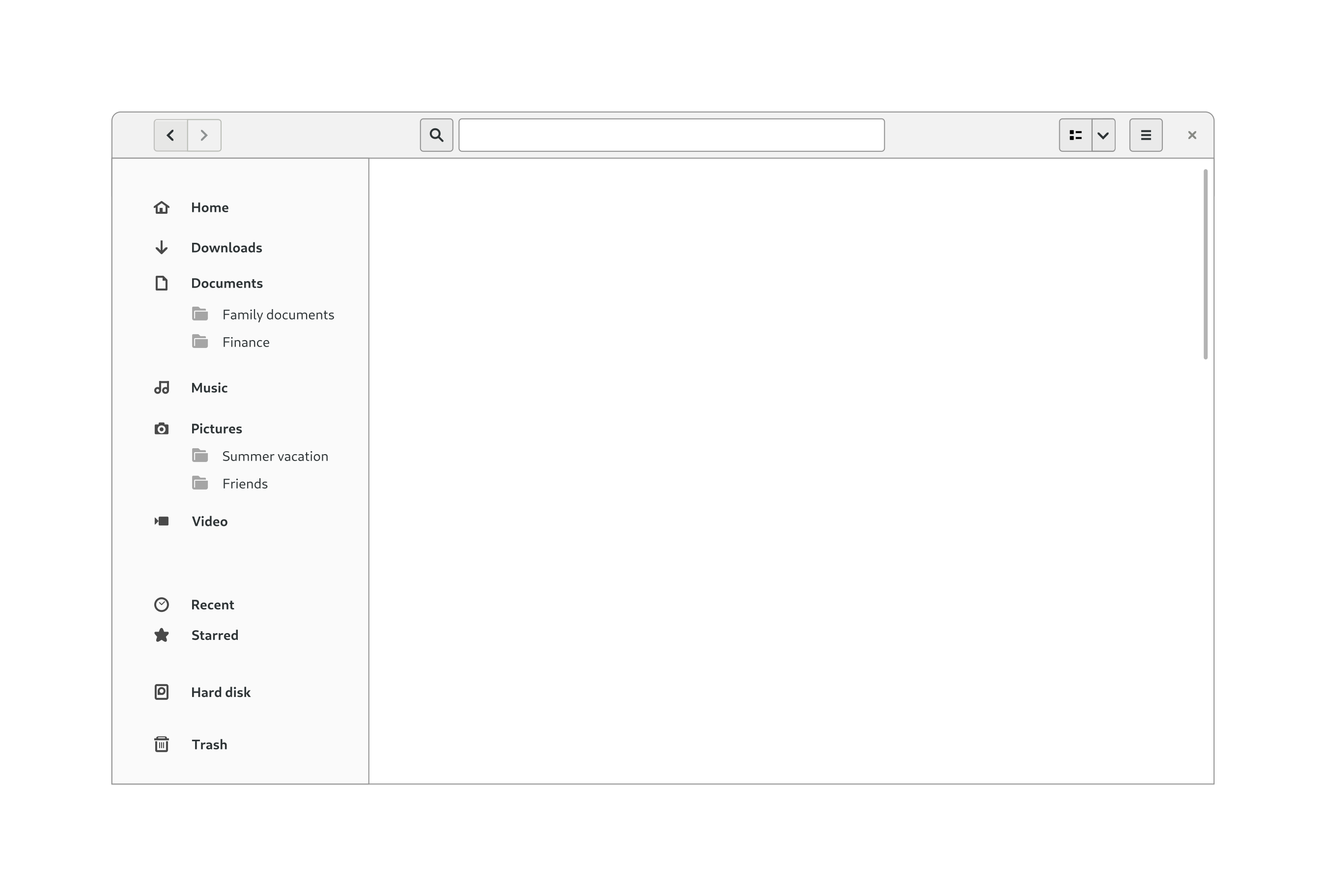
This arrangements is, in my perspective, ideal, because:
It merges the default shortcuts and the bookmarks.
This way you know where you can expect a certain folder (for example you can find the folder Finance in the folder Documents).
Have a more logical order.
Options that I rarely use (Recent and Starred) are at the bottom of the sidebar. Putting them at the top is, in my opinion, distracting. Hard disk and Trash are also at the bottom. At the end but still clearly visible.
There is a nice left and top padding which makes the text and icons stand out.
There is enough padding between the items which makes it more readable.
There is enough padding between the grouped items to make the groups visual visible. This way you can see what belongs together and what not (for example Recent and Starred are grouped together).
When I see this mockup it gives me a sense of relief because everything is where I expect them to be and because everything is aligned and spaced correctly.
It reminds me of a mockup I drew in the past where bookmarks would be groups by drive instead!
Actually, the current plans are to demote Downloads/Documents/Music/Pictures/Video to regular bookmarks. Many people don’t use all of these folders. And, for example, it’s possible to have videos in Downloads, to have images in Documents, or to have music videos on Music. We have effective search that wasn’t always available in the past, so we can leverage search to find Video files, for instance, instead of expecting people to put all of their videos in the Videos folder.
If they/you are going to demote the shortcuts to regular bookmarks, than I think that’s a good idea! Indeed not every folder is actually used.
If they/you are going to do that I would like to propose one extra feature: the ability to organize various bookmarks in a group. I remember that I missed such a option when I was working on several projects and I had many bookmarks added to the sidebar. I’m only not sure how this would look like and how someone could add, edit and delete groups. But that’s for another time.
Oh, I didn’t mean that many bookmarks, more around 8 a 10.
A simple solution would be to have the possibility to add a separator between the bookmarks. More or less like how Firefox does this. This separator could be an empty space or a short horizontal line. This separator could be added by right clicking on a bookmark and the option ‘Add separator’ and it could be removed by right clicking on the separator and choosing the option ‘Remove separator’.
Anyway, this is only important when they actually have demoted the default shortcuts/bookmarks.