Hi, I am not technically knowledgeable in the subject of font rendering, but as someone who suffers from astigmatism, font sharpness and fullness is very important for me. So I usually set up my GNOME desktop to use a semibold font to mimic the highly praised font rendering from MacOS. It doesn’t actually need to be thick bold which becomes ugly, but rather semibold or medium is usually fine.
For some reason, choosing a semibold font via GNOME Tweaks doesn’t actually render them bold, for instance in the Shell menus or Files. The font weight must be set via gtk.css in ~/.config/gtk-3.0 and ~/.config/gtk-4.0 for the boldness to be properly rendered.
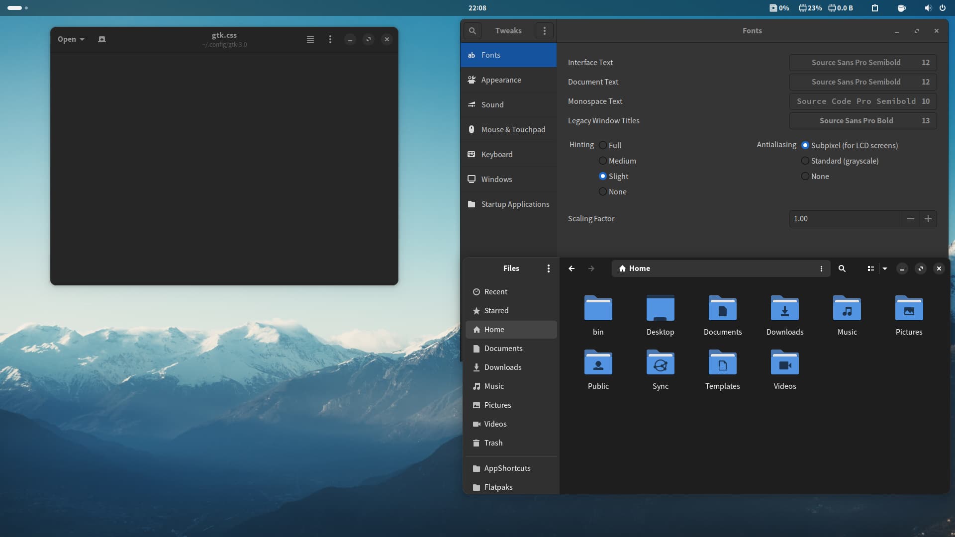
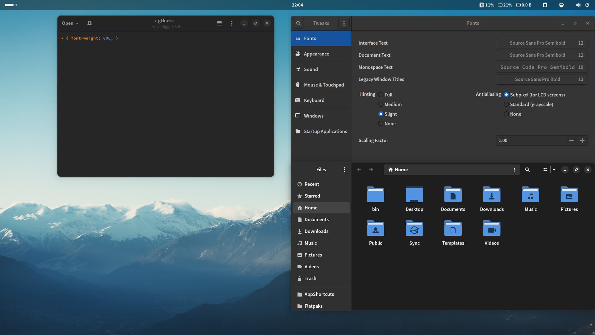
I show two screenshots of my GNOME desktop (openSUSE Aeon if it matters) using the same Source Sans Semibold font, one with the font weight set to 600 and the other without. If you notice, without font weight the fonts look noticeably skinnier. So this setting really helped fonts to look sharper and fuller across the board, in the shell and apps.
My suggestion is that either the default GNOME fonts are set to have an increased weight or an accessibility setting is introduced to allow this to be enabled by the user.
As someone else with astigmatism, I wholeheartedly agree that this would be helpful - I can very easily see “heavier” fonts at the standard text sizes, while the current Accessibility setting for “Large Text” has the - to me, anyway - undesirable side effect of also inflating the size of the interface elements themselves to accommodate the larger text.
In your experience, is that something that can be set consistently for multiple different font families (e.g. would the same setting have the same effect in Source Sans, Cantarell, Ubuntu, etc.)? I imagine for it to be an “Accessibility” setting, the same parameters would likely need to produce the same desirable effect across at least the common interface fonts?
in your screenshots I see selected “subpixels for LCD screens” - my experience say, that it doesn’t work with more and more apps (GTK4 based). Gnome / GTK seems to be less and less user friendly for people with eyes problems.
The Shell does not use GTK’s CSS, except for determining the style of server-side decorations; otherwise, the style is part of GNOME Shell itself.
The font name is determined via GSettings:
gsettings get org.gnome.desktop.interface font-name
Should give you the current font and size, whereas this:
gsettings set org.gnome.desktop.interface font-name 'Cantarell 10'
Should set the font size. I’m not sure what GNOME Tweaks is doing, but GNOME Tweaks is currently barely maintained, so it might be a bug.
The font weight is kind of complicated to set via settings; the font-name setting uses the Pango font description syntax, which is documented on the API reference. You can try tweaking it.
Hi. I have several 4K displays (one of them an old iMac with 218 ppi), so also try and set a higher font weight for readability.
I notice some strange behaviour with IBM Plex Sans (otf). This has a Regular weight (400), and a slightly heavier Text weight (450). If I select Text via GNOME Tweaks/Refine the system will actually use Regular, even though the gsettings string is “IBM Plex Sans weight=450 11”. But if I delete the Regular.otf, the system will correctly use the Text weight.
Even more strange, if I add back the Regular.otf to my local fonts, and sometime later delete it again, the UI text areas are filled with blank square boxes even though it never used the Regular.otf!
Can anyone else see if they can properly select IBM Plex Text weight as UI font when the whole family is installed?