None. I have my own.
And there’s only one Gnome desktop ![]()
Jokes aside I like nautilus default look and the second picture shell so yeah.
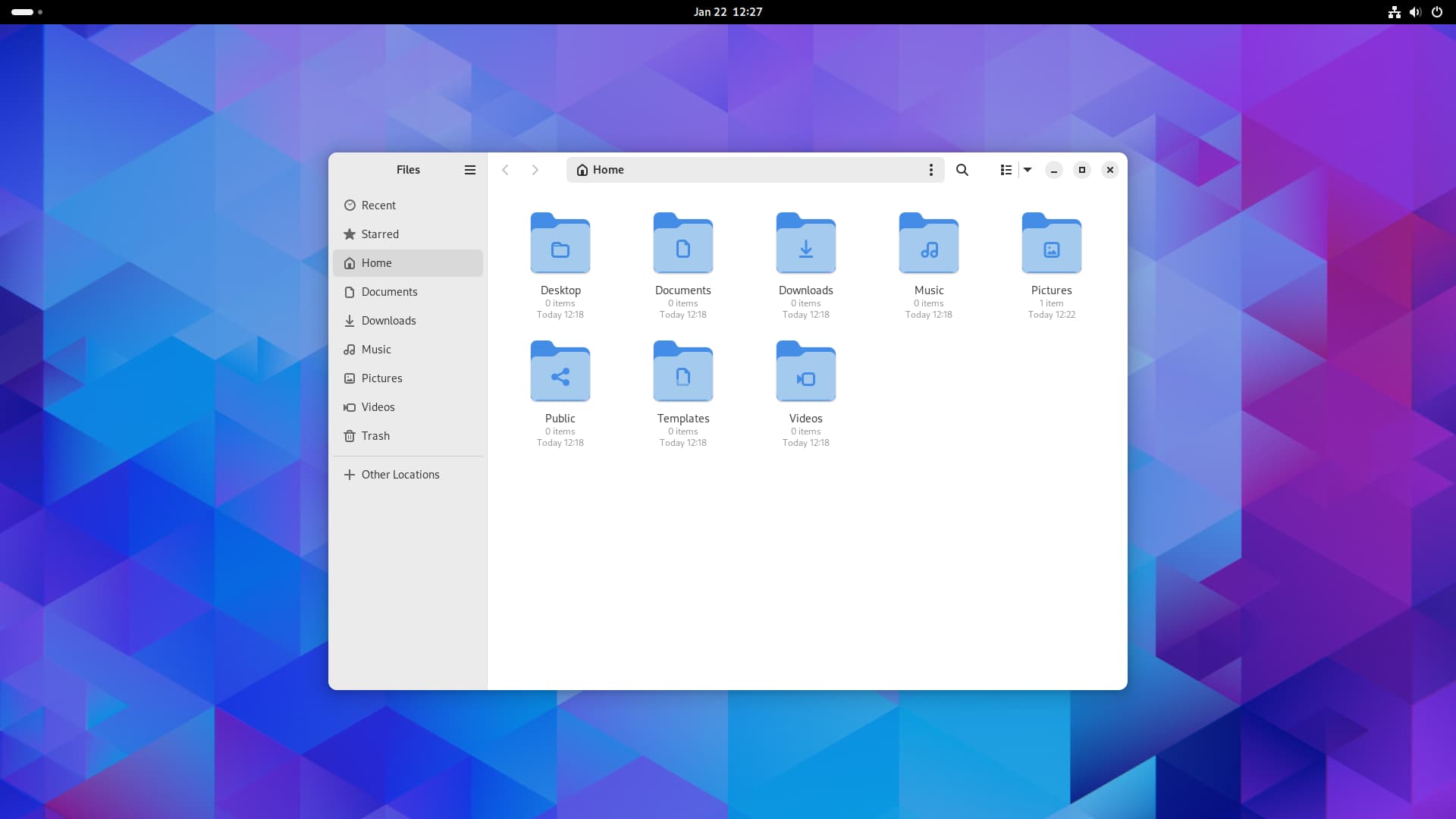
The top one. On first glance I prefer the top desktop’s shell because the bar is the same colour as my monitor’s bezels, so it would integrate well. I also prefer the top desktop’s app window because the lower one moves the folder icons on the left into a separate UI element for no apparent reason or benefit.
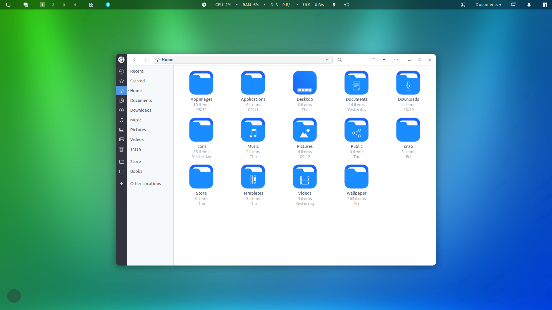
Looking closer, I see the bottom desktop has resource usage information in the top bar. I would prefer not to have this as I usually don’t care about that information, and when I do I open a terminal and run Top. We already have an icon in the system menu that tells us when the network connection has failed, whereas displaying the current network speed is close to pointless. An extension to warn about approaching resource limits would be good, but not this large permanent display, it’s just a distraction. The clock is more useful, but has been removed.
The lower desktop has a lot of icons in the top bar which I can’t imagine ever needing. In particular, from left to right: monitor, stack/layers, window, window, upgrades, Mac, desktop, tiling. I don’t know what they all do, but I can do all I need by pressing the Super key.
I’m not a fan of numbered workspaces. Scrolling through them sequentially works well, and we have a visual representation of them in the overview if we want to pick a specific one without scrolling. So the top desktop wins there too.
I should say some nice things about the bottom desktop: it has better folder icons and doesn’t have desktop icons or widgets.
Yeah, that’s what it’s all about – personalization…
I come from a long Mac background and recently got rid of it because of privacy issues. I have a border-less monitor so to me the transparent top bar just feels and looks better. Being an ex Mac user the top bar is still my main focus area. I can navigate and get to every location, app and file on my system by just using the top bar and mouse. The file manager theme is just decoration. I have about 5 favorite GTK themes that I switch between depending on my mood.
The top one. I find the top bar on the second screenshot to be confusing, like where is the activities button or pill filled indicator. As for the file manager that extra gray bar feels useless unless you can have different shortcuts then what I see in the screenshot. on a different note if find the ubuntu logo on top or any distro logo being there to be a problem for derivatives and distros that just want to ship things stock. The only things I like is the icons and blur-my-shell.
But hey that’s just what I think. if you like it then great for you.
Even borderless monitors have borders! With the default top bar it just looks like the top border is slightly larger than the side ones, and everything else is workspace.
I like the minimalist, distraction-free philosophy. I tried dash-to-panel for a while, but noticed that my eye would always get drawn to the array of icons in the top bar.
My monitor has a very thin silver bezel. It is all about personal taste and preference. I am happy that Ubuntu 22 LTS has the capability to customize my system the way i like it since I spend a lot of time on my PC for work and play.
The top one. I like my GNOME as vanilla as possible.
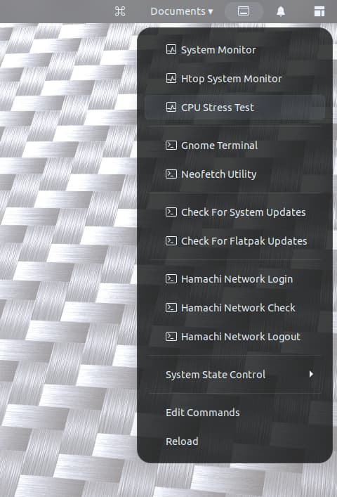
Personal taste is fine, but I see in your post about Gnome 42 that you are beholden to Ubuntu 22 for the foreseeable future because of your reliance on extensions, and that you resent this. There are ways to achieve the commands in the image above without using an extension.
- System monitor: press Super, type “sys”
- Terminal: pin it to your dash, henceforth use Super+[number]
- Htop: open Terminal, type “htop”
- Checking for updates can be done in Software or a terminal command. It’s a longer command than htop but you can set an alias, or use the up arrow to find the command in history.
- System state: you can power down by pressing Super and typing “shu” (for shutdown)
- Depending on what your CPU Stress Test is, it might be viable to put that in a script which you can run from the Run Command dialog.
Creating your own shortcuts is better than installing someone else’s!
Well the way I see it, would I use LibreOffice to write a letter or a plain text editor…? There are many Developers out there that put huge amounts of time and effort into making all sorts of software available for free. They are passionate about their creations that are often indispensable because they add value and functionality to the personal and corporate computing environment. There are also artists like vinceliuice that design classy, functional and aesthetically pleasing themes. Many of them rely on donations. I am a firm believer in giving credit where credit is due. I support most of the Developers, including Gnome for their software that I use. So, yes, sure I can use a plain text editor to write a letter, but why would I if I can do it faster and better using LibreOffice Writer…
For people who learn Markdown, plain text is better than word processing. And for people who learn Gnome, shortcuts and other tricks are better than extensions.
The 2 images you posted each contain design flaws: first the separation of icons from labels in the file explorer, and then having text on a translucent background. Gnome used to make that second error before version 40, when the desktop wallpaper was visible in the overview: if you had bright wallpaper it could make search results illegible. These days it uses a neutral background but you can replicate the error with Blur My Shell if you want things to be pretty all over. Not all creations are indispensable!
Can I know which extensions you need? I just happen to know a bunch and I mean a lot of extensions (I check the site every 3 days no joke) and have an insane amount of experience and currently use 40 extensions and have many waiting for me to make another user account to test them (as they might conflict or do things some of my current extensions already do).
Seeing from the picture I don’t know what the fist couple of buttons do. For the workspaces indicator with numbers there is G45 extension and I personally use two extensions which I think are way better for using the workspace. The next two buttons I don’t know what they are, If I could guess would be one shortcut for apps and the next just an Icon for the current app.
At the middle I see an update indicatior which in G45 I do have. Next a cute looking resource indicator. I used to have one similar but currently use Top hat because I like icons, bars and the doble line network indicator. There are a couple more for G45. Next I see the volume indicator and I use a scroll at the topbar to change volume so I only need the icons tray volume indicator.
At the end I dont know the first icon. The next one looks a shortcut list for common places/locations/folders which is available for G45. Next I don’t know what that icon is. Finally a notification bell for the notifications list I suppose and lastly I think that’s ArcMenu? which is G45 compatible.
Anyways hope to see which extensions aren’t compatible with G45 and maybe I can find/know which ones are equivalent.
For the theme thats easier. And dare I suggest there are better themes out and I personally like the new nautilus changes to match GTK4 better.
I like the second one. The network/system monitor is cool, and the Nautilus left pane is nice. However I don not like the folder icons. To me, this blue colour is too much shiny.
I really like and use default Gnome, the only extensions I have are GSConnect and Round my window corners.
But I admit the second one looks really good
I like number 1 desktop.
I have a Arch Gnome 45 VM and yes I have many extensions that have been ported, but the fact is I am unable to achieve the look and feel I currently have with Ubuntu 22. Just look at Rounded Window Corners extension Github page. The issues with Gnome 45 are so overwhelming that the Dev has stopped responding with everyone there practically begging for fixes…
The icon theme I chose for that particular setup is but one of twenty icon themes I have. Just open tweak tool, select a different icon theme, and that is the beauty about it.
This particular setup is but one of 10 I regularly switch between. I intentionally chose one of the less appealing ones for this exercise.
But rounded window corners been fixed. Been updated, I use it.
Reading your other replies I don’t think the problem is G45 and more like OC, ADD and ADHD software running between chairs and desks. Might want to run chill-its-free.software anyways, cheers!