This is my current setup with dash to panel and arc menu:
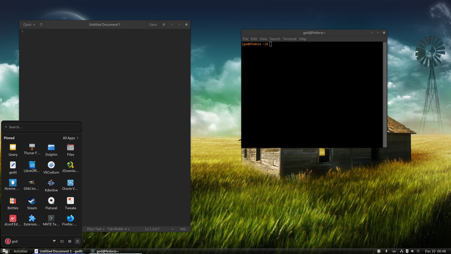
I honestly can’t live without these two. I use arc menu as an app launcher and on the panel I have only the running apps shown, and in expanded mode (I don’t like icons only).
Also, before someone brings up keyboard shortcuts for pinned apps and how useful they can be, dash to panel does have an option to re-assign Super+num to the running apps. So in the screenshot above if I press Super+2 it would open the second app. This is actually even better for me because if for some odd reason I end up having too many windows in one workspace, I can still easily navigate with the keyboard, without having to press Alt+Tab a billion times. I actually treat workspaces as workflows so I do often end up having 4 and even 5 apps opened.
Note that I don’t actually have arc menu bound to the super key. I still use super for the overview which I use quite often. Arc menu is when I use the mouse. it’s basically an expandable launcher for my most used apps on the panel. Otherwise when using the keyboard exclusively, I search for the app I want to open and open it that way. I also use the apps grid sometimes too, where I had all my applications (I have 62 flatpak apps and a bunch of system ones, so a lot) all grouped in categories.
Anyway, the main reason I love this setup so much is as you notice, it takes no more space than the top bar, and has these extra useful items inside of it. Not to mention the insane number of customizations both Dash to Panel and Arc Menu offer that I can’t live without. Other DE’s I’ve tied like Cinnamon and KDE, even though they offer a taskbar built in, it misses more than half the things I want. And I have some very unorthodox requirements. For example, I hate animations, hovering over anything to trigger an event, I want specific spacing, colors, indicators etc.
So in terms of people who like docks, what is it about them that’s so good? All I see if a giant waste of screen real estate for some big colored icons …? Especially if you have both a top bar and a dock combined. Every single time I see a mac os computer it looks so unappealing to me. I even noticed in Windows 11 they have once again incrased the size of the taskbar. In a few more versions they will make it even bigger probably and you’ll get the mac os dock mixed with the windows taskbar ![]()
In fact, the default GNOME workflow makes a lot more sense than a dock, except for the fact that it doesn’t isolate workspaces, which I believe it should.
By the way, I find auto-hide also very inconvenient. You either have to make it so that you have to put a bunch pressure, or you need to be very precise with your mouse when close to whichever corner the dock is in. And I don’t like either of these possibilities.
What’s your opinion?
*** Also if anyone’s wondering what my icon theme is, it’s a stripped down version of Breeze dark that inherits Yaru dark and Adwaita, and also with customized folder color (orange). Breeze dark works well in all applications (gtk and qt) and Yaru/Adwaita for the system tray, gnome settings and shell components.