The tabs in Gtk apps are drawn witth Gtk Notebook Container which draws tabs with pages, but the Tab management is bad. Some of the reasons why Notebook Tabs are bad for GTK users:
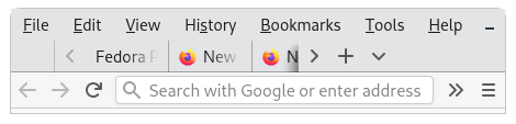
- Blocking the info: Instead of presenting content/folder/file/pages in visible tabs, the notebook header hides existing open tabs when the tab number increases to more than 4-6 tabs (based on label size). Now, the user will be at loss of finding his/her opened content/folder/file/page and may forget that the existing opened tabs is open. It makes working with multiple tabs (more than 6) very very difficult, because it hides the information user was working with.
E.g., open 10 Nautilus Tabs with different directories. you can only see 4 or 5 (depends on label size)
Another example, I am most affected by this. I open text, python files in gedit. And gedit open new files in Tabs. If I’m working with more than 5 or 6 files (on full hd maximized window) which I usually do, with multple py files, and open another file. The notebook header hides my existing opened file in 1st tab to which I will be copy/pasting. Yes, Split window helps somewhat, but, randomly opening a new text file, and pushes the old tabs in hiding mode. We have to struggle with Arrows which are kept on far Left and far Right side of the window/notebook header, just to find my file to paste text. This is abysmal behavior of notebook tabs.

And if we see Chrome and Gnome Web or Gedit with 5 tabs with big file names: Chrome is showing (all) 16 tabs whereas gnome web is showing only 4 (out of 7).

-
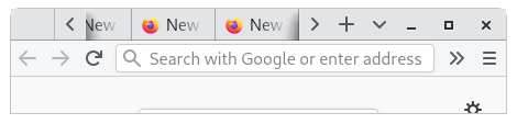
There is unnecessary unclickable, padding between 2 tabs Notebook Tabs If we click in that Gab between 2 tabs, the click is wasted. What’s the point of having unclickable padding between. Below, G is the Gap
[Tab 1] G [Tab2] G [Tab3]
There should be no gap beween tabs. -
Can’t move Tabs : say we have 10 tabs 1,2,3…10, and we are on last tab i.e., Tab 10. It is not possible for us to move the 10th tab to 1st position or any tab position which is beyond the Arrows on left or right.
Hence GTK application with Notebook Tab bar are not popular. Gnome Web is a decent browser, but the Notebook tabs make gnome-web/epiphany a web browser which is difficult to navigate, and work with many tabs.
Yes, It is wrong to clutter tabs into teeny tiny buttons like chrome, but the tabs should become as smaller to present more pages/tabs for better workflow.
As gnome is touch friendly. The minimum tab size should be of a button like on a headerbar, and a menulist like button on right like in gnome-web should be made a feature of notebook header. The current Left [<] and [>] arrows on notebook header is very difficult to navigate.
Best Example: gnome-terminal

Gnome terminal almost does it perfectly. This gnome-terminal like tab sizing should be done by gtk apps. I open more than 20 tabs in gnome-terminal with ssh sessions to different servers.
more improvment for tabs of terminal:
- hide button, on hover show like chrome does
- remove left and right arrows and gap between tabs which will allow more tabs to be packed.
Thank you.