As stated in the title, I see the gtk4 text on MSYS2 Windows specifically look really bad compared to it’s prior gtk3. I’m wondering this difference is intended or the MSYS2 build has something wrong?
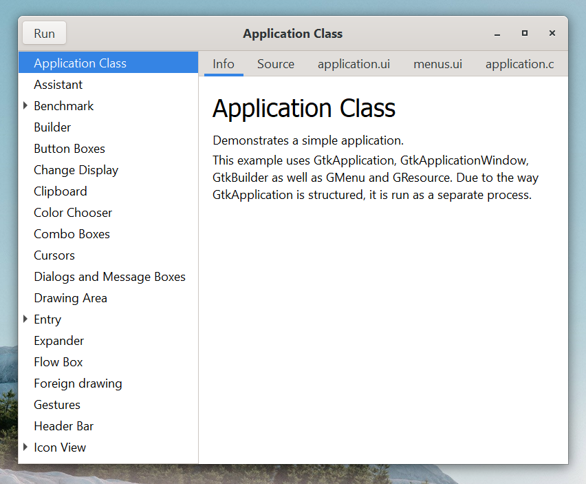
gtk3-demo application
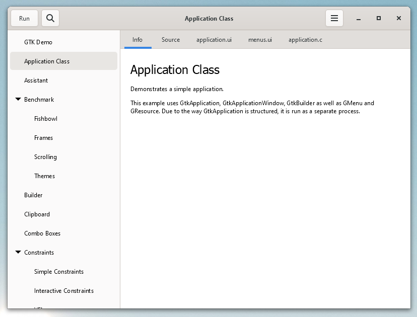
gtk4-demo application
As stated in the title, I see the gtk4 text on MSYS2 Windows specifically look really bad compared to it’s prior gtk3. I’m wondering this difference is intended or the MSYS2 build has something wrong?
gtk3-demo application
gtk4-demo application
Do you have the same issue with other GTK4 apps? I guess then it is related to this issue: Blurry text everywhere in GTK4 (#3787) · Issues · GNOME / gtk · GitLab
I don’t know for Windows but on Linux with GTK4.6 or newer the workaround is to create the file ~/.config/gtk-4.0/settings.ini with this in it:
[Settings]
gtk-hint-font-metrics=1
Oh, nice!, enabled gtk-hint-font-metrics and looks good now, thanks!
This topic was automatically closed 30 days after the last reply. New replies are no longer allowed.