And I would like to see something like this:
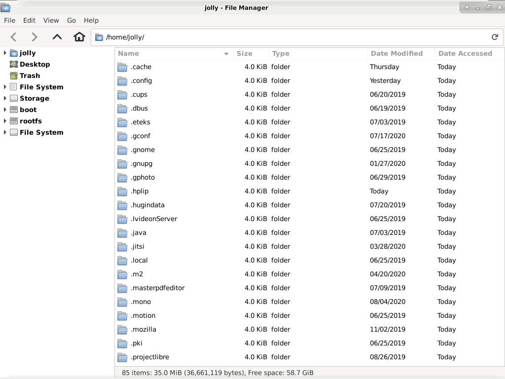
where the left panel can be customized with various drives or directories as shortcuts.
Does that answer your questions?
And I would like to see something like this:
Does that answer your questions?
What exact do you want to change in the current sidebar? “Customize” doesn’t tell us much, please describe the exact changes you want to make and why.
Example:
I don’t like where Files shows Other locations. I want to mount my “other locations” directly in the left column.
Ah, yes, that’s something we want to do, and there is work in progress in that direction.
Until then, maybe you can achieve your desired result by adding the x-gvfs-show option in fstab
An how exactly is that done? And what exactly will it accomplish?
You can either edit the fstab file manually (easy to find information in the Web) or use the Disks app option “Show in user interface” as explained previously by Zander.
I guess you missed the place where we discussed the Disks app option. It does nothing to help me. In the examples I posted here there is no drive displayed even though it is checked.
The fact remains that Files does not work well, and it is a sad situation when it is used as a default mechanism for opening and browsing files. Now maybe Gnome used the File Chooser Dialog as the basis for creating Files, but whatever. It is not intuitive nor customizable. Further, forcing users to edit configuration files to try and make it work is silly.
Click on “Other Locations” in side bar in Files, and post the screenshot here.
The GNOME community and its developers, are trying their best to help you, in-spite of the fact that everyone’s time resource is limited. But, your comments are for most part generic, inaccurate and unhelpful, which doesn’t help neither you nor the community. Clearly, the developer has mentioned that:
If disks app GUI option doesn’t work, provide enough and accurate information on that particular issue, so we can figure what is it, that is not working. I use multiple disks - internal and external, with multiple different filesystems and partitions, and all disks and partitions are displayed under “Other Locations”, if not already displayed in the side pane.
Thanks for understanding.
There is a misunderstanding going on here.
First, let me state that the Gnome programmers’ efforts are greatly appreciated. I have supported and promoted them for decades.
Second, it isn’t that someone didn’t say that something is being worked upon, no matter how nebulous, but rather that there remains a lack of recognition that the whole thing has big problems.
Third, I have no interest in sub-categories displayed under some “Others” heading. I doubt many would. After all, why required yet another mouse click. That is an obvious problem, and certainly not something a qualified intuitive design expert would overlook. I gave you an example of another program that does it better. I would expect this issue to be immediately repaired rather than a non-specific timeline for addressing it.
Everything I’ve given you has been on point. That some may not see it as helpful or inaccurate is their problem.
Let me be clear; as it sets, my recommendation at this point is to remove it from public use and keep it in the testing phase. This would be the most helpful for computer users everywhere. That way they would not have unnecessary expectations based upon what is expected from a good file manager. Files is not one of those.
Thank you.
Please, don’t extrapolate from your personal preference to a general principle: it serves no purpose, and you definitely can’t know that. Reasoning by absolutes, in UI design, is never a good idea.
The reason why some volumes have been moved to the Others section is because having a lot of elements in the side bar—which can grow arbitrarily large, with the various user directories, remote volumes, and user shortcuts—is not going to be helpful either. Saving one click is not a design direction: we are not trying to speed-run the desktop experience.
If you want to always have access to some locations from the side bar, you can use shortcuts. You cannot hide the “Other locations” button.
What’s a “testing” phase? The current UI of Nautilus has been there for the past few years.
Our development is done entirely in the open, and this issue is no exception. The discussion and work branch for this issue are publicly available.
I suggest you reassess your expectations. This is a volunteer-driven project. Besides paying them, you are more likely to motivate other people to solve an issue that you care about by helping them help you, while being considerate and displaying gratitude and patience. Entitlement and condescendence have the opposite effect.
I’m not extrapolating. I am basing my considered opinion on many users feedback over decades.
Further, UI design is an easy thing to test. It clearly hasn’t been done in the real world here. That is provable.
My opinion is just that. However, it is founded upon simple observation.
For instance, just finding this site was not easy. Trying to find the timeline for your project is clearly not forthcoming.
Nautilus has been user tested multiple times:
so you probably want to tone down your approach, and check your own biases.
At this point it seems clear you have settled into your own opinion, and nothing short of accommodating it will suffice. This means this topic can be closed, as there’s nothing left to discuss.
My suggestion is to subscribe to the issue about the sidebar structure; another suggestion is to go through the issues in Nautilus that deal with the side bar, and look at the various changes that happened, including the relative discussion.