In Builder, I’m finding that my bottom panel is crowded with disparate things, including a debugger and a search / replace tool. I’m pretty happy that widgets in Builder are permanent, like I can’t close them by accident and then have to hunt through some obscure and gargantuan View menu to enable them again. But I’m finding that the mix of roles isn’t really sitting right with me and I wish I could arrange them differently. For instance, I would feel better sticking that debugger in the right hand side panel, and maybe that search widget can go in the left hand side panel. So anyway, here’s how that goes…
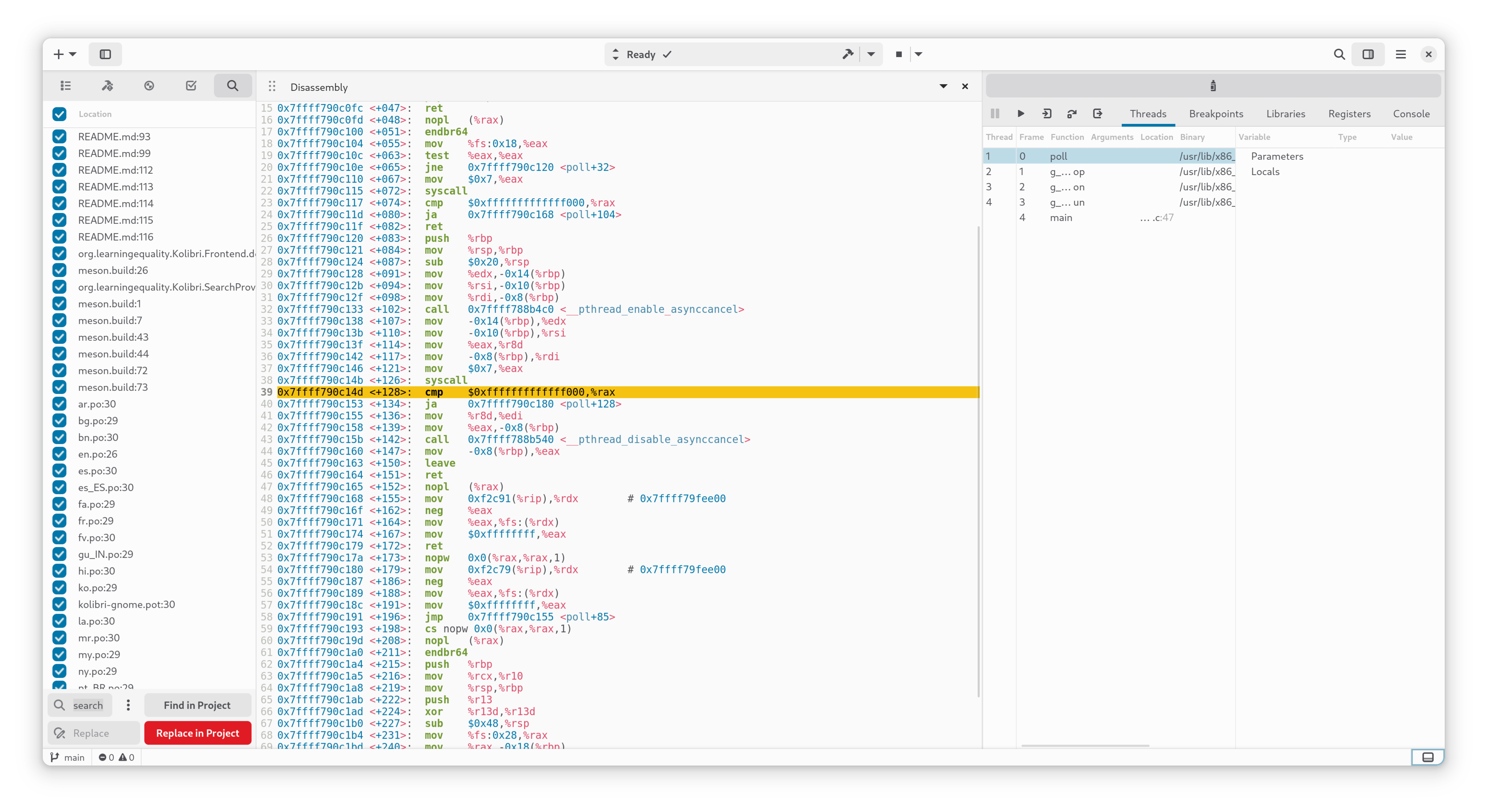
Those interfaces are awkward to interact with, and I have to do an uncomfortable amount of horizontal scrolling to get at the available context. And that’s unfortunate, because it means I really have no choice but to put both of these widgets in the bottom panel.
I’m wondering if there is any ongoing work to adjust these things? For instance, it would make sense to me if the Search widget could adapt to its available width, doing a more vertical layout if it’s shaped more like a sidebar. Or if it really should only live in the bottom panel, I wonder if the panels and widgets scheme is inappropriate for it?
(The debugger is a bit of a separate problem, to be fair. I imagine the dream here is more that Builder itself has all this context and there’s less stuff crammed into the widget?).