Feature idea: Ability to toggle the "recursive search," possibly with a shortcut or a clickable action

Hey there! I want to discuss a proposal for adding a new feature to toggle the recursive search option.

The problem:

The search function is very useful for locating files inside the current directory. However, in very populated directories (especially while browsing large projects that contain folders like node_modules), the search becomes unusable because it returns too many useless results.

The current solution:

We already have a solution for this problem: the option to disable the recursive search, which works well. However, this creates another difficulty: sometimes you do want to use the recursive search.

The side effect:

We lose the ability to perform recursive searches. This isn’t unexpected, as it’s exactly what the setting indicates. However, having to access the preferences to change it for a single search and then disabling it afterwards is overkill and harms the experience of using Nautilus.

The proposal:

Initially, I have two ideas:

  1. A shortcut:
  • You can toggle this setting quicker by just pressing a key combination, even while in search view.
  • A toggle button could be helpful, but I know GNOME tends to have a minimalist approach, so maybe just adding the shortcut to the “shortcuts” panel is already good enough.
  1. A friendly message:
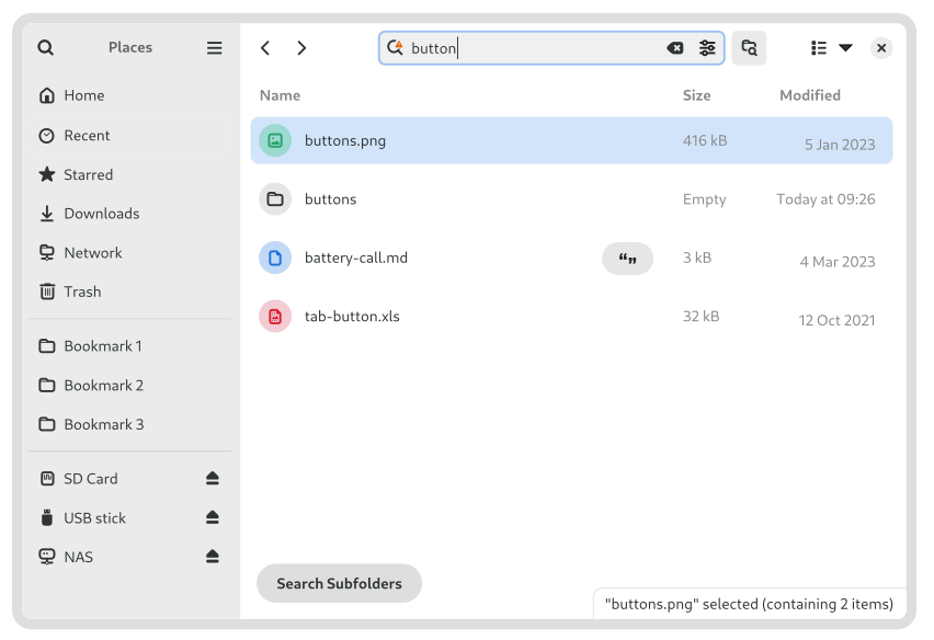
  • The message "Searching only in this folder"Âą always appears. It could have a clickable action like “Searching only in this folder. Do you want to expand your search?” or something similar, which when clicked, temporarily enables the recursive search until you exit the search view.

The first approach doesn’t require UI changes (if implementing only the shortcut), no new settings, and will possibly not impact QA at any level, as it is just toggling some existing option faster. If an icon is considered (which I don’t think is needed to be honest), then the design will need to be discussed, as I have no suggestion in that regard.

The second approach might be more user-friendly but also more confusing in some cases, so tests and further discussions would be necessary.

This is my first post here, by the way.

Thank you for your attention!

¹ I don’t know if that’s the message in English; I’m sorry! But it’s the blue bar that appears when you search for something while having recursive search disabled.

1 Like

Hi. Thanks for the thoughtful suggestions.

I’d like to learn more about the difficulties with the recursive search.

the search becomes unusable because it returns too many useless results

What do you mean by “unusable” here?

Which kind of results are you getting which you find to be useless? What makes them useless? How could we make the results more useful?

Hello! Thank you for your reply!

I realize “useless” is perhaps not the most appropriate wording for it. I wanted to say something like “not relevant results” instead.

I rely on search a lot in every GNOME app. In fact, it’s very useful, and I love how consistent it is! I am used to being presented with a list, starting to type, and having the options reduced to 2 or 3 results. However, the problem when replicating this in Nautilus with recursive search enabled is that it actually does the opposite, and I feel overwhelmed by the number of results it brings up on the screen.

I know the results I want are on top since it prioritizes the current directory, but I have difficulty focusing on them. I tend to disperse my attention easily, and just by having too many files showing on the screen, I find it disorienting to locate them that way.

In fact, one of the reasons I decided to try and use GNOME is that I can focus more on the things I have to do, especially because it’s simple and clean. I feel like Nautilus becomes “hostile” and counter-intuitive by throwing an immense amount of files at me like that when I actually just want to know the names of 3 folders that are inside the current directory.

Which is why I have chosen to disable the recursive search. This did wonders, and I feel good working with Nautilus that way. It’s fast to locate what I want, and the list is always concise and short, which personally helps me a lot. However, it led me to the problem of losing this feature when I actually want the recursive search. I would say that 95% of the time I’m doing non-recursive searches, while only 5% of the time I actually want to use it.

Now, when I want to do a recursive search, I re-enable the option and disable it right after.

So I had this idea and wanted to share it with all of you, because I think it might help with the problem I commented about, by using features already present in Nautilus. Maybe is not the best idea however, which is why I wanted to hear you.

After writing the post I made a script and configured a shortcut for it, so I can quick toggle the option. I’m actually using right now! For my surprise, the view automatically refreshes so it does exactly like the first proposal I made. It’s going great, at least for me :smile:

In case anyone wants to try, just set a shortcut for it:

#!/bin/bash
current_value=$(gsettings get org.gnome.nautilus.preferences recursive-search)
if [ "$current_value" == "'never'" ]; then
    gsettings set org.gnome.nautilus.preferences recursive-search 'always'
else
    gsettings set org.gnome.nautilus.preferences recursive-search 'never'
fi

Thanks for your attention!

2 Likes

I do this as well, and agree it’s an odd shortcoming of a file search to not have this toggle handy.

It would fit very neatly in the search Filters.

When, What, and Where!

nautilus-search

1 Like

There are some proposed designs for sections that can be used to separate the results. Currently, sections are not implemented for the grid view.

Thanks for sharing more about your experience. Now I understand why the abundance of results may hurt the usability.

I wonder if a visual separation between current folder results and recursive results would be enough to avoid the disorienting and distracting effect of recursive results. But until a prototype is available for testing this is just speculation.

We have design mockups for a button which expands search to subfolders for the cases where recursive search is usually disabled:

This is pretty much the same concept as your 2nd suggestion.

1 Like

I think that having a separation might help, but I think it can lead to confusion in some scenarios. For example, when there is no results in the current directory, depending the implementation, the view would either:

  • Present a “No files in this folder” message in a reserved space for it.
  • Hides the place before the separator and shows the subfolder files.

The first isn’t very much attractive, and the second will result in a possibly large list, returning to the initial problem.

I’m just speaking loud my ideas, I have no idea how the separator would look like actually.

This is wonderful! And it’s better than what I’ve imagined. I really liked!

I’d vote for this if possible.

This topic was automatically closed 45 days after the last reply. New replies are no longer allowed.