As a long-time user and advocate of GNOME, I’ve deeply valued the continuous evolution of this environment. However, since the advent of GNOME 40, certain aspects of the apps menu have presented usability challenges, such as navigation difficulties and visual inconsistency. I’m reaching out to share these concerns and propose potential enhancements, hoping to improve our collective experience.
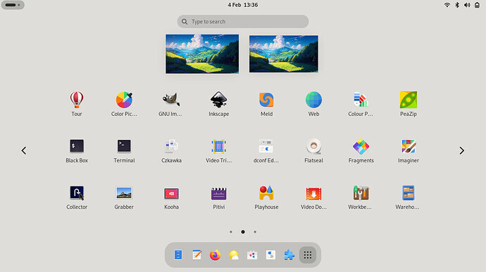
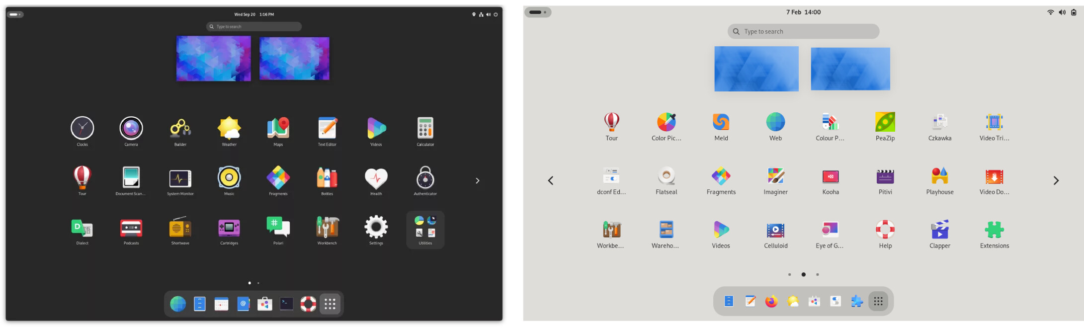
Uniform Grid Layout Across Different Screens: The apps menu grid layout varies across screen resolutions (e.g., 8x3 on a 1080p laptop and 6x4 on a 1440p external screen), disrupting intuitive use. Standardizing this grid layout could greatly enhance user interaction and efficiency.
Visibility of Apps in Dock and Menu: Currently, when an app is added to the dock, it disappears from the apps menu. Although extensions can fix this, they often conflict with others. A native solution, perhaps through a dconf configuration entry (a low-level system setting), could allow more nuanced customization without altering the settings app, thereby reducing extension conflicts.
Alphabetical Sorting of Apps: The ability to sort apps alphabetically is currently dependent on extensions. A native implementation, possibly via dconf configuration entries, would offer a smoother experience and avoid conflicts with other extensions.
I understand that these design choices were made with careful consideration by GNOME’s skilled design team. However, I believe these suggestions could resonate with a broader user base. I propose initiating a dialogue or a community vote to discuss these design elements.
Based on the outcomes of this discussion, I plan to open issues on the GNOME issue tracker to formally propose these changes. This approach will allow us to collectively decide on the best course of action and ensure that these enhancements align with the needs and preferences of the wider GNOME community.
Thank you for considering these suggestions. I look forward to a productive and engaging discussion on how we can further refine and enhance GNOME for all users, and I encourage you to share your thoughts and feedback on these proposals.
The current code is based on the aspect ratio of the available space for the icons. It is not specific to resolutions. Basing it on the whole screen aspect ratio will result in smaller icons in some cases and that is something people have complained about in the past.
As I often use my laptop with an external monitor in closed mode, I frequently switch between two different layouts. At one moment, I’m working with one layout, and at another, I’m adapting to a different one.
My proposal is to empower users with the ability to choose the layout that best suits their needs and preferences.
For instance, in your scenario, a 6x4 grid layout might be more convenient and efficient. Offering such customizable options would greatly enhance user comfort and productivity.
When I switch from 1920x1200 to 2240x1400 the number of rows changes from 3 to 4…
Basing it on the whole screen aspect ratio will result in smaller icons
…and the icons get smaller.
I’m not saying it should be based on the aspect ratio, but I would expect to have more rows in portrait mode, and for the number of rows to remain constant across every 16:10 resolution.
My desktop looks a lot like Ilia’s in each resolution. I would guess that the relatively smaller size of the top bar at the higher resolution crosses a tipping point for the layout algorithm whereby it uses more rows to fill the extra vertical space. Unfortunately this results in all objects being smaller relative to the screen size than at the lower resolution.
Because that changes the aspect ratio of the space available to the icon grid. There are fixed height elements like the panel or elements that have a maximum height, like the dash. So the aspect ratio of the available space can change with the resolution.
Like I already said basing this on the aspect ratio of the screen will result in icons getting scaled down when this would not be necessary with a different layout in some cases. People have been complaining about that in the past.
Like I already said basing this on the aspect ratio…
Nobody’s asking for that.
…will result in icons getting scaled down…
If that’s a problem, is it wrong to use 4 rows and smaller icons when 3 rows would fit, with larger icons? Having 4 rows when it’s not necessary is the essence of the complaint.
Whatever it’s doing, and whatever it is based on, the result is bad.
That’s because I disabled the code to automatically adjust the layout like you suggested in your original post. I wanted to show that using a hardcoded layout will lead to bad results in screen sizes other than your specific example. With the current code it should result in something like 4x6 or 3x8.
That’s not a specific enough question to have a yes or no answer. Assume a large screen in portrait mode: it could fit a width of 8 without scaling down. Would that be correct? It would probably look weird to have 8x3 in portrait mode with all the empty space at the top/bottom.
The comments here are mostly focused on the app grid layout, but I just want to add that I think an alphabetical sorting of apps in the app grid would be helpful for me as I’m too lazy to organize it myself, and keep installing and uninstalling apps makes the grid get very disorganized. Sorting alphabetically, to me, would be a quick fix that adds some functionality back to the app grid rather than it being basically just random. This suggestion should probably be moved to another thread as it is different, and we probably don’t want the comments on different features to get intertwined.
There’s probably a better automatic sorting method than alphabetical sorting, but that discussion should probably happen on a separate thread.
Example of a page in my app grid that while alphabetically sorted isn’t helpful:
Ideally, it’d figure out the grid size based on screen size (in pixels) so that an icon would be the desired size for that screen density, as would the distances between icons. From there, it’d independent of screen size and aspect (I use vertical screens in some machines).
Yeah, I’m planning to separate sorting and hiding to separate thread.
Anyway, according to your message
There’s probably a better automatic sorting method than alphabetical sorting, but that discussion should probably happen on a separate thread.
I’m fully agree with it. I think, user should be able to chose it. At least using Gnome Tweaks.
I understand the way GNOME developers decided to operate, like “We give you a base, and you can modify it with extensions”, but I’m not agree with it as the code quality of extensions is very different.
The answer is yes, because you’ve already stated that smaller icons are bad. I was not suggesting aspect ratio be the deciding factor, it should be icon size.
Compared to my own desktop, this has a larger search box and smaller icons, and it looks worse. Is there anything to be fixed in the layout algorithm, or is this fine?
GNOME automatically scaling the layout depending on your screen size, so it can look bigger and narrow or smaller but spacious one. imho… i think small enough but spacious layout is more comfortable than bigger items but narrow ones.
mine theme is just pure GNOME 45 with different color. looks like the underlying algorithm isnt that best currently but it can be better. @ilyachch maybe reach out into gnome shell gitlab ?
The icon size can’t be the deciding factor, because multiple layouts might work without the icons scaling down. In particular it would not help with the case this thread was created about.
When applying scaling to the entire desktop, things like the search box get larger, but that also means that there is less room for the widgets that can shrink, like the icons in the icon grid. If there is not enough room anymore for those, they have to shrink.