Not sure if this is a problem of gnome or nautilus or gtk, but anyway.
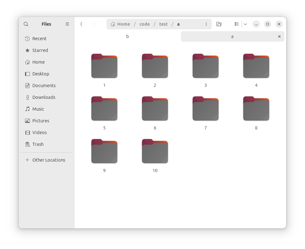
It’s quite confusing to visually tell which tab is being activated, the white one (b) or the grey one (a). I’m no UI expert, but each time I see exactly two tabs opened, my instinct tells me that the white one is opened, since it visually merges with the contents below, like the tabs of google-chrome for example.
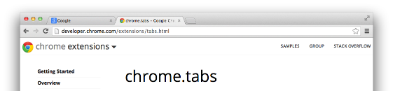
(example image that’s failed to be uploaded as image: https://sunnyzhou-1024.github.io/chrome-extension-docs/static/images/tabs.png)
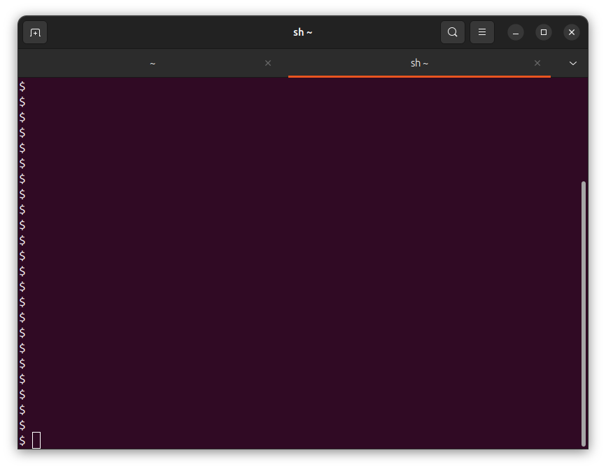
If, for some reason, it has to use difference instead of sameness of color to represent tab activation, at least the non-activated tabs shouldn’t merge with the content window below. For example, the tab activation in gnome-terminal look much more reasonable: