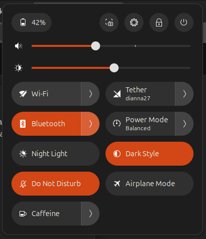
Currently When A lot of Quick toggles are activated it feels like the bottom part of the quick settings look to bright and gives imbalance when compared to upper controls (slider, and system button).
We could balance this it like this instead
Dark mode:
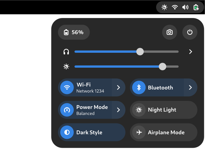
Light mode:

Benefits:
- Each toggle is more recognizable.
- When multiple toggle are activated, it doesn’t overwhelm the eye.
- Visual balance across the entire menu.