Firstly, apologies for the split topic. There are some rather annoying limits on how many links and media new users can have in posts…
I’ve created this topic after a brief discussion with @antoniof on GitLab issue #1714. You can view the specific disussion comments here.
As raised in GitLab, Nautilus makes it very awkward to compare the properties of files or folders. Forcing the user to use the details/list view (for certain file attributes) or to open multiple new windows. All making the UX a bit naff.
An example use case to demonstrate where the current Nautilus UX causes some frustration could be comparing the sizes of 3 or 4 folders within a single folder.
To demonstrate what this looks like in, arguably, the platforms our users are most likely to come from:
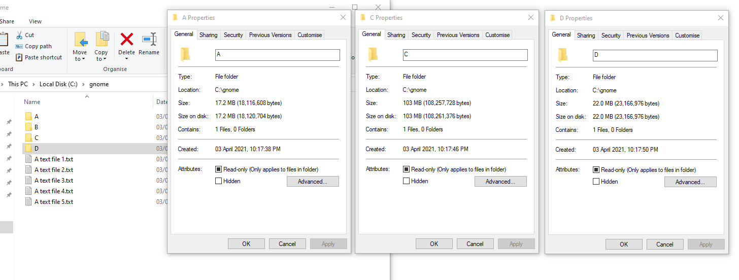
In Windows Explorer, this might look something like this:
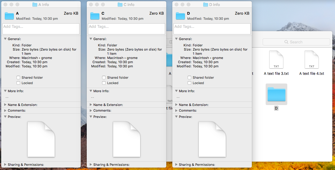
One thing Finder & Explorer had in common in this particular scenario was that they did not require the user to repeatedly find their folder, in multiple separate windows. The user flow was essentially:
Right-click file/folder.
Click ‘Properties’/‘Get Info’.
Repeat for file/folders within current folder (same window).
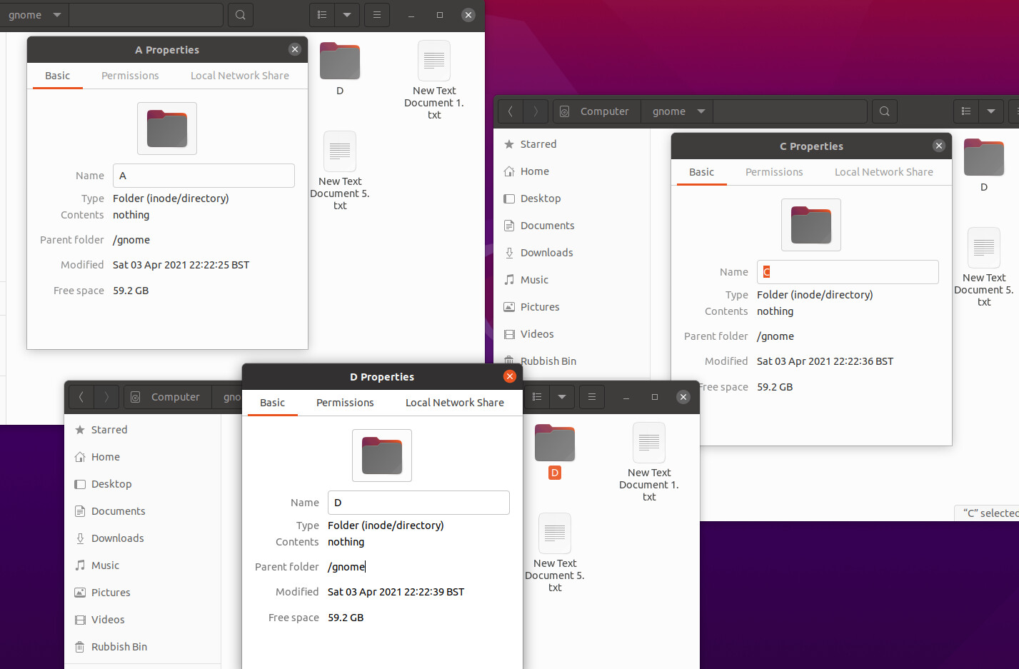
In Nautilus, the user is expected to:
Right-click file/folder.
Click ‘Properties’.
Open a new nautilus window.
Navigate to the folder opened in the first window.
Right-click file/folder.
Click ‘Properties’.
Repeat for file/folders for comparison.
As you might imagine, a user coming primarily from Windows or macOS may find this workflow a little odd and frustrating.
A while ago (I believe the Ubuntu 18.04 era), Nautilus used to support similar functionality to Explorer and Finder. File/folder properties windows were not modal and were not attached to their parent window. This meant users could get the properties of files/folders within a single window. Which was (personally) much easier, much faster and in a manner that was consistent with the other platforms.
I’m aware that the gnome-tweaks tool allows you to toggle the ‘attached modal’ thing. But that only really just lets you move the properties dialog around. User input on the parent window is disabled (because the dialog is still modal).
Problems
So to summarise the UX issues I’ve mentioned above for discussion:
Users cannot compare the properties of files/folders within a single window. Something that has become, somewhat, the norm and expected.
Users with small screen realestate struggle to view multiple properties dialogs at the same time (unless they resize the parent windows first or strategicly place the dialogs after disabling attachment to parent window in gnome-tweaks).
When the property dialog is focused, the parent window is brought foward on top of other windows. On a screen running at 1920x1080, you can only really comfortably get 3, maybe 4 visible at the same time with the default window size (see Nautilus screenshot above).
Solutions?
What could we do to improve the UX for users wanting to compare multiple files/folders within the same folder and/or window?
Change nautilus properties dialog so that it isn’t modal and make this the default behaviour.
Properties dialogs could be placed centered to the parent window (if not already).
Leave it as is but allow users to disable modal dialogs in gnome-tweaks (put changes required for first point behind a feature toggle).
(Somehow) prevent parent windows from being brought forward when their properties modal is focused in order to stop them hiding other Nautilus properties windows.
Something else I’ve not thought of.
I’m keen to hear what people’s thoughts are on this. Are there other UX quirks with the way Nautilus currenty behaves with file/folder properties that I’ve not mentioned that would be worth discussing as well?
@tbernard - mentioning you here as I spotted you had posted here about wanting to redesign this UI 2 years ago. I’m not sure how much or if any progress has been made there since then?
This is not possible at the moment, or I can’t find a way to make it possible. New non-modal windows will open at the top left corner of the screen regardless. And this is major reason for the Properties window to be modal.
The positioning of new windows is determined by the wayland compositor, so the application has no control over that, other than making it modal.
I don’t think either the Windows Explorer or macOS Finder examples provide a good user experience for comparing file properties:
You need switching back to the main window for each additional file, which becomes harder when the utility windows flood the screen.
You need to arrange the utility windows on the screen side-by-side.
You need to vertically align the utility windows to make it easier to compare rows.
And this assumes all window have the exact same rows taking the exact same height, which is not necessarily the case.
This is a cumbersome worflow. Sure, achieving the same result in GNOME Files is even more cumbersome, but matching the Explorer and FInder behavior is not a satisfying solution.
Instead, I believe this presents us an opportunity to be better than Explorer and Finder at comparing file properties.
Oh right, hrmm… Reading up about it a few other developers have asked the Wayland devs about this ‘limitation’ as well. They don’t seem to want to add support for applications to be able to position their own windows (citing security?..).
Apparently there are extensions that provide this functionality (mentioned on gnome’s GitLab here). But we probably don’t want to be adding that?
It sounds like we’re essentially reducing our UX by using the modal workaround for window positioning. If we have no control over that, and the Wayland devs consider that limitation to be ‘by design’ and that control should be left to Wayland, then perhaps that’s all we can do? At least without abusing their APIs with hacks or extensions. If they find that users begin to complain or request features or changes to functionality that isn’t possible because of their own design constraints then perhaps it will persuade them to implement missing features? GNOME have been mentioned as an example of reasons why such features aren’t needed, but that seems only because we’ve had to reduce UX to use their APIs (at least in the case for Nautilus).
I agree that Explorer & Finder’s user experience for comparing file properties can become combersome, especially if you want to compare more than a few files at once. However, I do wonder whether they haven’t redesigned them themselves because there really isn’t a decent compromise in UX and functionality. Afterall, they do have people who’s full-time job is to design UI
This does, as you say, give us a good opportunity to try and come up with something better than Explorer & Finder!
Unless we have a completely new UI for just comparing file/folder properties (what I’d assume would look something like a bunch of file/folder pickers?) I’m not sure there is a way of preventing the requirement of users having to choose the things they want to compare on the main window.
Perhaps to prevent a build-up of file properties windows from filling the screen there could be one ‘master’ properties dialog. And that each file/folder the user wants to see are added as ‘tabs’ to this window? Currently in Nautilus (and Windows Explorer) we have tabs showing permissions or sharing options. Maybe these could be moved and displayed in a longer, scrollable window similar to Finder? I guess it’d be some kind of Explorer/Finder mutant properties window…
Users still need to switch back to the main window to select the files/folders they want to compare properties for…
… however, there is only one window. No properties dialog clutter when comparing a bunch of files or folders.
No need to precisely align properties dialogs.
BUT
If users want to compare lots of files (5+?), then tabs might look a bit ugly.
This hinges on the ‘master’ dialog not being modal so users can select multiple files from the main window. Otherwise we’d just end up in the same situation with Nautilus atm.
I’m not overly sold by this idea myself, but it might be an acceptable compromise? Perhaps the tabs could be pulled off of the ‘master’ window to spawn individual windows (like a web browser) for those who prefer that (or this whole thing feature-flagged?). Just throwing an idea out there. Struggling to come up with anything better than what we have that still has the modal dialog restriction.
One approach that would not require any detachable properties window and no specific new (and developer-time intensive) comparison UI, would be to instead display the property dialog information in a tab.
Pro: -we get detachability for free
Con: -rather unconventional for a properties dialog, the only thing I can think of that comes close would be “show source” for websites in browsers.
Hi Peter, thanks for creating a mockup so we can get an idea of what a tabbed solution might look like!
I agree it does look a little unconventional. I guess conventional displays of file/folder properties is something similar to what Windows Explorer & macOS Finder does?
However, this could be a decent compromise between what we have now and adding hacks to work around Wayland limitations to get something more traditional. Yea, I think that sounds good, we could use modal popups for permissions etc. like you say.
Would we be considering changing this to be the new default for viewing file/folder properties? Replacing what we currently have? Or will we allow users to choose between tabs & properties modal dialogs, leaving the current UI as the default?
It’d be good to get other people’s views on this mockup too!
Just a small note, I wouldn’t really say this is a limitation in Wayland, it’s more of a design stipulation. If it comes down to it, the way to do this in Wayland would be to have a flag on the window that says the window is of a certain type, and then put some code in the compositor that knows where to place that window. I’ve never really seen a situation in Wayland (or in X, honestly) where it was necessary for a window to globally position itself, if it’s desired to add more rules for window positioning, the way to do it without compromising the security is to keep the rules for positioning within Mutter and Gnome-shell.
I do like the mockup, I personally never was able to use windows or mac properties dialogs well. To me the huge number of disconnected dialogs fills up the screen and gets out of control very fast.
It’s probably best to get feedback from the design team first, I will ask on IRC tomorrow. In general I don’t think maintaining two ways to view properties is any good, so IMO it should fully replace the current property dialogs.
Questions that I am still having on the tab-concept:
Do Properties open in a new tab?
How should the path bar look for the properties view?
My suggestion would be to do as shown in the mockup, to open in the same tab and then just display it as a normal entry in the path bar (without any context menu however). The responding location entry would be the respective file path.
One last thing I realized, with properties in tabs one can quickly get a visual comparison/diff by switching the tab back and forth. That might already classify as a better way than comparing two property windows side to side.
The main use case is comparing file/folder sizes? Are there other properties that might want to be compared?
In pure UI terms, using a list view is probably the best solution for that, since you can see each item alongside one another. I don’t think that a dialog is a good solution for comparing items, irrespective of whether it’s modal or not.
@p3732 great thanks, would be good to hear what the design team think of what we’ve all been discussing.
I agree, whatever we end up agreeing on I think it should be the new default behaviour.
Did you mean ‘window’ here? If we display the properties in the current tab then we are likely to have very similar UX behaviour to what we do now with a modal dialog - users having to re-navigate to the same folder in a new tab/window in situations where they want to compare another file/folder in the same location.
That’s a very good point! And might be quite nice! I think it’d be neat to be able to open up properties of multiple files/folders within a particular folder quickly and get the file/folder comparison you mention if they always open up in new tabs. And if users would like a side-by-side comparison (or just want to see them all at once), they can pull the tabs off the window.
Hi @allanday, I think that probably is the main use case to be honest. If you’re referring to the list view already available in Nautilus, that doesn’t currently give you the size of folder contents. For files, then users could just use that. Did you have other file/folder properties in mind?
If we were to use a list view and we were to display file and folder sizes then it could get pretty slow depending on where the user was (if they were at / for example). Alternatively, I guess they could use Baobab/GNOME Disk Usage Analyzer if that’s what they were really after?
Well, as discussed before, non-modal dialogs have uncontrollable placement, so the same applies to new windows, as it would essentially be the same. Besides, it reminds me of the old too-many-pop-ups issue that browsers used to have.
I think it’d be neat to be able to open up properties of multiple files/folders within a particular folder quickly and get the file/folder comparison you mention if they always open up in new tabs.
Hmm, currently showing the properties of a selection shows their combined size and I do think that is something very useful. So comparing multiple files/selections can not be started in such a simple way. Adding a separate menu entry is possible, but those are already quite exhausting, so that would really only make sense if there is a common use case.
Speaking of: @allanday the list view concept does not work for comparing file sizes of multiple item selections. Additionally the properties dialog also offers other file information that could be compared, e.g. image/video resolutions, song artist and such. Not sure if that is a common enough use case though.
Ah maybe I misunderstood what you had said before. I thought you were saying that file/folder properties would appear in the same window/tab as the one the user was looking at (not spawning a new tab within that window).
That’s true, I think the current user flow we’ve been discussing would enable users to do this per file/folder quick enough anyway to warrant not needing to add another menu item
Hey @p3732, were you able to get input from the design team on this discussion?
It’d be nice to keep the momentum going on this and work towards getting something in the works if possible.
Is there anything else I can do to help?