Recently we get an update on GNOME Shell on mobile and this work-flow is amazing!
https://blogs.gnome.org/shell-dev/2022/09/09/gnome-shell-on-mobile-an-update/
To get the actual GNOME Shell on desktop closer to that work-flow (that is very good in my experience with it), there is some humble suggestions and a mock-up.
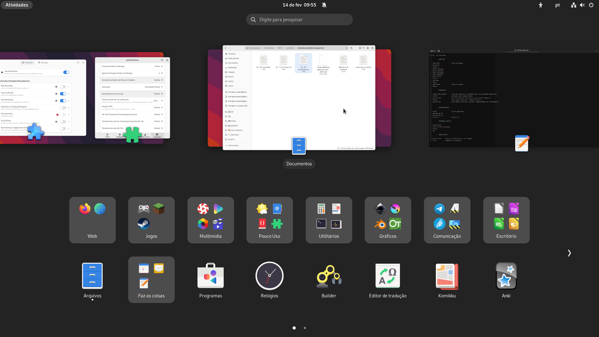
Note: I do not know how to make beautiful mock-up like GNOME designers do. I simple take a lot of prints of my desktop and edit it with Krita. So the interface is in Portuguese, but the elements are recognizable, aren’t they?
- First of all, the Dash is gone and the App-grid take it place and function.
- The App-grid lost one row (to liberate space to Workspaces-overview) and has 16 items (GNOME Shell on mobile has the same quantity).
- And the Workspaces-overview are slight smaller, but apps icons and names still with the same size and are recognizable.
Now the Dash is gone, what happen to SUPER+NUMBER short-cut?
- It’s response: maintain the same behaviour, now into the App-grid.
- For example, in the mock-up if pressed SUPER+9 should initialize “Arquivos” (exactly the same Dash’s behaviour) and if pressed SUPER+1 should open the App-folder “Web” (giving to the user quick access to his favourite App-folder).
With already presented modifications GNOME Shell on desktop can work with it’s normal behaviour. But to get even more close to GNOME Shell on mobile work-flow there are more changes to do on Shell’s behaviour.
Add auto-workspaces behaviour:
GNOME 40 was designed to maximize workspaces usage making them more discoverable.
To be honest it help me to use 3 workspaces, but my activities overview continued a mess. Then I discovered Maximize To Empty Workspace extension, it helped to get 9 workspaces in use normally. But it is not perfect and today I disabled this extension and - surprisingly - continued to use various workspaces (I’m addicted to to this work-flow now).
To increase even more workspace usage add auto-workspaces behaviour: when initializing an application, or a new instance of an application, the window should open on a new workspace next to the current one. Of course, if the user drag and drop an app icon in an specific workspace the window will open on this specific workspace.
Design Principles: Reduce User Effort. If something can be done automatically, do it automatically.
Try to minimize the number of steps required to perform a task. (In this case, organize activities by workspace) Design Principles - GNOME Human Interface Guidelines
Add auto-activities behaviour:
Today when applications on the current workspace are closed you get an empty workspace.
This can mislead people to think: “The computer freeze! There is nothing on the screen.”
My mom is the example in this case, she was confused when using my computer (Silverblue with no extensions).
For a similar reason in GNOME 40 was added the already open Activities behaviour on section initialization.
The suggestion is add this same behaviour when the user get an empty workspace. To see this in action exist an extension called Auto-Activities maintained by @CleoMenezesJr.
Design Principles: Reduce User Effort. If something can be done automatically, do it automatically. Design Principles - GNOME Human Interface Guidelines
Try to minimize the number of steps required to perform a task. (In this case, change the workspace, or open an application)