There are a few issues with GNOME desktop as it is currently that I feel need addressing, and this is my attempt at solving them. Firstly, hiding everything behind a small activities button is confusing for newcomers, and the large amount of pointer travel going from the top left corner back down to the bottom whenever you want to access an app gets a bit tedious. Not having any sort of quick visual indication of open and running apps can also be frustrating for people who are used to using an OS with a regular dock or taskbar.
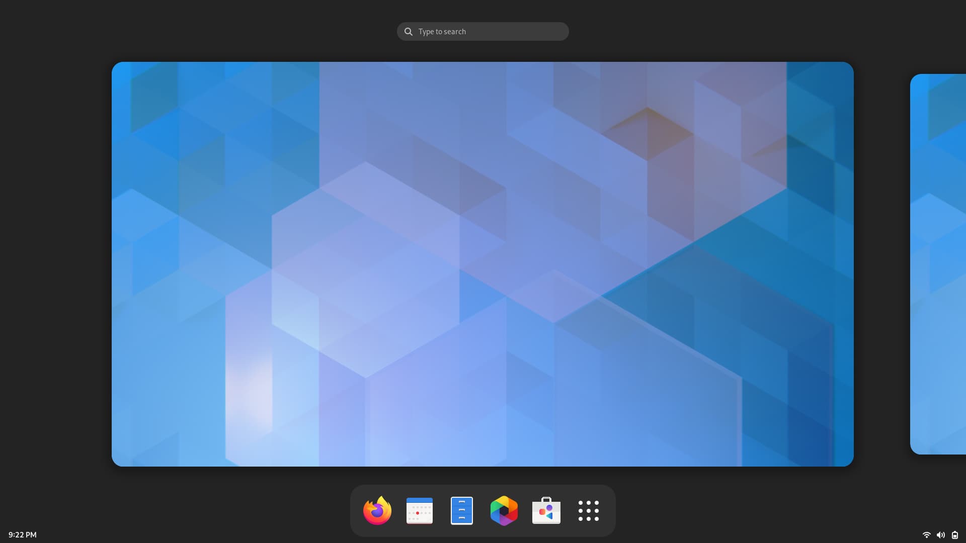
Integrating a partially occluded app/taskbar button into a bottom panel fixes these problems while still remaining true to GNOME design principles. Beyond being much more recognisable to Windows or Mac users, it is immediately obvious that clicking that particular area or swiping upwards will get you where you need to go. The area underneath the button can also be a hotspot.
Do people think it is a bad idea, or is this not the right place to post such things? If it is the latter and the idea has some merit, it might be worth directing me to a place where it will get some more interest.
I am not going to comment on the mockups themselves, but let me give you a bit of an advice; you’re free to disregard what I’m saying—but as a person that has been in the GNOME community for the past 20 years, I can give you some context and recommendations.
Commenting on mockups is a full time job in an of itself, so very few people in the design team have the bandwidth to do that on top of their jobs.
A radical change of the desktop layout not only has to get the buy-in from the design team, it also has to get buy-in from the Shell maintainers; it has additional effects on documentation, engagement, extension development, and a whole lot of people involved in GNOME.
I would never recommend for a newcomer to attempt this kind of large scale redesign of the GNOME identity. I mean: I know it’s fun, and interesting, but it’s going to require the level of integration inside the development and design community that comes from experience. You’ll get burned by this, and you’ll leave thinking that the GNOME project does not need designers.
I recommend you start from something smaller, like application designs; or from details in the Shell. This will give you a more approachable issue to work on, and avoid being burned by it.
I’d also recommend you join the Design channel on Matrix if you want to talk to the design team.
I did not say I was a designer, and I wasn’t suggesting that I was going to do the work myself. The comment about the newcomers was in reference to people unfamiliar with GNOME. Watching them use it for the first time it is clear that the activities button is a source of confusion; they do not even appear to be aware of the hotspot. I was merely presenting an idea I thought had merit, open for comment by anyone in particular and not just professional developers.
Thanks for the context and recommendations. I will take my ideas elsewhere.