Hello! For many years, I have been trying out different Linux desktop environments and tried to see how many of them could fulfill my accessibility needs. I am visually impaired, so I rely on some accessibility features like larger text sizes and screen magnifiers to make my computing experience less difficult and frustrating. In this regard, GNOME already seems to do a decent job, and I’m pretty happy to see that accessibility is slowly getting better and better. However, there are some small things that I feel are missing, that if added, would make GNOME pretty much the perfect desktop environment for me.
The purpose of this post is to give some ideas and suggestions for possible features or improvements to existing features, in the hopes that some of my ideas will get implemented at some point, so that me and many other users can benefit from them.
1) Better text scaling options
As of now, the GNOME Settings app has the option to increase the general UI text size to a larger size. While this might suffice for some, I feel that just having a single switch with no other options is not enough. The only way for me to increase the size even more (without using Tweaks) is to use the “Increase text size” keyboard shortcut. I’d like to see a GUI way to do this, maybe with a slider or a simple dropdown list.
2) More keyboard shortcuts for Zoom screen magnifier
The GNOME Shell Zoom (screen magnifier) feature is useful, especially the automatic focus on UI elements or text cursors. The cursor crosshair and color filter features are good as well, however they lack keyboard shortcuts to switch them on or off. I do not always require a cursor crosshair or a color filter, but I find it useful from time to time, so I do not need to always have these activated all the time.
Another ability that many screen magnifiers have is the ability to move around the screen while in a magnified state by using the keyboard. In GNOME, I still rely on a mouse for this, because keyboard shortcuts for this haven’t been added yet.
3) Text cursor indicator
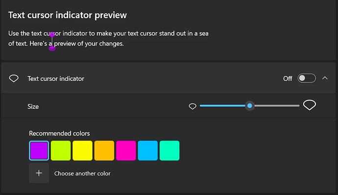
Windows has a feature called Text Cursor Indicator, which, when activated, displays little arrows on top and below the text cursor in order to make it easier to find. The indicator color and size can be changed. This feature is unfortunately absent from all modern Linux DEs that I have tried. Windows also allows changing the thickness of the text cursor in all applications. If these features are technically possible, I’d like to see them added as well.
4) More legible selection border
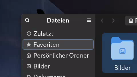
Since libadwaita, keyboard navigation inside GTK4 apps seems to have improved quite a lot in my experience, largely due to the fact that buttons or other elements now have a blue border around them when selected. I’m pretty happy about this, though I would suggest adding an option to the accessibility settings that would make them even more legible with a bigger border or contrasting colors.

These are all the ideas and suggestions I have for now. GNOME has been improving quite a lot on accessibility over the last few years, and I’m happy to hear about new improvements to the Orca screen reader or the Newton project. I would be thrilled to see some of my ideas being implemented, especially because they are mostly minor and hopefully shouldn’t be too difficult to add.
I personally do not have much development experience, so I cannot contribute much other than giving feedback.
If you have any more questions, please let me know ![]()
(I already published an unfinished version of this topic by accident and deleted it afterwards, my apologies!)
