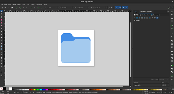
Since GNOME 47 introduces accent colors for libadwaita and the GNOME Shell, I wanted to create a small icon theme of matching colored folder icons for Nautilus. However, I’m not sure how I should pick the proper colors for such an icon theme.
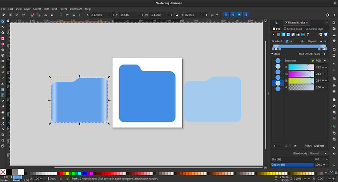
For example, when I open the folder.svg icon from the adwaita-icon-theme repository in Inkscape, I can see that the icon has 3 different layers as shown below.
There are 5 different colors used for these blue folder icons which are #a4caee, #438de6, #62a0ea, #afd4ff and #c0d5ea. Among these colors, #62a0ea is also “Blue 2” in the GNOME color palette. So if I wanted to create Purple colored folder icons, I could replace #62a0ea (Blue 2) with #c061cb (Purple 2). But what should I do about the remaining colors? Moreover, there are a few accent colors in GNOME like Teal, Pink and Slate which do not have an equivalent color name in the GNOME color palette.
Can anyone please offer any helpful advice regarding this?
I suppose this is a follow-up question to this post on GNOME Discourse. I’m new here and this is my first post on this channel so if I’m breaking any rules then please let me know.

