Hi everyone!
I am opening a new topic with the same name as another, because between each, some things have changed.
Among them, the top left corner as been filled with a global search icon, so the proposal is no longer working in recent versions of Nautilus.
Moreover, from what I have seen, the proposal struggled when it started to involve the design team (because the top left corner appears to be a privileged place).
Because this addition would benefit from a lot of Power Users (including me), I am coming to you for suggesting a design implementation.
The key features that it brings are the following:
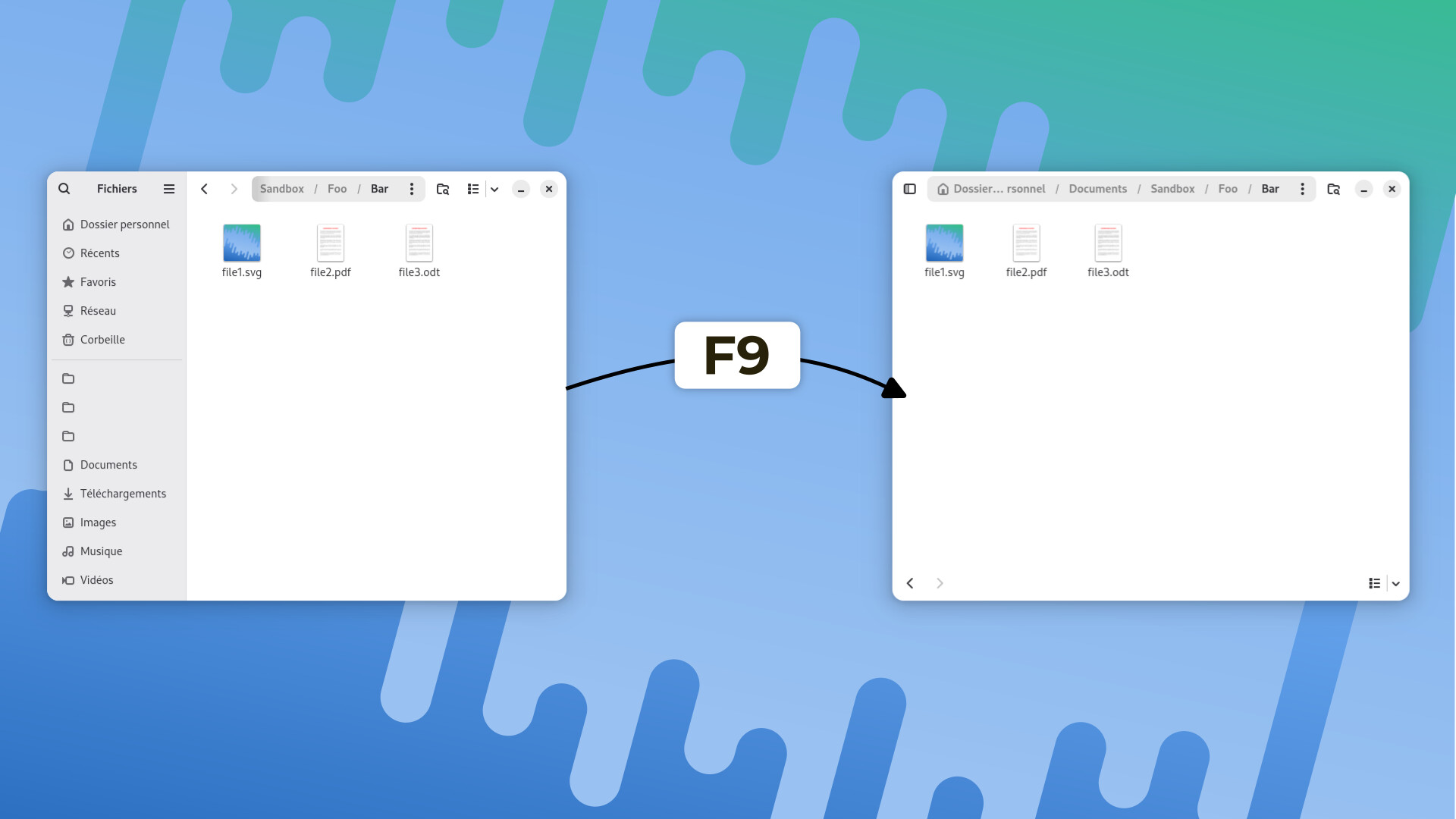
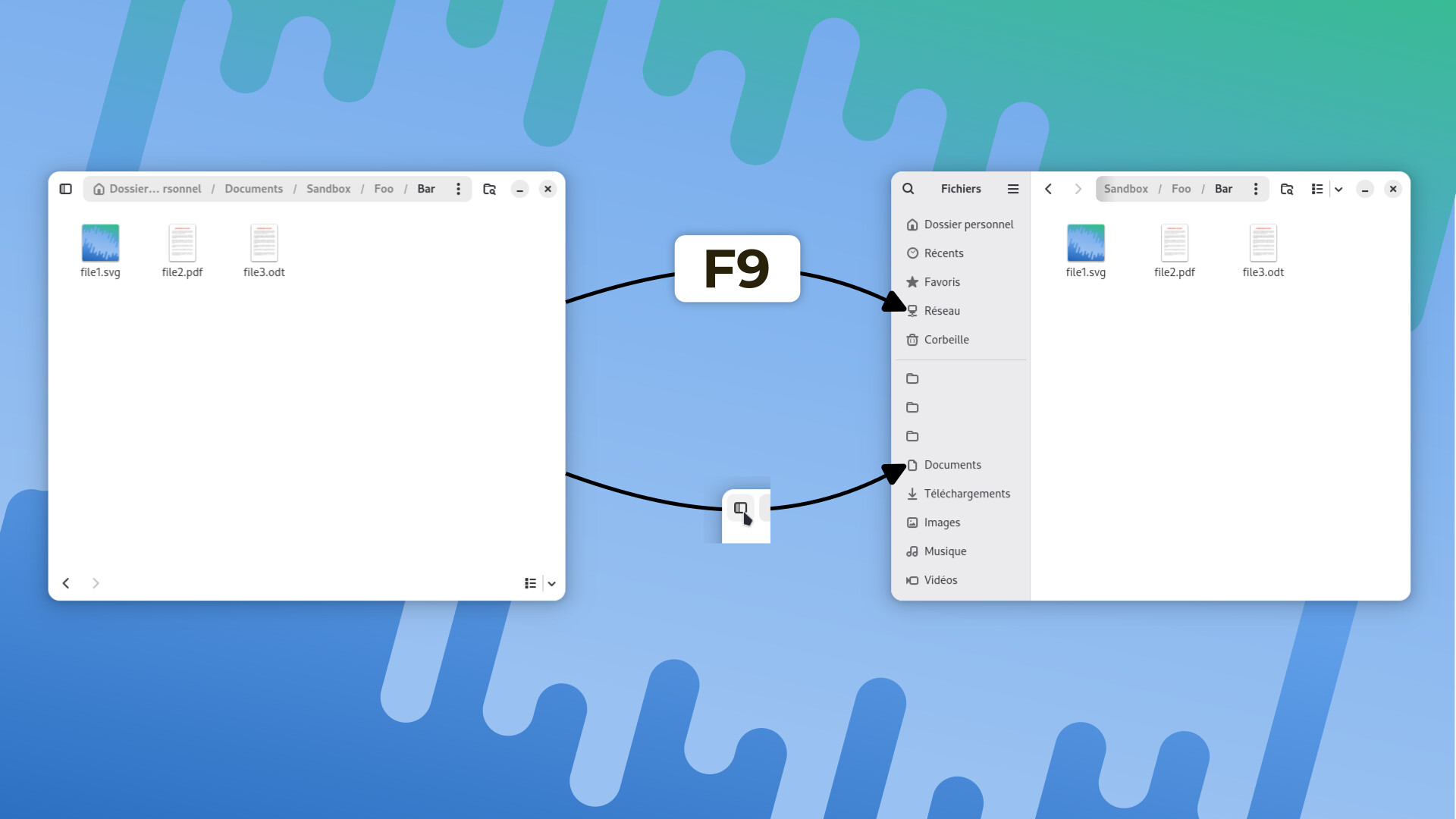
It makes the F9 key always working regardless of the window state (sidebar collpased or shown) (like the previous proposal)
It does not involve any UI redesign (I am only playing with currently implemented UI layouts)
The idea is that when the F9 key is triggered when the sidebar is shown, it would change the window state to be sidebar-collapsed (just like when the width of the windows is lower than a certain value).
In order to prevent users who accidentally triggered this keyboard shortcut to complain, a sidebar toggle button is present on the top left corner of the window (as designed in this window state, so no new button is required!).
Hi, i appreciate your proposal and I do think nautilus should change something about its sidebar behavior. A shortcut-only interaction isn’t great for accessibility or discoverability. We’d at least also need a menu entry.
Personally I’d rather combine the search buttons as the user study has shown it as causing confusion. Then the previous proposal of a toggle could be considered again.
Either way, this needs input from some designers, I’ll link to it in the design chat.
if I may join in the discussion, I agree to all the points of your reply, but I need to add that the accessibility or discoverability problem is already present in small sized windows : you don’t have any hint on how to hide the sidebar (by clicking outside of it, or pressing the F9 shortcut) : If it’s acceptable at small sizes, why not on other sizes ?
And if I may go further (if designers do intervene on this thread), I think that there has been a mistake a few years ago on the importance of the shortcuts displayed in the sidebar : the content part of a file viewer is more important than them, and so, you should have the possibility to hide them sometimes (as do almost all the others file viewers, or as did Nautilus most part of its life) : according to GNOME HIG, shortcuts shouldn’t then be in a sidebar, but in a utility pane.
It would also give more area on the headerbar for controls (even if I personally find a menu entry enough to toggle the visibility of the sidebar).
I don’t quit agree with this. It’s not the best indication, but the view area is greyed out when the sidebar overlaps, to indicate that it can be closed by clicking there. Plus of course, there is the most common case to hide it by clicking on an entry.
I personally agree with this. I don’t know whether this really requires a utility pane rather than a sidebar, the HIG reads ambigious enough for both to me.
I apologize as I may have been excessive in the behavior of the small sized windows, because as you pointed out :
Nonetheless, in small sized windows, the fact that the view area is greyed out only suggests (at least for me) that the sidebar is in the foreground : you need to try to discover that there’s an existing reaction in clicking on the greyed out view area : As I’m really comfortable with trying and breaking (and fixing) software UI , that is not a problem to me, but if you need a visual indication of the existence of a possible action, I’m not sure this is the right thing : on many software, a greyed out zone suggests an zone where you can’t act on.
On the choice between sidebars and utility panes, I mainly pointed it, because many people seems to think that a sidebar should always be visible, which is not explicit on the HIG, unlike the page on the utility panes : and for me, as there’s benefit in a tool like Nautilus for more space available in the headerbar (the sidebar pattern wastes space there), it would be another gain. But I think the HIG are only best practice advices, not the “ten commandments” of GNOME…