Good day, everyone!
This post discusses the appearance of the GNOME Panel and the need for Dock, as well as the behavior of maximized windows of application.
Surely in one way or another each of the judgments about the changes in the DE interface has been raised, but I would like to make some generalizations.
At the outset, it should be noted that I find GNOME to be a visually pleasing DE. However, there are some elements that need a lot of work to improve the “comfort” of use. In my opinion, the primary goal of DE is not to provide the user with pretty wallpaper on their desktop, but to provide a user-friendly mechanism for interacting with the system, preferably with an very intuitive interface.
1. GNOME Panel and Dock
Since GNOME 40, a very controversial decision has been made to open up the virtual desktop toggle panel when starting DE. Many users find this solution (up to now) very strange and aesthetically unpleasant, and it is hard to disagree with the latter. However, before you judge it, you should understand why it happens and what the reason is. As far as I can see, the reason for it lies in the fact that on the one hand there is a desire to use the Dock-panel and on the other hand there is a desire to hide this very Dock-panel in all cases except for the opening of the applications menu and the mode of switching between virtual desktops. Accordingly, since the most commonly used applications are located in the Dock, it is necessary to display this very Dock when starting DE.
In fact, the problem lies in the contradictory desire on the one hand to keep the Dock-panel, and on the other hand to get rid of it. I would say that it is still necessary to make a choice in favor of one or the other solution in the main branch of development. If we are talking about “keeping” the Dock-panel by default, it is necessary that the Dock is always available. In fact, this is why the Dash-to-Dock extension is so popular. It does exactly what the “basic” version should do, which is make the Dock available at all times. I’m not suggesting including all Dash-to-Dock functionality in pure GNOME, including fine-tuning the Dock-panel, but allowing users to have constant access to the Dock bar without too much fiddling. Otherwise, GNOME stops following its own paradigm - “Simple”!
Another way of solving the same problem is on a completely different plane. You can do away with the Dock-panel entirely, and move application launches to the GNOME-panel, as is done in many other DE shells. Windows-like style, if you will. Basically, the same principle is used in the Dash-to-Panel extension. It should be noted that this extension is also super-popular (and as if not even more semi-popular than Dash-to-Dock). The image below compares GNOME-panel in the case of “pure” GNOME and with the Dash-to-Panel extension.
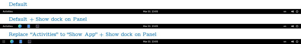
It seems to me that it is necessary to listen to the community and people’s aspirations. The very popularity of the above extensions points to the urgent need to change the interface in this direction. Of course, these options are mutually contradictory, and perhaps in “pure” GNOME you should give the user a choice: use the Dock panel or put the taskbar area on the GNOME-panel.
2. The behavior of Maximized window
I believe that no one will argue with the statement that the size of the working area of the screen is extremely important for the work of users. It is not only about “aesthetics”, but also about usability of the screen space. GNOME DE, it seems to me, has a very significant flaw, stretching back as a legacy from the window systems implemented in MS Windows. Specifically, I’m talking about the “Window Titlebar”. In a mode where there are multiple windows on the screen, or when a work program window does not take up the entire desktop, it probably makes real sense. However, when the window is maximized, it makes no more sense to have this object on the screen than it does to have a program label behind the window. In fact, it is a direct reduction of the possible working area of the screen.
It should be emphasized that I am not talking about the “Menu Bar” which includes the context menus File, Edit, View and so on, but only about the window header which contains the program name (sometimes the file name and path to it) as well as the maximize / close window buttons.
In my opinion, you should hide the window title when maximizing an application window, and dynamically move the “close window”/“maximize window”/“minimize window” function buttons to the GNOME-panel.
I’m not sure there can be no confusion by moving them to the upper right corner. However, it’s a “matter of taste,” and probably appearance and aesthetics experts can suggest a better placement position. As an option (absolutely no call for anything or binding), you can move the “Power-off menu” to the left side of the panel, before the Activities-bar, add a fixed indent to the right of the border of the screen on the right side of the menu (before the Status-bar). Accordingly, in the “reserved” space, you can place the appropriate function buttons to close and unmaximized the application when maximizing the window. Or, alternatively, the Status-bar and the Power-off menu can dynamically change their position (move to the left with a sufficient indentation) when the window is maximized to full screen mode.
Of course, it should be noted that a number of applications designed specifically for GNOME use the window header area much more efficiently, such as the Epiphany browser, but text editors and IDEs, alas, are not as advanced.
Implementing such a feature will increase the working area of the screen by ~ 5% (depending on the diagonal of the monitor, of course).
Also, as far as I understand, similar functionality is implemented, for example, in KDE with the “Active Window Control” extension. I won’t refer to MacOS, of course. :))
3. Using “Power-Off” menu on GNOME Panel and Terminal
When using the above menu to shut down the computer, the user needs to make 4 mouse clicks to shut down. Personally, I think this is an excessive number of mouse clicks. It could easily be reduced to two: the first click brings up the shutdown/restart/end-of-session selection menu, and the second the corresponding user selection.
The same goes for the terminal call in the clean version of GNOME. It would be much more convenient if there was a default shortcut to open the terminal. For example ctrl + alt + T. This is a trivial convenience for users! For the most part, users set up a shortcut to the Terminal anyway.
4. Using single button to switch keyboard layout
Another problem faced by some users (those who use multiple keyboard layouts, such as French and English) is to configure switching between keyboard layouts using a single key.
At the moment, in fact, the only possible keys are Caps Lock and Scroll Lock. Tweak → Additional Layout Options → Switching to another layouts → …
If you try to switch the keyboard layout through the “basic settings”, then there is a problem with the popup menu, which blocks the ability to type. This problem has been known about for quite some time.
I would suggest adding the Pause / Break key to the list of possible alternative keyboard layout switching.
P.S.: I sincerely hope that at least some of my comments will be heard by the developers and they will be taken into account rather than discarded. ![]()