This option won’t hurt current GNOME workflow, as it will not be default. Of course, it’s sad that GNOME doesn’t have a dock on desktop, it only in Activities, but it probably will at some point, considering how GNOME surprisingly up user-friendliness with coming of GNOME 40 generation.
Hidden windows are displayed in the overview.
1 Like
I’d like to shift back the discussion from “don’t use minimize button” to “have option for maximize button”. It is an action I use a lot (more often than closing windows, actually), yet its execution requires more effort, especially in non-default input contexts. With the mouse, double-clicking is okay, but dragging the window is rather tricky to do in some multi-monitor setups. With touch inputs, dragging remains a high-effort action and I don’t think double-tapping works.
GNOME should really provide the option to maximize/minimize windows with just a button, and in my opinion, by default.
2 Likes
It’s true that hidden windows are displayed in the activities overview. It works just fine for a bunch of hidden windows. However, if we choose to place the hide/minimize button on every window and always in front of the user, we are apparently encouraging its use. A logical consequence is a horde of disorganized windows in the activities overview. If those are, for example, multiple versions of the same legal contract that I need to work on, they may be indistinguishable in the activities overview if I also have a few dozens of other windows open, for example, with client’s documents, legislation, commentaries, etc. That is not a problem for GNOME, since the Shell design apparently encourages using workspaces to sort through such chaos. But putting the hide/minimize button in the windows titlebar without providing an alternative to activities overview for managing them would give the wrong message to the user. It would only bring disappointment.
Sorry, but I don’t see the link between maximizing a window and dragging a window. What is your real issue?
I don’t think double-tapping works.
Why do you think it doesn’t work?
OK. Personally, I prefer switching between apps rather than switching between workspaces.
For this, @DartDeaDia has this whiteboard issue: Dock on the Desktop (#90) · Issues · Teams / Design / Whiteboards · GitLab
Here are two relevant issues:
- window overview wastes screen space + illegible + stalls (#5381) · Issues · GNOME / gnome-shell · GitLab
- Thumbnails in window picker sometimes unnecessarily small (#5631) · Issues · GNOME / gnome-shell · GitLab
In the first, I suggested having grouping. However, in your use case, would grouping by application suffice or do you tend to group by client?
1 Like
Report about one week discussion on GitLab.
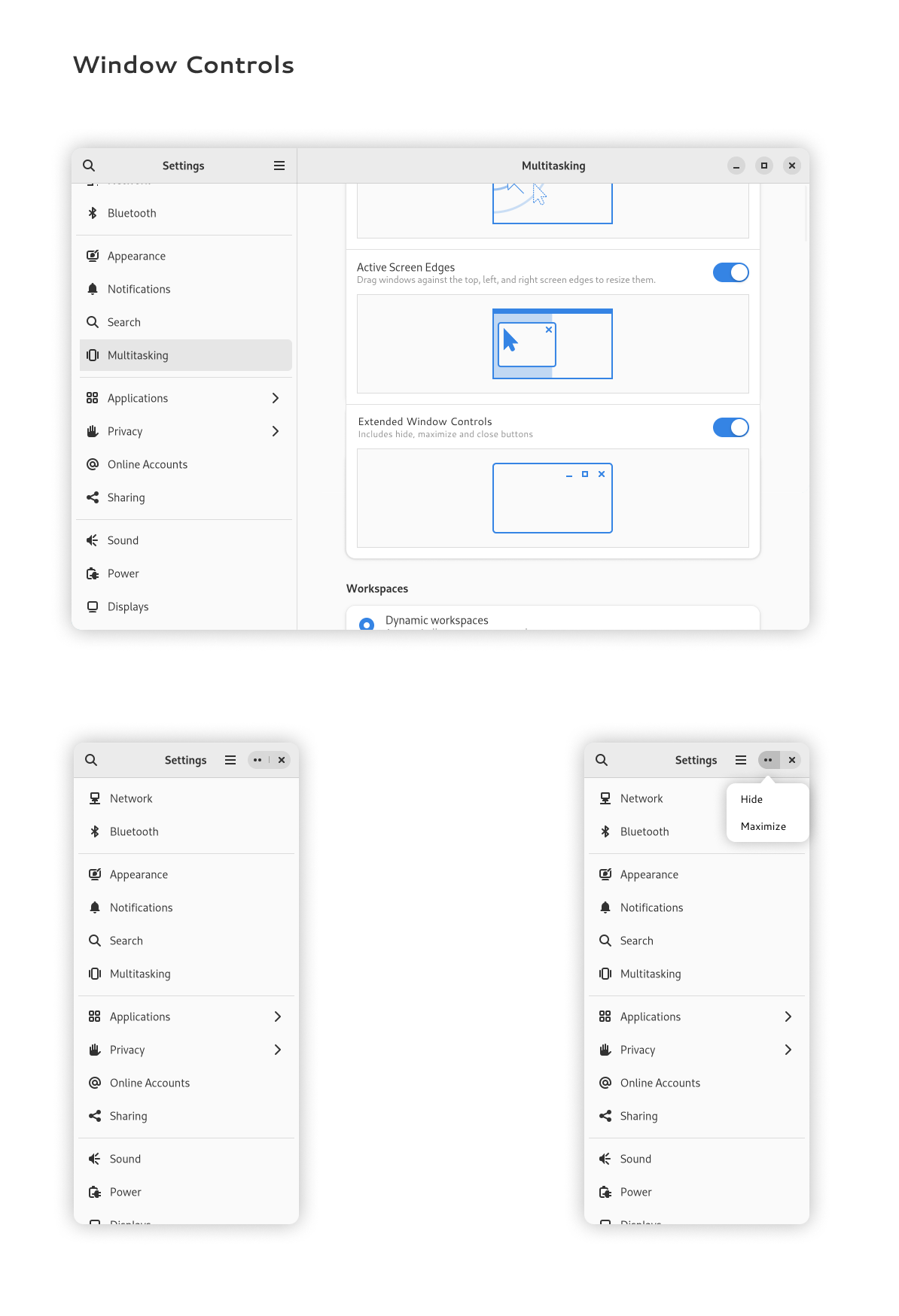
Among the shallow: Now it calls Window Controls, also it moved to Multitasking page, and Window Controls setting is as a switch, to take up less space.
The biggest update is the adaptive Hide/Maximize/Close buttons. Together with Michaël we thinked about adaptive three buttons design.
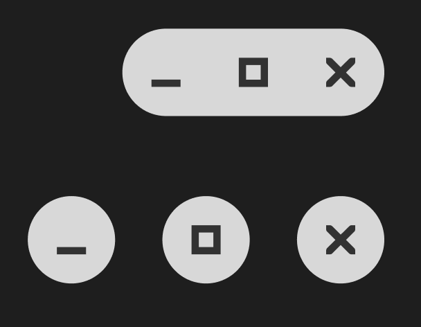
In the last iteration, it “two dots” and a close button. By clicking on “two dots” will appear a context menu with Hide and Maximize options.
3 buttons takes up too much space when the window is reduced to mobile size, so 3 adaptive buttons is a good compromise to save space and still have the functionality of 3 buttons.
That might be the way.
I think for mobile, the maximize/minimize/close buttons are not needed. So on mobile the three buttons should disappear. Of course, if an app gets resized to mobile size on desktop they should be visible.
1 Like
Doesnt Ubuntu have its buttons on the left?
I dont think these mockups will work there.
Those might bring some imporvement to the appearance, but I believe that grouping by application would not improve my personal workflow that I referred to above.
I usually use a single workspace and switch between applications and windows with keyboard shorcuts. Though, I often forget whether I have to switch applications or windows. I might forget the application where a document is opened. Cycling through applications and windows for occasionally needed data might bury the documents that are continiously being worked with. I usually cycle less if I separate those and if I separate input data from the documents I am creating. Thus, I group them that way in workspaces if I start getting lost.
Instead of hiding some buttons, could remove gaps to get shortened buttons.
1 Like
This topic was automatically closed 30 days after the last reply. New replies are no longer allowed.