There are also statuses like chat status, sync status. It is also about having a menu, but we have app actions, although there are menus with dynamic information like, for example, the temperature of the hardware or with custom widgets.
I agree with that, and that’s why I don’t agree with background apps being accessed by going to quick settings, unless they’re built into indicators (e.g., microphone muted, screen recording) and to have a temporary indicator (i.e. until app is closed or shown only when focused) for e.g. screenshot tools.
It is still not clear to me for any of those icons what the “chat status” or “sync status” is. IMO, if a sync failed or a chat disconnected then it is desirable to have a notification to tell exactly what is happening. A tiny random icon is just the worst possible way to communicate this.
Sync Statuses: badges on app icon to indicate sync is active or paused.
Here it’s about changing chat statuses or start/pause syncing as quickly as possible without opening the app. Because there’s an app icon, you might want the feedback to be indicated by a badge or other custom icon instead of a big notification (from which you can’t change the status or see it at a glance depending on where your notification is in the list).
App indicators have exactly the same problem when there are too many of them like in that screenshot. It is not easy to tell at a glance what is happening because it is just a random jumble of icons. And it gets worse when you have to scroll them or overflow them into a menu. This is all explained in the article that was written 5 years ago. Really, it is exhausting to have to keep going over this so many times whenever this is brought up. Nothing has changed about app indicators in the years since that would make them more usable, the same problems persist.
The idea that they are supposed to be a quick access feature does not even hold on Windows anymore. In Windows 11 they are all hidden away in a menu by default, the API is in maintenance mode, and apps are instead supposed to use the newer notifications API that can support progress and badges. So that is why it is very strange to me that people are still requesting this feature due to Electron.
On Windows they have a taskbar which gnome-shell does not have (and that will also depend on how many apps you have). Having badges on apps in the app grid (in Windows, in the start menu) will only be useful if the apps are all pinned to the first page or to the “dock” (if it remains).
So it is no different than the notification area which is also in a menu and must be manually pinned to the task bar… It’s not like you cannot get this kind of inconsistent behavior with GNOME, you just have to use an extension.
No. Sorry, this is a source of confusion. On Windows there is no “app indicators” instead it is called “notification area” which makes the point that it was only intended for notifications, not for random apps to keep putting persistent icons in. The API was so abused by applications that all icons are hidden in a menu by default unless they have a notification to show. On GNOME what we think of as “notification area” actually has proper notifications that can be dismissed, not icons. Although I think it is kind of funny that Microsoft seems to be copying GNOME now with Win 11 and having a very similar “quick settings” style menu.
Yes, I know that sometimes some apps put their icon unusefully or just for fast launching (e.g. OpenOffice) instead of optimizing the app to launch faster.
However, here it is about:
Quickly changing chat status and seeing this status easily without looking for a notification in the notification center in GNOME.
Supporting apps that only have a menu as their user interface (e.g. Dropbox, Flameshot).
Other ways can be certainly found for those, but that means other platforms also agree about the means. For example, for chat application, it is about finding an UI such as we have a spec for chat status (e.g. old messaging menu in Ubuntu).
Flameshot have app actions, then it can be more exposing app actions and having a permanent access to take screenshots with the portal. Such app doesn’t really have to run in the background if its action can be launched fastly.
For sync apps, just expose them in the menu of a sync toggle. But the system has to know what are the sync apps.
(note that these are only examples, not especially complete proposals)
Again, app indicators are not useful for either of those things. Other platforms do not even agree on the means, like I said even Windows has de-emphasized this and made it so you cannot quickly see status without looking for it. KDE also does the same. If all you care about is legacy apps using the old app indicator APIs, you can just implement some compatibility layer that converts it to a newer API (notifications, actions, background apps, etc).
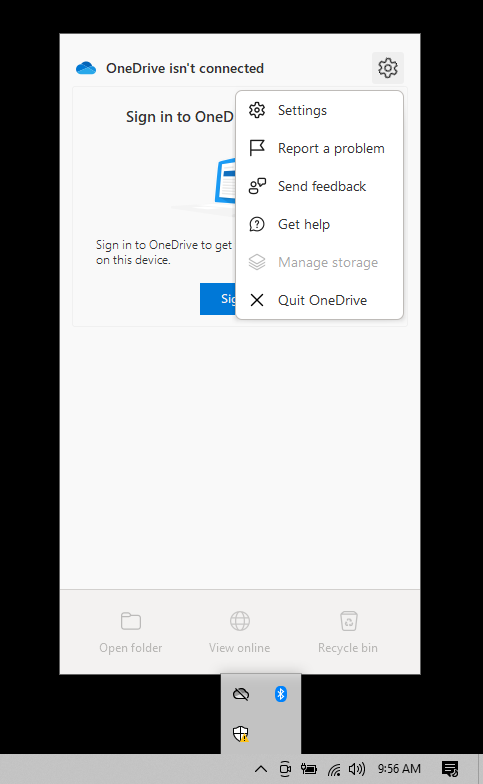
Apps that only have a menu can easily have it turned into a small dialog, that UI is much more usable than having a random menu driven by a tiny icon. Here is a screenshot from Windows 10 that shows more problems with that approach:
This is a built-in Microsoft app for syncing files. It does nothing by default and just takes up space, to configure it you have to go three levels deep in a menu. So that recreates all the accessibility problems with cascading menus, in addition to the accessibility problems with notification icons. Why is it even there? It would make more sense as just a normal app, it does not benefit from being a menu at all. Note there is also another notification icon all the way on the very right, that also shows a different panel with notifications that are similar to GNOME. And also note how all three menus are different styles for some reason…
For Sync apps, that will be more like the list for the VPN toggle (see the VPN part), with a 3-dot button for the menu. However, one can counter-argue that this has nothing to do with the system statuses of the system. This is a minimal interface, where issues (e.g. unable to sync) are reported via notifications.
For the Flameshot case, you want to take screenshots. If you want to take screenshots on different workspaces, you don’t want the menu to be a small dialog because it certainly won’t be consistent with launching other apps or as a mini-app ( that you then need to move between workspaces). One way to handle this is to have actions more directly available. For example, see this. However, in this design, some aspects need more thought (e.g. location to access these actions, user experience for installing apps that only have actions).
No, that will not work out the way you want it to, see my screenshot for what real sync apps actually try to do. And with app indicators you can expect many of them to pile up over time to the point of overcrowding. There is no menu needed if all you are trying to do is see status of a sync. That is what progress notifications are for, you can associate a “cancel” action with the notification.
You also don’t want it to be a menu, because GNOME does not have named workspaces so that would make no sense. Really what you want to do there is create a shell extension that hooks into the workspaces in the activities overview. This is another case where status icons are just the worst possible way to implement the desired functionality but they only seem to get used because they are there. We have better APIs so there is no need to cling to an old one that does not work so well.
I’m talking about app actions/shortcuts, not app indicators.
For sync apps, that will be an « Open » action in the menu which either open Files or the web browser to see your files. If something goes wrong in the sync, it is notify with a notification.
For the design I linked, it is also about app actions, but this may require custom icons (only if all possibilities cannot be standardized).
That is not how file sync works. There are multiple folders that can be synced and a user needs to be able to edit the list of folders. A menu is just not suitable, neither are app actions. That is why things like the OneDrive app have a thing that looks and acts like a menu but technically it has some custom widgetry in it. You simply cannot do that just with exporting a menu over dbus. Custom icons are not going to work either, see the many previous issues I mentioned with those.
Yes, that is the way I have always seen these discussions go for years now. I have mentioned this before. The many accessibility issues and usability issues are brought up, they are never addressed, the discussion goes nowhere because the issues fundamentally cannot be solved by adding more icons and menus. When you dig into it you find that what people really want are notifications, or panel applets, or app actions, etc. But for whatever reason people still cannot let go of the idea of app indicators.
Use filters in notification center (app icon + count badge). You will always have to click on the clock.
Show app icon with badge on lock screen.
Add global notification counter.
A “+X” counter when returning to the computer after having unlocked it or after a period of inactivity (e.g.: no mouse or keyboard activity).
Add a persistent summary notification like “You have X new notifications from [app_name]” (persistent because you have to dismiss it or click on an action). This is a special notification in which one could click on the relevant application (= an action) to access its new notifications. Appears after a period of inactivity or after unlocking the computer.
Have filters with counting badge/label in notification center to quickly access specific notifications.
If you come back after being away and there are new notifications, automatically show the notification center when activity resumes (if there was no activity) or when unlocking. Have an additional badge/label indicating the number of new notifications on filters.