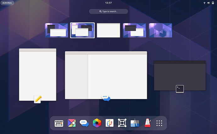
New Shell design (feedback)

Another thing that needs some further work is the workspace switching in activities. I tested the development branch and noted a few things:

  1. On activities, with a touchpad, you switch workspaces by scrolling up and down, even though workspaces are vertical. With touchpad, unlike mouse wheel, you can two finger scroll vertically, and it would be more natural if the required scrolling movement was in the same direction as layout of the workspaces. I’ve come to terms with the horizontal layout, but the bindings should also reflect that. On the same note, mouse wheel should also do the same as 4 finger up/down swipe. Otherwise the spatial experience breaks down.
  2. You can switch window focus with arrow keys in activites. This is good. You can even move your focus to windows on other desktops. Also good! The view does not follow the window focus when it moves to other windows… Not good. I think it should either A, move your view to the same desktop where the focused window is, or B, switch view to the state where all desktops are visible like dragging windows does. Option A would be more in line with the spatial design.
  3. Dragging a window in overview moves view back so that all workspaces are visible. This is great! However, at the moment this seems to be the only way of accessing that nice view. I hope more ways of accessing it will be implemented in the future.

Hi, I want to point out the new overview design removes the ability to select items from the favorites bar by slinging the mouse cursor to the screen edge. It is a small detail but wanted to bring it up here so the feature is not accidentally removed from the overview.
Screenshot from 2021-01-08 17-30-22

1 Like

So, I think the ergonomics could go either way (pulling down on the bottom edge definitely feels different than flicking into a corner, but I’m not sure which feels better…), but I think on the balance that having only some unknown portion of the bottom edge be hot would probably be a mistake. After all, making the whole edge hot automatically gives you two hot corners you can flick the cursor into.

The discoverability question is interesting. While the Activities button is certainly the most discoverable way of accessing the overview, I’d argue that it only indirectly helps you discover the hot corner itself. The Activities button, after all, gives no visual indication that there’s a hot corner next to it (e.g. you can’t look at a static screen shot of Gnome 3 and point to where the hot corner is without already knowing). It only helps you discover it by accident by making sure that your cursor spends time up in that area where you may accidentally trigger the corner, and helps you remember it’s there after you discover it by association.

As far as discovering the hot edge, I think there are approaches that may work. For example, if you have a glow effect on the bottom edge every time you returned to the session from the overview than users would see that there was some relationship there and hopefully be lead into finding the edge. This would be reinforced by the new shell starting in the overview, so the user will see the glow the very first time they ever see the session.

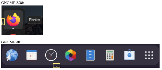
Also, I thought this Shell 40: increased pointer travel from activities to open app grid (#68) · Issues · Teams / Design / os-mockups · GitLab was a pretty interesting mock up, though I’d probably left align the icons in the dock to minimize the travel distance.

Adding a link to the picture for further context:

I also think this is good design. Left alignment of icons would make sense if using only the bottom left hot corner instead to whole bottom edge. Visually I kinda prefer the middle layout though, but without hot edge in it is a bit inefficient design.

I’m not sure about touch screens, but on a touchpad, they’re going to implement this, as a three-finger swipe-up, AFAIK. They might have actually done that already.

The thing is, since the bottom edge is a much larger area (than a single corner), you would have to make sure it’s not triggered that easily, otherwise it would get annoying very quickly. OTOH, having to exert too much “force” (by pulling your mouse downwards) just to open the overview wouldn’t fly either.

Indeed, dash-to-dock does this pretty well, but when it’s activated, it simply shows up on top of your current window, without shifting everything on your screen upwards (as opposed to entering the Overview), so accidentally triggering it isn’t as disruptive.

But these are mostly implementation details that, once tuned, could make for a good end result :slight_smile:

Also, don’t take me wrong - I’m a fan of replacing the top-left hot corner with something that’s more intuitive, be it the bottom edge or something else. It’s just that, while it feels straightforward to us geeks, I understand that GNOME is also meant for the “mainstream” public where the “just works” experience is paramount.

The onboarding screen would help, indeed, but I can imagine many people just skipping it, not paying attention to it, or simply forgetting about it later. As a result, when they launch an app upon their first login, they may easily get lost and unable to launch any other apps, simply because they don’t know/remember the gesture. AIUI, this is also the reason why the top bar (with the Activities button) is always visible in GNOME (by default, unless you’re using an extension to hide it, of course).

I think that good UI design shouldn’t require a (new/non-technical) user to read a manual in order for it to be usable, even if it’s just an “onboarding screen” that takes less than a minute to flip through.

Agreed. The hot corner is just a convenience thing that helps streamline the workflow (once the user is acquainted with it). What’s important, though, is that there also is the actual Activities button (although it arguably doesn’t look like a button at all) that you can click. By removing that, they would make it into guesswork for those inexperienced users that didn’t get the memo. At least that’s how I think the GNOME design philosophy goes, and I pretty much agree (even though I’d very much like to see this being configurable!)

Yeah, a glow effect could work. But again, it’s apparent to us power users, but that doesn’t mean the regular person using GNOME for the first time would have a clue what it means :slight_smile: (They could certainly be curious enough and discover the hot edge, but again, it’s not readily available just by looking at the desktop.)

Yeah, I 100% agree about keeping the Activities button. If you’re using Gnome Shell and you can’t get to the overview, then you really can’t do anything at all. Having a widget on screen all the time that you can click to get into the overview is essential, and the Activities button serves that purpose as well as anything would.

The way I would envision discovery of a hot bottom edge is that new users would, at first, click on the Activities button to access the overview. Each time they entered or exited the overview this way there’s be a brief glow effect at the bottom edge which (hopefully) they would eventually notice and investigate.

You do lose the more direct connection between the Activities button and the hot zone though. In the current shell you can think of the Activities button and the hot-corner as essentially the same thing, so there’s three discrete methods for opening the overview (Activities button/hot-corner, Super key, touchpad gesture… at least I think that’s all of them). Now you would really need to think of them as four different ways, but going from three to four doesn’t seem like that large an increase in conceptual complexity.

Alternatively, if you went with a hot bottom-left corner as opposed to a hot bottom edge, then in principal you could move the top bar down to the bottom and maintain the connection between the hot corner and Activities button. I think there’s good reason not to do that though. At the very least, I find the idea aesthetically unappealing (though I guess that’s not much of an argument for anything). More concretely, the top bar is an important part of the Gnome Shell branding. If you look at a screenshot, the top bar is generally going to be the only visible element that lets you know the person is using Gnome Shell. It would be a shame to muddy that by moving the top bar around and making it less recognizable.

1 Like

We have a Tour app where such basic navigation elements are explained, so it could be put there (it’s already the case for the hot corner IIRC)

Besides for new comers, activities button is also important for virtual machine users. With virtualbox, hot corners require disabling the mouse pointer integration, and with vmware hot corners will not work period. So without activities button there is not way to access the activities overview with mouse.

Thinking about it, having the whole bottom edge be hot might be too disruptive. Apps require using their bottom parts often enough to trigger the action accidentally on a regular basis. So, hot bottom left corner might be better.

Yeah, it certainly is possible that having the full edge be hot will be too much. One of the reasons I’m bullish on the idea though is that I use a Mac for work and have the dock set to auto-hide on the bottom (the gap of totally empty space on either side of the dock when it’s not set to auto-hide drives me bonkers) and I don’t recall ever triggering it accidentally. It’s hard to know for sure without trying it, though, so if it doesn’t make it into the design for Gnome 40, I’ll write an extension for it and see how it feels.

In any case, having a hot bottom-left corner is a totally reasonable fallback, especially in combination with the layout changes that @12people suggested on the gitlab issue.

I come from Reddit. I’ve been a passionate Gnome user since the first time I tried Linux. I heard this is the place to make feedback on gnome 40’s UI. This is long and I will mainly focus on just the negative experiences I’ve had so far. Thank you all to those who continually work on making Gnome the best version there is.

So I’ve been using Gnome 40 for the past couple of weeks and here are my thoughts.

TLDR;
The new design, while boasting a beautiful design, feels like a backward step towards usability. The new design introduces problems while not providing tangible benefits for users and undermines the fundamental features of Gnome.

I will first go over the three main usability issues I’ve had with the current UI scheme for Gnome 40.

Horizontal workspaces vs verticle ones.

  • The first issue we can immediately see is the horizontal workspaces and application grid. On the current Gnome design, workspaces and applications are all on a vertical grid. Vertical grids are much more natural to desktop users as we often use the scroll wheel, which moves up and down, to scroll through them.

No single entry point.

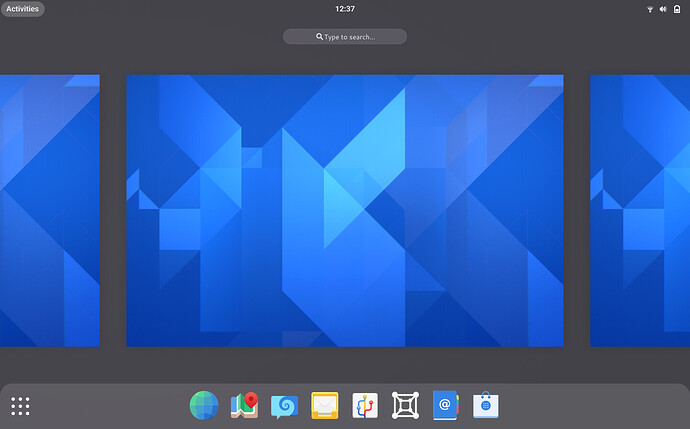
  • The second issue is that we cannot see all other workspaces available from the Activities overview. To do that we would either have to open the application grid, or grab a single open application. This design is against one of the fundamental key aspects that the developers stated that they would retain with the Gnome 40 UI change. Specifically, the “Single entry point” the Gnome activities overview currently provides. This makes the new design objectively worse than the current design as we have to perform additional actions to see all the workspaces but still end up viewing less information at once. To add insult to injury, if we decide to use the [Grab an app] method to see all the available workspaces makes it impossible to know which workspace the application belonged to. The empty grey space this creates makes it look incredibly ugly and dull.

Switching between workspaces is clunky and slow.

  • The third issue is that we cannot quickly move between different workspaces. When using workspaces to their full potential, it is easy to use many workspaces at once. I often end up using 6 to 8 workspaces when I need to get work done. Let’s say I have 8 workspaces currently. I was working on a word document in the 1st workspace but had to move to the 8th workspace to reply to a colleague. I would use the keyboards shortcuts to move through every individual workspace, or enter activities overview and scroll through every individual workspace, or enter activities overview and click through every individual workspace, or open the application grid, click on the 8th workspace to select it, then click once more to zoom in on the workspace. These actions are objectively much slower and worse than entering activities overview and selecting the workspace I want to go to on Gnome 3.38.

There are a few smaller issues here and there but these are the main issues that make Gnome 40, in my subjective opinion, objectively worse to use.

I will now go over the issues I’ve noticed while reading the blog post for Gnome 40’s UI. The blog can be found here: GNOME Shell & Mutter

According to Gnome Blogs, horizontal workspaces were more intuitive to use compared to the old ones

"In our user testing, the new workspace design demonstrated itself to be more engaging and easier to get to grips with than the old one.”

and that the new design is better for touchpads

“Effective touchpad gestures can be incredibly effective for navigation, yet our gestures for navigating the shell have historically been difficult to use and lacking a clear schema.”

I have five issues, inquiries rather, with these statements.

No mention of testing methodology subjects.

  • There is no mention of who tested these new changes and how these tests were conducted. By not stating the who why when where and how the above statement seems very untrustworthy. It makes me believe that the tests were done to windows and mac users, operating systems that use horizontal desktops rather than vertical ones. This is all the more obnoxious considering that windows and mac users don’t utilize virtual desktops at all! Heck, I’d go as far as to say that most non-gnome users don’t know what virtual desktops are!

Up and down gestures are more comfortable than left and right gestures.

  • Four-finger gestures to swipe left and right is not comfortable at all. Lay your fingers flat on a laptop touchpad, you have significantly more space for your fingers to move up and down rather than left and right making up and down gestures more comfortable than left and right gestures. Additionally, our fingers and anatomically designed to bend up and down not left and right, another point that makes up and down gestures more comfortable. Those who have the tiniest of hands, or are using the latest, expensive MacBooks with massive trackpads would have a slightly better time using the left and right finger gestures. For the rest of use that comprises 99% of the Gnome user base with comparatively tiny trackpads and average to large hand sizes, left and right finger gestures are a nightmare.

  • For three-finger gestures, the current model in Wayland is to pinch to activate activities overview. However, with the Extention, I can already use three-finger up and down gestures to activate activities overview and the application grid. If “Up and down moves in and out of the overview and app grid.” is what you want, then simply add these smooth animations to the current overview scheme.

We can integrate the UI schemes of Gnome 40 while keeping the same functionality of activities overview.

  • If a better boot experience is wanted, then integrate the new activities overview zoom in and zoom out animation scheme to the current one and make the workspaces window only appear if there is more than one workspace. The new UI look is what makes it more “inviting”.

  • Gnome 40’s activities overview looks more “inviting” because the animations and UI overall is more polished, not because it is necessarily more user friendly or more useable in general(at least as much as I can tell). Implement these polished designs to Gnome 3.38 and then compare them to the current Gnome 40 scheme.

Gnome’s appeal is that it embraces virtual workspaces to its workflow in a polished manner. If I wanted horizontal workspaces with clunky interfaces, then I would be using Windows or macOS. Gnome is the only proper Desktop Environment that fully utilizes workspaces and uses verticle workspaces in a way that simply makes sense to the user. Don’t throw that away to entice random windows or macOS users, only for them to use Mint Cinnamon edition or ElementaryOS respectively.

Finally, I will talk about some potential counter-arguments about the three main issues I had while using Gnome 40.

“Horizontal workspaces aren’t that bad. They might be better since you move between different displays left to right as you would in real life”

  • I agree. Horizontal workspaces aren’t a detriment to the usability of Gnome. But we already have verticle ones that work well with touch devices, and mouse scroll wheels. Why spend the time to learn a new inferior layout? Additionally, when the blog stated that testers said that horizontal workspaces felt like moving between displays, they probably said that because

  • A. They likely never used workspaces before

  • B. If they had, their experience with virtual desktops would have likely been horizontal workspaces thus preferring familiarity.

  • C. Because Gnome 40 moves the entire display when changing workspaces(the background image moving is the key point here) while gnome 3.38 makes it look like the apps are the ones that are moving.

Implement the new animations and workspace changing effect (lifting the entire desktop up and down) to gnome 3.38 and you could get similar effects.

“The new horizontal workspaces allows us to see a tiny glimpse of opened applications in the workspaces on the left and right makes productivity even better!”

  • First of all, the tiny bar of applications isn’t enough to know what the application is. Open the nautilus on the right workspace and gnome-software on the left. Now, enter the activities overview and tell me if you can tell me which application is which. You can’t. All you see is one white bar on the left with the close icon and one bar on the right with the search icon. Furthermore, even if it was possible to tell which was which I could have just looked to the right-hand side of the screen to see which application is on which workspace. No need for this when switching workspaces. Furthermore, we could just implement this feature to the existing gnome 3.38 UI. If the vague left and right sides of an application are enough to tell what it is then the top and bottom sides of an application should be enough to tell what the app is.

“The New UI looks pretty. The old one does not”

  • Yes, I agree. The new UI looks incredibly well polished, and we can bring that polish to the current design while not sacrificing usability.

To wrap things up.

The new UI undermines the fundamental design aspect of gnome “Single access point” by making it harder to view all the available workspaces.
Viewing all horizontal workspaces creates a lot of wasted space and makes each workspace tiny.
Switching between different workspaces is clunky and slow.
Verticle workspaces are better than horizontal workspaces.
Verticle touchpad gestures are more comfortable than horizontal gestures.
Polish the current design to use the same animations and effects of Gnome 40 and we can have the best of both worlds.
8 Likes

At this point, I think the best course of action would be to delay the release of a redesign until a later version like 41. It feels as though the decision on the Shell 40 UX design came out of nowhere and is being rushed out of the door in an immature state without allowing sufficient input from the community. Version 40 is coming out too soon to properly involve the community in such a major UX redesign and spatial model change.

I created an issue about this on Gitlab and ask for a thumbs-up from anyone else who is in agreement: Shell 40: Postpone major redesign until a later version

5 Likes

Regarding the increased pointer travelling to reach the favorites bar / application button, I totally agree with the proposition of @Feichtmeier on Gitlab to have a hot bottom edge. It seems to me both efficient, intuitive and non-invasive.

1 Like

It took me a while to get gnome40 to build on Manjaro, but I’ve been testing it for some days now. Some notes:

  • It feels extremely smooth and snappy. I feel happiness just navigating it
  • The default keybindings could use some love to accomodate new desing. Super+wasd is great for spatial navigation
  • Activities overview:
    • Moving to adjecent workspace requires clicking it and entering a workspace requires clicking it when it is in the focus. This takes a lot of mouse movement and clicking. It would be better if you could change workspace by applying pressure to the screen edge and clicking a workspace would immediately enter it.
  • Workspace overview:
    • I wish there was a way to access it besides dragging windows
    • it feels weird that when you drag a window to another workspace, you are immediately booted back to your original workspace. It might feel better if workspace focus would follow the moved window?
  • Application drawer:
    • Dragging application icon opens it in the focused workspace instead of the workspace you dragged it to. This makes it feel random
    • Dragging windows between workspaces works only if the movement starts from the focused workspace. Easiest fix would be to have the workspace focus follow pointer without clicking?
2 Likes

I don’t use the application drawer very much, but when I do, I wish it scrolled vertically instead of horizontally. Especially with the new design. It feels weird that you enter the app grid with vertical movement, but once you are in there vertical movement does nothing. Two swipes up, and then it is time to sideswipe.

But horizontal app grid is much better for arranging the grid, and it wouldn’t work quite as well with vertical app drawer. You can actually drag icons to another page! So over all it’s still a win.

1 Like

Because a computer monitor is not a physical desktop and trying to link them together as the same concept is incorrect.
A computer monitor is stood up vertically in front of your face, whereas a physical desk is laid out horizontally flat in front of the midriff of your torso. You look forward at a desktop and look downwards at a physical desk
So, it’s easy for a human to imagine there being space above and under the monitor as when one scrolls it scrolls off the screen in one of those two vertical directions.
The only time horizontal design would make sense would be using one of those Microsoft Surface tables from a number of years ago where the image is projected on to the physical desk surface.

Also, one interacts with a computer monitor with an external object (finger, mouse, touchpad), whereas with a physical desk, one interacts directly with the object.

Another example is that one doesn’t normally push their papers off the sides of a physical desk and pick them up again. Yet with a computer monitor, we are constantly pushing information out of our way in order to focus.

1 Like

Also, specifically for the current Gnome 3x design it’s effortless to just toss your applications into the various desktops with a right sweep movement. With the keyboard shortcut CTRL+ALT+DownArrow/UpArrow it’s straightforward and natural to flip between the various full-screen applications. These then enter and exit the screen in the expected Vertical direction which fits with the vertical screen sitting in front of one’s face.
It’s also easier to set up several desktops at once. So for example, when programming one can start up the computer open Spotify, Gnome-Text-Editor, Gimp, a terminal. then quickly right swipe them onto the various desktops making everything ready for a days work.

With Horizontal one won’t be able to do this anymore, as one will only get 1 1/2 virtual workspace at a time to work with.

1 Like

Now that the workspace minimap is back (which is really great), is it still really worth keeping the wallpaper thumbnails (i.e. big workspaces) behind the window picker? While I understand there are still some advantages to it, overall I think its disadvantages outweigh them IMHO. E.g.:

  • It overlaps with the minimap, which makes the overview cluttered.
  • It makes the window picker area smaller (especially horizontally).
  • It requires the minimap to be extremely small for the sake of aesthetic, which is not great from a viewpoint of usability.
  • It requires the scale-up hover effect for window thumbnails, which is inconsistent with everything else in GNOME (except for its side wallpapers).
  • The animation when entering the overview is kind of discomfort because the wallpaper and windows are scaled down with different scales and movements. (This small but recurring discomfort does not exist in 3.38.)
  • The triple-layer in z-axis (dark gray background + wallpapers + windows) could feel heavy/cramped compared to the double-layer (darkened wallpaper + windows).
  • It seems kind of inconsistent that window thumbnails ride on cards (wallpapers) and slide with them, but app icons in the app grid don’t.

In addition, although I didn’t have a strong opinion about the dark gray background vs. wallpaper background, when I actually tried the both in a VM (with the same horizontal layout), I found the wallpaper background much more engaging (and feels spacious) even on the boot/empty state. (It was a surprise to me because I didn’t have this feeling when I just saw the mockups. After all, the reason initial testers found the GNOME 40 more engaging might be mostly due to its updated visual style rather than the strong spatial model?) Anyway, removing the big wallpaper thumbnails allows the wallpaper background again, like this:

I really hope designers will reconsider about it. If we could give it up, we can solve a lot of design issues in GNOME 40.

The minimap is a stop-gap solution until the design can iterate over the next few cycles.